Calendar:Event in a Tab
Please don't edit this page, unless you are Paul Morris (or maybe Fallen or MakeMyDay).
This page is for the "Event in a Tab" feature, a 2016 Google Summer of Code (GSoC) project by Paul Morris. It will document various details including design, implementation, etc. High-level progress updates will be posted to the Mozilla Calendar Project Blog (with the "gsoc" tag). The tracking bug is #1272540. Public communication channels are IRC (#calendar on irc.mozilla.org) and the mozilla.dev.apps.calendar newsgroup / mailing list.
Contents
GSoC Project Summary
Currently, events and tasks are created and edited in a dialog window. This project will add the option to create and edit them in a tab instead, providing more room and flexibility for the UI design. A supplemental goal is to explore implementing this feature in HTML/CSS/JavaScript rather than XUL. By using a responsive design, an HTML-based implementation could fully replace the current XUL-based event dialog. The UI could change depending on the width of the viewport, providing either a wider (tab) view or a narrower (dialog window) view.
Project Plan
- Get the current event and task UI working from a tab, as another option alongside the current dialog window. At this stage keep the UI the same, just port it to a tab without any changes.
- Explore implementation options, particularly the feasibility of using HTML rather than XUL. Consider XUL, plain "vanilla" HTML, HTML with web components, and HTML with React. Decide on the path to take in 4.
- Finalize the new UI design for the tab and dialog window for both events and tasks. Incorporate UI/UX feedback including accessibility considerations.
- Depending on the feasibility of an HTML implementation either implement the new UI: (A) in XUL, (B) in HTML, or (C) first in XUL and then in HTML if time allows.
- Integrate with automated testing (time permitting).
Notes: 1, 2, and 3 can be worked on concurrently. The goal is to finish at least 1 and 2 before the midterm evaluation period (June 20-27) and at least 3 and 4 before the coding period ends (August 15).
Design
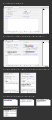
We are currently seeking feedback on Mockup N. It is the result of a number of revisions (A through M) that are all documented below. The mockup images are intended as relatively rough "wire frames" to show layout and they only approximate spacing, sizing, and aesthetic details. Unless otherwise noted functionality is the same as in the current implementation.
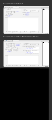
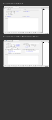
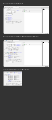
Mockup N
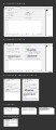
Mockup N

- "Responsive design" will be used for the implementation. As the window expands horizontally, the elements (and possibly horizontal spacing/margins) expand with it up to a breakpoint where the two-column “tab” layout goes into effect. Then the elements would continue to expand in both of the columns, up to a certain limit at which they would expand no further (to keep things more focused on a very wide monitor/window). After reaching that limit the elements would stay in place (left-aligned, or possibly center-aligned) as the window expands further to the right.
- Shows new Mozilla date/time picker (which may or may not be available yet at time of implementation).
- Vertical scrolling in a tab: Categories, Reminders, Attachments, Attendees, and Description can take up as much vertical space as necessary to show all their items. In most cases, where there are only a small number of items, there will be enough room on the page to show them all without any scrolling. In less common cases where there are many items, the content of the tab will become taller than the viewport and the whole tab will become scrollable. (The toolbar at the top, with "Save and Close" etc., does not scroll but remains visible.) This approach allows viewing all of the items at once when there are many of them. (This is instead of having smaller boxes around each of these elements that are independently scrollable, which does not allow you to see all of them at once when there are many of them.) (This "whole tab scrolling" approach is how it works in Google Calendar.)
- Vertical scrolling in a window: when the contents of the tabbed box (Reminders, Attachments, Attendees, and Description) becomes too big to fit vertically, the tabbed box becomes scrollable.
- Suggestions are welcome for the name of the "More" tab in the window dialog design.
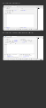
Original Mockups A and B
The following two mockup images (A and B) and notes are based on the GSoC proposal and are a starting point for further refinements of the design. See below for subsequent mockups and notes.
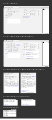
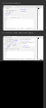
Mockup A
Mockup B


Basics
The mockup images are intended as relatively rough "wire frames" to show layout and they only approximate spacing, sizing, and aesthetic details.
The images show a newly created event and an event with elements added – repeat, reminders, attachments, attendees. These are shown in a tab and also in a the smaller window format. Unless otherwise noted functionality is the same as in the current implementation.
There are two variants shown in two separate svg files. They differ only in the placement of the "privacy," "priority," "status," and "show time as" elements.
Event in a Tab
The elements in the right-hand column are more optional, and in the simplest cases they will be left at their default settings. Putting them in the right-hand column gives greater prominence to the less optional elements in the left-hand column, like the timing of events, that must be entered for every event.
For reminders, attachments, and attendees only a minimal UI is displayed at first until the user acts to add these items to an event. There is simply a link or button to click to add these elements. They are shown as a blue link in the mock-up but they could be a button instead.
For reminders, clicking the link/button creates a reminder, indicated by the appearance of two drop down menus, one for the kind of reminder and one for its timing, along with a small button (shown as an "[X]") to delete the reminder. Additional reminders can be added by clicking the "Add reminder" link/button.
A new selection box for choosing the timing of a reminder is shown at the bottom of the mockup images. Its behavior is similar to the time and date selection boxes. It replaces the current drop down menu and "custom" dialog.
Clicking the links/buttons to add attachments or to invite attendees shows their respective dialog boxes (which are the same as the current dialog boxes). A box with a list then appears showing the attachments and attendees, and these boxes work much same as the current boxes for these elements. The "Notify Attendees" and "Separate Invitation Per Attendee" checkboxes only appear when attendees have been invited.
A delete button (shown as an "[X]") has been added next to individual attachments and attendees, and a "Remove All" link/button has been added as well.
Privacy, priority, status, and "show time as" are indicated and changed via drop down menus, (rather than showing them in the status bar at the bottom of the window). This allows them to be edited "in place" and makes them more discoverable since they are currently only accessible via the options menu and so may be easily overlooked.
The labels such as "Title" are shown right-aligned for a clearer connection between them and what they label. But they could alternatively be left-aligned instead. There are no colons on these labels for the sake of visual simplicity.
To make time zone settings more discoverable, a link/button for "Time Zone" could be shown by default, as shown in the mockup images.
A "Save" button has been added to the toolbar.
Event in a Window
"Add Reminder," "Add Attachment," and "Invite Attendees," are shown right above the box where these items will be listed when added/invited. The boxes containing these items are shown in a tabbed interface, much like the current implementation but with a "Reminders" tab added. A difference is that the respective tabs do not appear until they have content. When items are first added to them their tab is made the active tab. Ideally, as the window is resized the size of these boxes adjusts to match the height of the window.
As currently, the "Notify Attendees" and "Separate Invitation Per Attendee" checkboxes are only shown when the attendees tab is active.
Toolbar Considerations
The toolbars shown in the mockup are simplified, without items like "Privacy" and "Invite Attendees" that can now be edited more directly "in place." The thinking behind this is to simplify things by keeping display and editing of elements together and not spread them out in different places. As shown, the toolbars only contain buttons that affect the event as a whole, like "save" and "delete."
However, it may make sense, especially in the tab layout, to have more items in the toolbar to provide additional ways of editing elements for different users and use cases. If desired, we could keep the current toolbar items and potentially, in the tab view, add "Priority," Show Time As," and "Status" to the default set of toolbar items. There may even be additional items that could be added to the toolbar that go beyond the current toolbar options.
Proposed Horizontal Resizing Behavior
As the window expands horizontally, the elements (and possibly horizontal spacing/margins) expand with it up to a breakpoint where the two-column “tab” layout goes into effect. Then the elements would continue to expand in both of the columns, up to a certain limit at which they would expand no further (to keep things more focused on a very wide monitor/window). After reaching that limit the elements would stay in place (left-aligned, or possibly center-aligned) as the window expands further to the right.
As shown, the two-column layout rearranges the elements somewhat. This rearrangement is kept to a minimum for more consistency between the window and tab views.
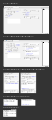
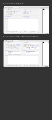
Mockups C - I
Mockups C through I are based on feedback from Richard Marti who suggested a full-width Description box, moving the Privacy etc. items below the Description, and rearranging Attachments, Attendees, and Reminders.
These mockups only show the "Event in a Tab" design to simplify the discussion by focusing primarily on the tab design first, and then to consider the narrower dialog window design in light of the preferred tab design(s).
Mockup C
Mockup D
Mockup E
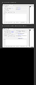
Mockup F
Mockup G
Mockup H
Mockup I


Notes on Mockups C through I, grouped by similarity (C G H I) and (D E F):
Mockup C
- reminders in the right column in same row as timing info
- attendees and attachments in the next row
- description full width
- privacy etc. below description
- problem: calendar and category under location are asymmetrical
Mockup G
- like C but Calendar and Category are moved down into second row above Reminders to fix asymmetry with C.
- problem: do Calendar and Category really fit in this row in terms of their function?
Mockup H
- like C but with Calendar and Category below Description with Privacy etc.
- minimize horizontal space taken up by these 6 items below Description and fit them into their own "toolbar" to allow their own horizontal spacing (no longer aligning with the two main columns)
Mockup I
- like H but with Attendees and Attachments below Description
- less need for horizontal lines to divide things, so removed
Mockup D
- like B but with full width Description and with Privacy etc. below description
- problem: attachments and attendees can make right column taller than left column (above description) which is somewhat awkward
Mockup E
- like D but with Location, Calendar, and Category in left hand column below Reminders so Attachments and Attendees have more space
- problem: seems unbalanced, too much in left column with a new event
Mockup F
- like E but with Reminders at top of right column
- problem: right column is taller than left when things are added to it
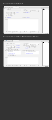
Mockups J, K, and L
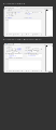
Mockup J
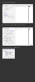
Mockup K
Mockup L


Mockup J
- Like G but with 2-column (divided) horizontal divider lines.
- Categories has a "tag cloud" design, and is moved to its own line. Categories and "Add Category" button/link wrap to new line when they won't all fit on previous line.
- Color swatches added to calendar and categories.
- Reminders are in a box that will become scrollable when many are added.
- Question: Should categories get a scrollable box too or push everything down as it grows?
- Removed the "Remove All" links/buttons to simplify things a bit. These are probably rare operations so maybe best to leave them in context menus.
Mockup K
- Categories, Calendar, and no "Remove All" links/buttons like J.
- The Description is the whole right hand column. The reasoning is that it is arguably more useful as a tall "portrait" shape rather than a wide "landscape" shape because it is often used for lists of things and text blocks are easier to read when they are not too wide (e.g. columns of text in newspapers). Also the left hand column can have a fixed or max width, allowing the description to expand to the right and use the rest of the horizontal space on screen, taking better advantage of wider monitors.
- Reminders, Attendees, Attachments, and Categories (the "collections" of variable height) are in the left hand column. Rather than being contained in individual boxes that are (or become) scrollable at a set height, they are allowed to grow as tall as their content requires without adversely affecting the overall layout. Triangle handles on the left appear that allow these sections to be collapsed and expanded. If the left hand column becomes taller than the viewport then the whole "page" becomes scrollable.
- The triangle handles could appear immediately when adding items or later, possibly when the page becomes scrollable. An advantage of this approach is that it makes it possible to see all the contents of a collection (e.g. Attendees) at once, even when there are many of them.
- When the description contains more content than it can show, we would decide on one of two possibilities: (1) it can become scrollable, (2) like the left hand column it can expand vertically with the whole page becoming scrollable.
Mockup L
- Like K but location and calendar (fixed height elements) are moved to top of left hand column, providing more space for the left hand column (and its variable height elements).
Note: The basic layout of K or L could also be used with fixed-height individually scrollable boxes for Reminders, Attachments, etc. (i.e. instead of having the expand/collapse triangles and letting the page become scrollable). (The disadvantage would be that there would not be a way to see all items at once when they become too many to fit in their box.)
Mockup M
Mockup M

- Based on mockup J.
- Shows new Mozilla date/time picker (which may or may not be available yet at time of implementation).
- Categories, Attendees, and Attachments are more consistent with the appearance of mail tags in TB (and in the TB Conversations add-on where they have the "x" to make them easy to delete).
- The width of the Category "tags" ("boxes" or "bubbles") is proportional to the length of the category name, producing a "tag cloud" style alignment that minimizes the use of space. For Attendees and Attachments, their width is adjusted so that they align in vertical columns making for easier reading (especially when there are more of them and since they are not also distinguished by color the way Categories are).
- Clicking on "Add Category" will reveal a popup that is basically the same as the current one, a list of categories with checkboxes and a text field to enter new categories.
- The color of the calendar is shown in a way that is more consistent with the look of categories.
- When present, an event's URL property is added as "Event Link". (It is called "Related Link" in the current Lightning.)
- "Show Time as Busy" is a checkbox rather than a drop down menu.
- Scrolling in a tab: Categories, Reminders, Attachments, Attendees, and Description can take up as much vertical space as necessary to show all their items. In most cases, where there are only a small number of items, there will be enough room on the page to show them all without any scrolling. In less common cases where there are many items, the content of the tab will become taller than the viewport and the whole tab will become scrollable. This approach allows viewing all of the items at once when there are many of them. (This is instead of having smaller boxes around each of these elements that are independently scrollable, which does not allow you to see all of them at once when there are many of them.) (This "whole tab scrolling" approach is how it works in Google Calendar.)
- The window dialog is included in the mockup.
- There is no status bar for the window.
- In the window, categories are added to the tabbed box for more consistent viewing of multiple items.
- Scrolling in a window: when the contents of the tabbed box (Categories, Reminders, Attachments, Attendees, and Description) becomes too big to fit vertically, the tabbed box becomes scrollable.
Design Links
Fastmail date and time widget Mozilla date and time widget
Implementation
Possibilities to explore:
- XUL/XBL
- HTML (plain "vanilla" HTML)
- HTML with web components
- HTML with React
HTML with React
Links about React (mostly from Firefox Developer Tools and Firefox Hello):
Using React in devtools frontend code
Removing User Interface Complexity, or Why React is Awesome (blog post by James Long)
A precursor to my talk on Wed about React/Flux (James Long)
Video: "Cleaning the Tar: Using React within the Firefox Developer Tools" talk by James Long
Firefox Hello Desktop: Behind the Scenes – Flux and React (Standard8's Blog)