MDN/Development/Redesign/Whitespace
Contents
Reducing White Space in the MDN Design
There is a bug open to track progress on that topic: Bug 947835
Add screenshots with notes here
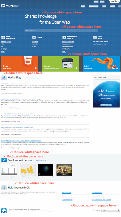
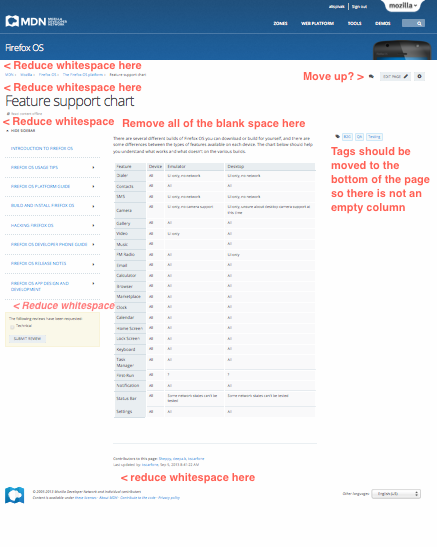
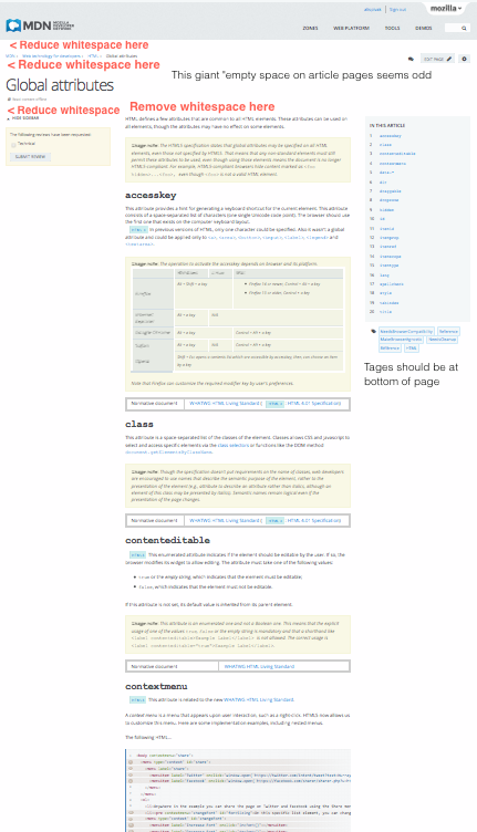
These are samples of annotated screenshots. More detail would be welcome (feel free to replace these with better examples)
Homepage
Landing Page
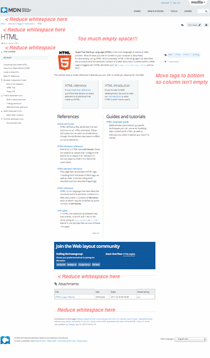
Also, reduce whitespace between definition list items (e.g., under References).
Zone Article
Article
Add notes about where we can remove white space here
Comments from Jean-Yves
There are a few people telling us that there are too much "white space". My interpretation of this is not that "there are too much white space everywhere", though there are some valuable real-estate unused, but also that it is difficult to see easily the boundaries of the article.
Re: white space, there are plenty of places where it is redundant with other means to distinguish different sections of the page; I tried to remove it from there, but keep it in place where it is used to stress the distinction. Also at some places, I change the background color, without removing whitespace, as removing them didn't bring anything to the real problem there, stressing different sections of the page.
Here is an attempt to solve this. I have labeled the different changes so that we can easily refer to them individually.
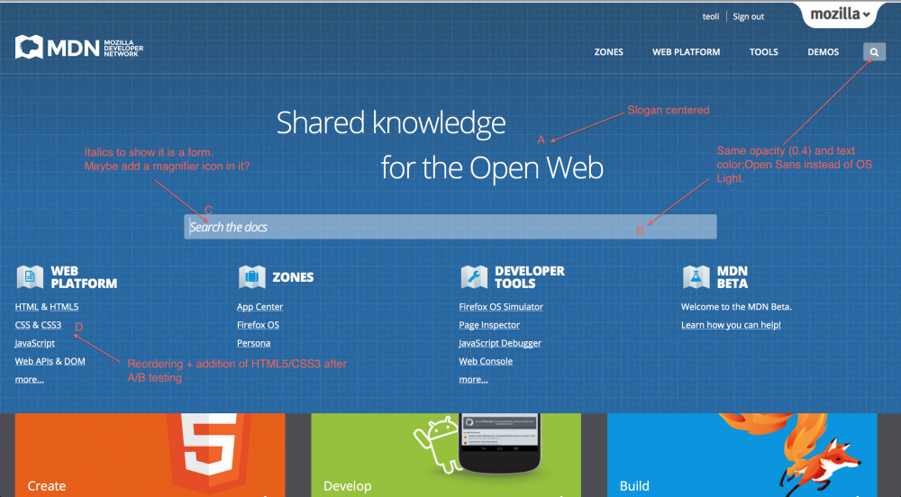
Home page, top
In this part of the Web site, I'm not annoyed by too much white space. I find this page pretty well-contained and it looks great on a tablet. I find it important that the three boxes at the bottom are not shown entirely as 1) they are bright and make the most important widget, the search in the middle, less discoverable, but also give a hint that there are more information on this page when we scroll down (this is the only visual clue for this).
A. I know that not everybody feel this as a problem, but I have the impression that the page looks better when the slogan is centered (as the search widget is)
B. I've unified the aspect of the central search widget with the one at the top. It improves a bit its accessibility and make it more discoverable.
C. Here I'm less sure. I think the italics make it more clear, but I'm afraid it isn't used in this way anywhere in the site. So maybe a magnifying loop somewhere may help marking it a little bit more.
D. I reordered the items in the logical way: HTML -> CSS -> JavaScript -> API and added the three buzzword that people are likely to look for (HTML5/CSS3/DOM). Note that A/B testing has been done by Luke around HTML5.
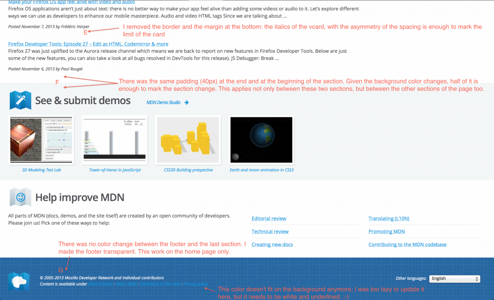
Home page, bottom
E. I removed the line between the items. I'm using the italics text, which is now a little bit closer to the article it refers to instead. I kept a clear asymmetry in the spacing before and after the italics text to make it clear it belong to the article. Articles have still a clearly delimitation without a strong clue, but I think the boundary is still very clear.
F. I divided by 2 the padding and the margin, the background color change is a strong clue by itself.
G. I didn't reduced the size of the footer, but making it transparent (and its consequence on the text color of its content) make it a stronger clue that we reached the end of the content.
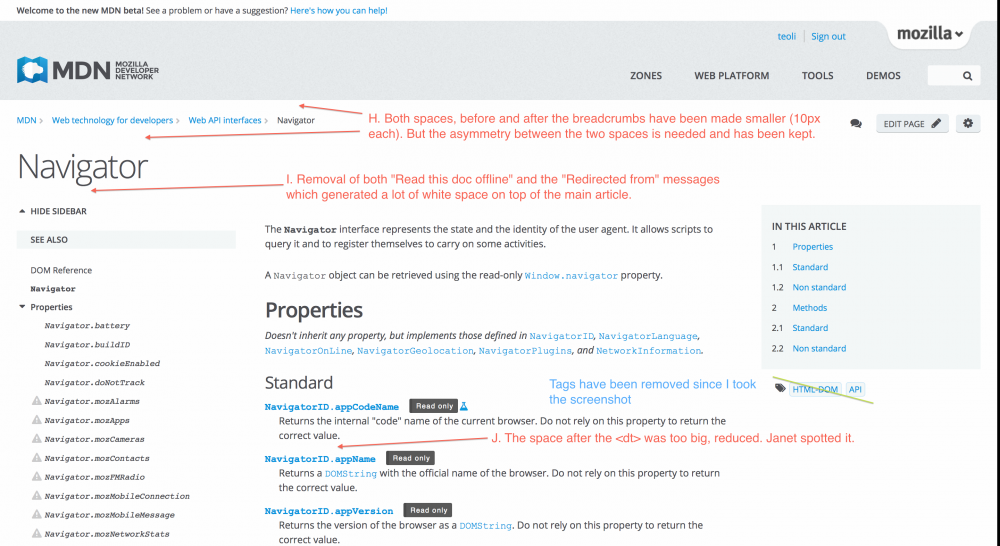
Article, with quick links, top
H. I squeezed a bit here, but I tried not to go too far away. I like very much the initial design: the spaces are giving a very slick appearance. So I removed 10px (around the elements), but not more, as it would have looked squeezed. I think it is a good compromise: preserving the initial feeling, but getting some valuable real-estate back.
I. Below Navigator the "Read the docs offline" is taking a whole lot of space *on the whole width*. It is a lot of space for something that people want only rarely and that leads to advertisement to install third party products anyway. Also in some case the completely useless "Redirected from PageName-Redirect_1" appears. So I just removed both element and the real-estate is back, without changing anything in the vertical rhythm of the page.
J. Janet pointed the large space in <dl> list. And indeed the spacing after the <dt> was a bit too big.
Article, with quick links, bottom
K. Here I was able to remove a lot of space as we have a strong visual clue (the top border line and the icons making it look like a small table). We could remove the border line if we give a specific background to the box, but I'm afraid it will be too much with modification N (background for the footer)
L. NIT: I spaced the different entries here equidistantly
M. NIT: We should align the first letters
N. Like for the home page, I made the footer clearly visible with a background (really made the footer transparent so the background of the page appear). It works well here. I didn't checked Zone pages which will have a strong blue here (or other later). Maybe we should have grey for them too?
Article, with attachments, bottom
[[File:Article_attachments_bottom.png|1000px}} O. As the table is a strong clue for a section break, I was able to remove the border, margin and padding of the next box. Note that the behaviour of this box is different when there are no attachment (see point K.) and when there are some.
Comment from Jeremie
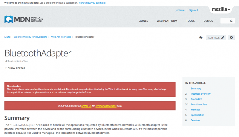
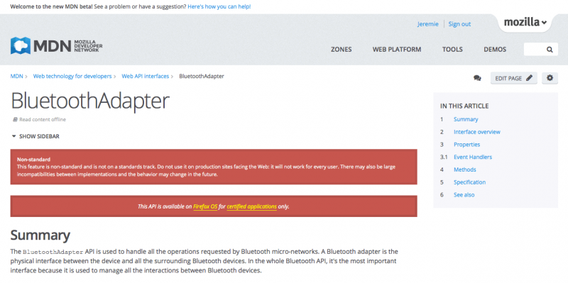
Here is a before/after example for articles:
In the second image check the line spacing at the top (seriously shrink) and the position of the TOC.
Comments by Jean-Yves about the TOC move
I'm very interested in this change. It goes in the way in making an article "in a box" and make it have a much more clearly delimitation. If we go that way, we shouldn't do this change alone, we should study where to put the title of the article when we have quicklinks.
I have no definitive opinion on this, but I think it is worth investigating.
Editing Article
Below Content
There's a lot of whitespace at the bottom of editing an article. The four minor actions (tags, revision reason, attachments, and the 'review needed' checkboxes take up a full screen height, but have excessive amounts of whitespace between each action (vertically). Kill most of it, and it'll be easier to use edit. Preferably, all of the editing options at the bottom of the page should fit in one screen along with the footer, so that if I scroll all the way down, I can see all of them. --Havvy (talk) 07:05, 26 November 2013 (PST)
