Bugzilla:Pretty
Make Bugzilla Pretty
As of Bugzilla 4.0, most of Bugzilla's major usability problems will have been addressed. There are still some rough edges, but for the most part, we've improved usability to the point where it's much less of a problem than it used to be, and we don't have to worry about it as much.
Now it's time to make Bugzilla look nice. However, we are not experts in this area. So, we are turning to you.
This is the "Make Bugzilla Pretty Contest". We are looking for designers to submit images of redesigned Bugzilla pages. If we choose your design, you will get:
- Prominent credits in the Bugzilla Release Notes, with a link to your web page.
- A link in the Bugzilla 5.0 release announcement on the bugzilla.org website.
- A case study for your web site that we can work with you to help create.
Most importantly, you will be able to say that you were the person or company that made Bugzilla pretty--a career-changing (and very marketable) accomplishment, at the least.
How To Enter
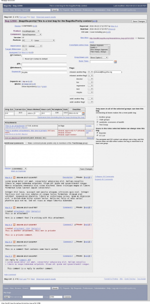
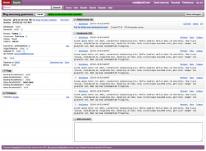
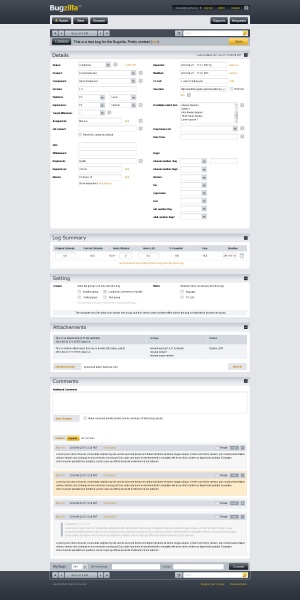
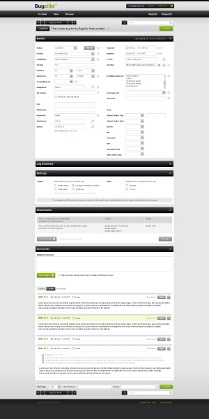
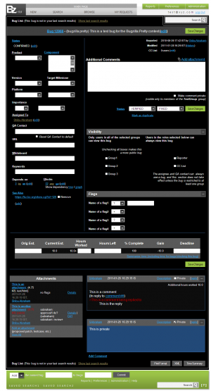
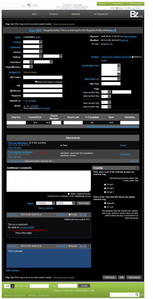
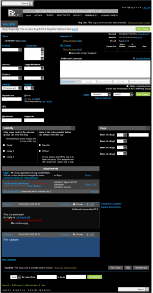
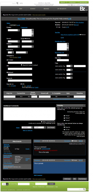
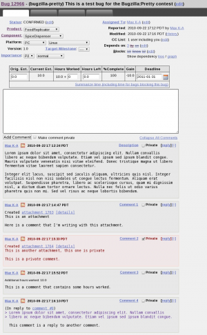
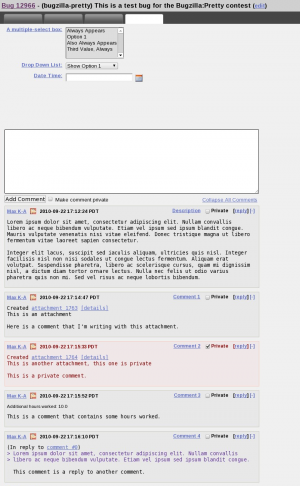
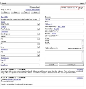
To enter, all you have to do is submit an image that is a redesign of this exact bug view page:
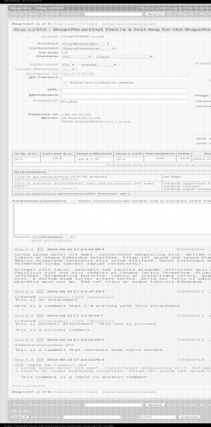
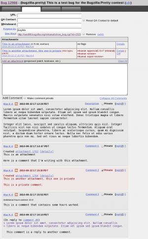
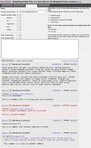
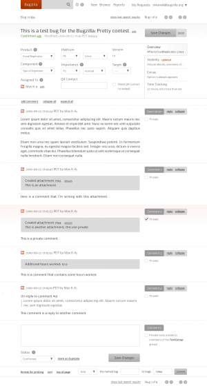
There is also an annotated version of the image that shows which pieces are optional or not shown to all users.
You don't need to submit a working HTML page, and in fact we don't want one--we just want an image.
To make your submission, just create a new sub-section of the "Entries" section below. You can see a sample entry there. If you have any trouble, you can also just email your submission to mkanat@bugzilla.org.
The deadline for submission is March 7, 2011.
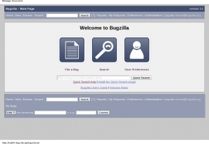
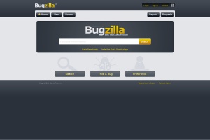
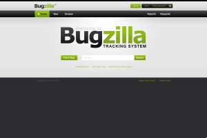
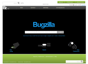
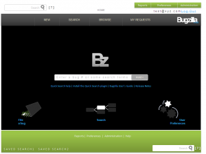
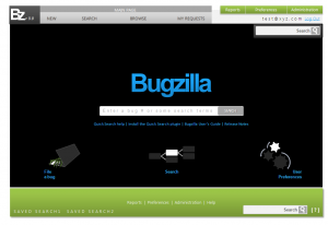
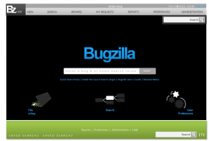
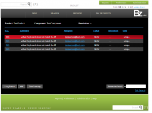
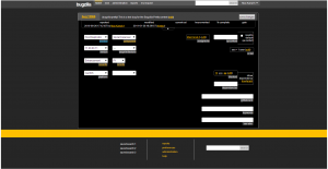
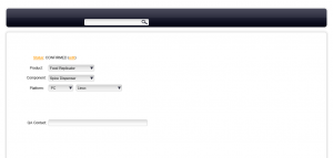
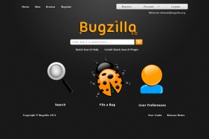
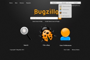
You may want to start with something simpler than the bug view page, so you can first submit a redesign of the front page, if you want. The front page looks like:
The Rules
- You must preserve all of the functionality of the current bug view page. Mostly, this means that you can't remove any field or link from the current image above.
- You may move anything on the page around to anywhere, including hiding things (though be wary of adding extra clicks to the page).
- This is not a usability contest, only a contest for how nice the resulting user interface looks. We have already done heavy usability work on Bugzilla--you are certainly welcome to improve visual usability aspects, but remember that other significant usability changes should happen as part of a separate project, not here.
- The winner's design will become the official design of Bugzilla 5.0, although we may make modifications to it as we implement it. We may choose to only use part of the winning design, and we may choose to combine multiple designs (in which case all designs used will be considered to have "won").
- The judges are the Bugzilla Reviewers, with the Bugzilla UI Lead (Guy Pyrzak) having veto power and two votes.
- We do not have to pick any of the entries. If we don't like any of the entries enough to make them our official design, then we simply won't choose any of them.
Entries
Sample Entry
Here's a little description of what I did, some of my thoughts about this design, and who I am.
Contact us using the information at http://www.everythingsolved.com/contact/.
David Elliott
Nisse Nordin
N.b. this was made quite a while ago and is by no means a finished entry (the entry do not comply to the rules), but I chose to add it anyway knowing I probably not finish it in the time frame due to lack of time. I hope it shows parts of the essence of my idea. Nuss 15:25, 27 January 2011 (PST)
Long Duong
Worked on it since late November. Majority of the design work is in place, but fine details aren't quite there yet. Enhancements can be made as you go along. If you have any questions, I can be contacted through here - http://lduong.com/contact/
Here's another design with much emphasis on details. Forms are the same from previous submission, but added some visual cues to improve recognition. This layout is also designed to adapt whatever brand you may have.
Shibu Abraham
Designers Comments: There isn't too much of a difference between the options provided, just a little rearranging and some fun while at it. Personally, for the bug page, my most preferred design is Bz_Bug3.png as I believe it puts most of the necessary input right in front of the user in a meaningful way and the screen does not look so busy when Advanced fields are hidden. I however had some concerns over future bugzilla iterations and the flexibility of this layout when new fields are added.
Inspired by the design elements incorporated by JWilde and Faaborg and facebook of course, I've added the design above. It's incomplete as the comments, flags, attachments etc, will either be the similar to what I've previously submitted or would be a variation on the what JWilde submitted, possibly something using jQuery.
Martijn Ras
The idea is to make a block with the most important options, followed by the comments. In case javascript is available all other blocks of information can be show in a series of tabs, otherwise they simple move to the bottom of the page. A side-thought while working on this was to add a button to collapse all but the topmost comment or even add a preference to do so by default.
Jonathan Wilde
This design's goals are pretty simple: to push lots of information up to the top of the page and to be lightweight.
The fields at the top of the page are compressed using a Drupal-style tabbed container. The text below the title of each tab provides a summary of the values of the fields in the tab. The sections not rendered in the mockup above are as follows:
- Visibility - The settings for which groups can view the bug.
- Extras - Flags, custom fields, whiteboard, bug blocking information, attachments.
- Time tracking - The estimate and time spent table.
The design is intended to be both visually lightweight and, after implementation, lightweight in terms of page size. The design should be easily implementable using CSS3's gradients, border-radius, text-shadow, and box-shadow for the special-effects. It will probably still look decent in browsers where these features aren't available.
The mockup is typeset in Nobile, which is available for CSS @font-face embedding. While I am fond of that typeface, Verdana can be easily substituted to cut down on loading time.
Implementation of the design entails a few background images for the faint texture on the search box and gradient backgrounds, but it can still hold together with plain CSS3 gradients instead. The gear, search, and down-triangle icons--which can't easily be reproduced with special characters in HTML can be easily sprited into a single, small image.
If you have any questions about the design, feel free to contact me. My email address is in the bottom right corners of the design note images below.
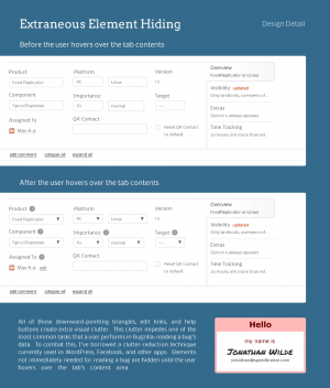
Note #1: Extraneous Element Hiding
This note shows how to simplify the design and reduce clutter even more.
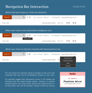
Note #2: Navigation Bar Interaction
This note shows the interactive aspects of interaction with the navigation bar.
Alex Faaborg
Design Principles:
- Clean stark lines
- Data over metadata
- Color represents value
- Spatially organized around the core journalistic questions
The theme [bracket] uses crisp, stark lines to organize content. To help quickly convey information, color is used only for the properties that have a value (in transition, positive, negative). Also, to help people quickly parse the page to answer questions, properties are spatially organized based on some of the core journalistic questions (what / who / when / how). Visually ones sees a series of colorful blocks link together, as people collaborate over time. The comment thread becomes sort of a software development DNA. The design focuses on data over metadata, and maintains a feeling of minimalism while still conveying a massive amount of information.
Example of how this design works with HTML email
Damien Whippy
Hi I haven't finished yet and am past the deadline. Here is my unfinished design anyway. Hope I posted this correctly :)
standio
standio allows for any user to customise the layout of any web page to their personal taste, save changes for future use or load a previously saved layouts. For further information goto: stand.io
Created a mock-up for this competition using Visual Studio as it serves as a good example of what we are trying to achieve.
Zeeshan Syed
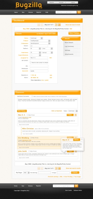
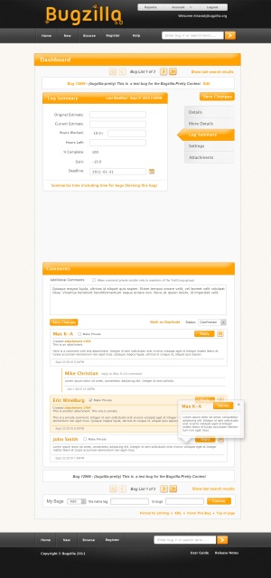
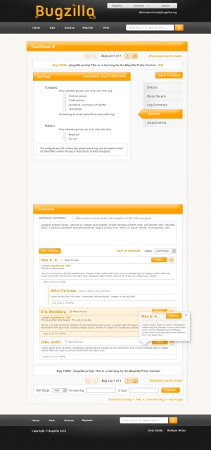
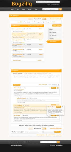
My idea was to eliminate the clutter in the old bug page; a bit too much scrolling. I accomplished this by categorizing all of the sections, and putting them into an easy to use, clean interface.
In the comment section, the user would simply click on the "Reply" button, and a message input bubble would appear. From here the user can type his or her reply and click submit to post it.
Christian Legnitto
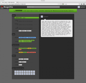
This isn't done and I'm a day late, but whatever. I'll probably end up making this into a 3rd party theme if I get time anyway...
About: This is a bastard child of twitter, github, and mozilla.com designs. I did the mockup in html and will likely post it somewhere so people can play with the interactions. The only images are the mozilla logo and the gravatar images, everything else is html and css (including the comment arrow)
Things to note:
- Large summary and background color denotes bug state so you can see at a glance what state the bug is in
- Sections on the left which can be hid or shown depending on group (like for time management)
- Uses relative times so humans don't have to count back
- Bug numbers and flags are color coded by state, so you can see at a glance what is outstanding in dependencies
- Clicking on the "pills" brings up a menu/select box to change it if you have permissions
- Users are shown with gravatars to condense space (though show full names on hover or when the design allows it). Clicking on the user div brings up a menu with actions.
Things that I didn't finish:
- The current menu items at the header and footer of bugzilla should be in the bar at the top
- If there are attachments they should be above the comments in a collapsible section
- Search brings a table view between the large top green bar and the gray heading bar, with right and left arrows in the light gray margins of the bug content
- The "Status" data should use gravatars as everywhere else does
