DXR UI Refresh
Contents
History
Once upon a time, Schalk Neethling surveyed the DXR userbase and heuristically analyzed the UI, resulting in some nifty mockups.
Later, Erik Rose came along and did another round of wireframes adding these simplifications:
- Removing the front page, which not a soul remembers the reason for and which complicates the implementation and visually destabilizes the UI when it goes "poof". (I think the UI was inspired by Google. But, unlike them, we don't have other properties to advertise, so we don't need a place to park a navbar.)
- Teaching the query syntax via live feedback from the advanced search form rather than through written instructions. It's a little more JS, but users won't have to pogo-stick back and forth to a help page.
- Making a few improvements to the multi-tree story
Then Erik mailed dev-platform and got tons of feedback about what they need from DXR and what their usage patterns are, and he realized that the textual query interface cannot be discarded; it is just too handy for custom keyword searches and search-box plugins. Erik, Schalk, Jonas, and rhelmer got together at the Santa Clara Mozilla Summit, chewed through all the dev-platform feedback and that from the DXR Innovation Fair booth, and came to the conclusions under #Plans_And_Priorities. The raw feedback is categorized and sorted under #Feedback.
Plans And Priorities
Top of the Heap
Here are the first several improvements we'll do. They either make DXR a lot better for some or a little better for all—again biased toward being able to retire MXR. I've attached the high-ROI items from #Feedback that made them bubble to the top of the list.
These will turn into filed bugs, not necessarily with a 1-to-1 correspondence.
-
Squash the last few bugs in multi-tree support, and index more trees. -
Support case-insensitivity. -
Implement a real query parser.-
(1) Docs (mostly user-facing) about how the query language is spelled and what it means -
(1) Don't require delimiters around a regex when entered into the Advanced Search Regex field -
(1) In the new UI, keep a text-only representation or some other way to be usable from custom search plugins or URL-bar keywords. -
(2) A way to semantically include double quotes in the search string: the parser shouldn't always eat them.
-
-
Quit auto-focusing the search field [as much].
Decisions
Here are some decisions the 4 people in the room (jonasf, ErikRose, rhelmer, and Schalk) agreed on at the 2013 Summit, recorded so we don't forget:
-
We'll write a search query parser that supports Python-style quoting for regexes and everything else. Use double quotes or single quotes. Each can contain the other. If you really need to go crazy, you can backslash-escape the kind of quote you're using. -
Regex search will support barewords. If you need to use a pattern that contains a space or quotes, put it in single or double quotes (see above). There's no reason to require quotes all the time, since we don't need to hang a "replace" pattern off the end a la vi. -
Advanced search and textual search should either be mutually exclusively shown (in which case we'd act like Google's advanced search, snapping back to textual mode when showing results), or we can have server-side code send back the textual equivalent to the advanced search (or the advanced equivalent to the textual search) along with the search results. That way, we don't immediately need to write a JS query parser, though we could add one later and get better latency. We'll have examples of what each advanced field takes in dimmed text in the field, demonstrating a few of the interesting features: for instance, '"main(const int, ...)"'. - Improve our filter names so they're shorter and more memorable ("subclass" vs. "derived").
-
Take the "l" out of line-number URL fragments. It looks like a 1. You can just start them with numbers.
Feedback
Here we've collected user feedback, largely from the dev-platform thread. We use the following numbers (and letter) to rank items with regard to MXR retireability. These express nothing about difficulty. Order of attack will of course take this and other factors into account.
- Must have. Everybody will be mad otherwise. Not having would be silly. MXR retirement blocker.
- Must have for >= 10% of the audience. Likely MXR blocker.
- Can wait but should get to to feel proud of the project. Might be able to turn off MXR without it.
- A useful thing for later
- A rare edge case, out of scope, or there's probably a better solution
B: Behind the scenes. A non-user-visible change that will enable other changes.
Now that we've landed the UI branch, the remaining items have migrated to the DXR Roadmap.
More Trees, More Often
-
(3) "Right now I think mxr updates from mozilla-central faster than daily. I've used that on a number of occasions to figure out what has broken my build/patch."[We now update every 6 hours.]
Search
-
(2) A way to semantically include double quotes in the search string: the parser shouldn't always eat them.
Blame/VCS integration
-
(4) Show hash or other VCS revision identifier, perhaps with the "Built 6 days ago" indicator. (easy)
UI/UX
-
(1) Don't require delimiters around a regex when entered into the Advanced Search Regex field -
(1) In the new UI, keep a text-only representation or some other way to be usable from custom search plugins or URL-bar keywords. -
(1) Optional case sensitivity -
(1) The Navigation pane, also something which shows up apparently at random, should be more predictable and should have whatever kind of disclosure control we decide upon for the Advanced Search form. -
(2) When navigating down the directory/file tree, it keeps autofocusing the search field, which is super-annoying if you're using keyboard-only navigation (with quickfind and enter) to do the traversal. -
(3) Change line-number fragment from #l5 to just #5. Lowercase Ls look like ones. (easy) -
(3) More obviously indicate when the search results are out of date. Dim them?[Added a spinner in the search field.]
Just Bugs
-
(3) Fix redundant "mozilla-central/search?tree=mozilla-central"
Initial Page
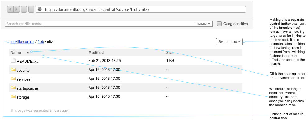
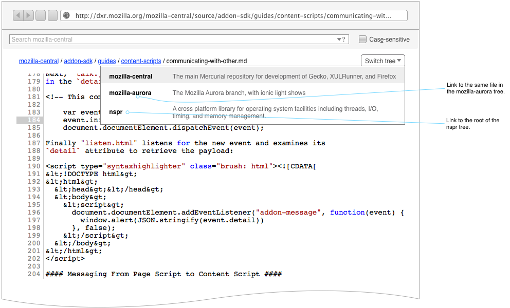
DXR's current front page goes away, replaced with a redirect to a browse view of a default tree. Breadcrumbs make clear where you are in the tree. The filters menu as pictured here is newer than the question-mark-and-down-arrow in the other figures: it provides a larger click target and, for the keen of sight, a label.
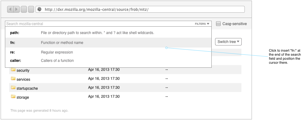
If we need further documentation on the query syntax, don't add a help link and clutter up the page. Instead, stick the help link (or embed the help itself) in the filters menu: that's what you're looking for help on anyway. You'll scroll down the list of things, they won't answer your question, and then keep scrolling and hit the help. Or, if people slam the menu closed before they hit the bottom, put the help link on the right side, spanning all the rows. See the Scraps canvas in the OmniGraffle for some presentation ideas.
Search
The search panel gets an ever-present case-sensitivity checkbox, with an accesskey so it can be toggled quickly and without leaving the keyboard.
A help pane, accessed by clicking an icon in the search field, describes the available filters. Users no longer have to check a manual (which never existed) or the source code to uncover them.
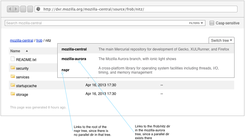
An unambiguous Switch Tree menu is available. It now occurs in most contexts throughout the site.
Open Questions
- Can we detect when a qualified name is entered and do a fully-qualified search only then? What of global symbols?
Search Within
Search Results
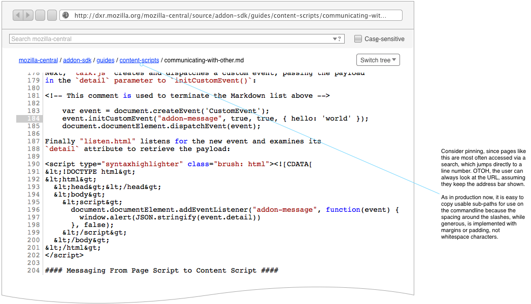
File View
Drill-Down Advanced Search: A Dead End?
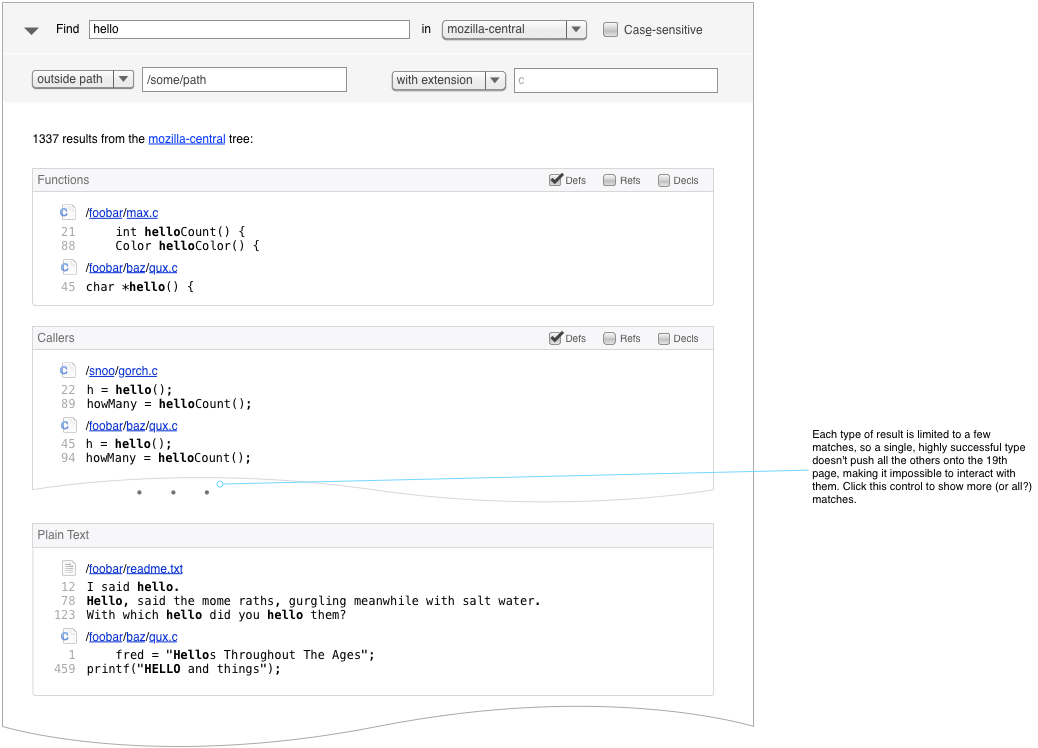
This style lets you start a search quickly, without a lot of up-front thinking about constraints or DXR syntax. Like a web search engine, it returns a mixture of matches, across various filter types, and invites you to drill down further if you don't see what you want.
Problems
- If we divide the results by filter type, we can't also divide them by extension or path, unless we hierarchalize, organizing extension subdivisions under filter-type ones. But what if we combine the interactive approach with an explicit couple of disclosable fields for truly extradimensional filters? If somebody loves that, I'll sketch it.
- Any symbolic-filter result is also going to show up in the plain-text result section. Should we de-dupe or something?
Notes
- As now, Caller or Bases or Members results would show once the query matched a full function or class name.
In the end, this style has some nice things going for it, but I think it takes too much clicking around for the tastes of our audience. Plus, it would likely be lower-performance than the current system, at least without redesigning the data storage. Finally, we're not a web search engine: our users have a pretty good idea what kind of entity they're searching for up front, and making them sort through a bunch of noise to specify that constraint (along with tolerating the mental switching inherent in dialogue) strikes me as impolite.
[Coming back to this after a few months have passed and we've had a lot more thoughts, inputs, and experiments on the subject...] The best part of the drill-down search—its thought-free searching—can be delivered by...
- An "id" filter which finds any identifier, regardless of type
- Better ranking of search results and handling of text searches: rank identifier matches first, then proceed to plain-text hits, etc.
Gallery of Unwanted Advanced-Search Widgets
Just for fun, here's a slagheap of discarded advanced-search disclosers. :-)
