Drumbeat/website/feature boxes
Drumbeat.org Front Page: Featured Project boxes
- These images appear in the Drumbeat.org front page carousel (see it in action on the staging site)
- Their job is to trumpet & make noise about featured Drumbeat projects
- They should be sexy, eye-catching, and scream out "click me!"
- Please help us make them better by suggesting alternate copy, imagery or design. Edit this page, or get in touch with Matt.
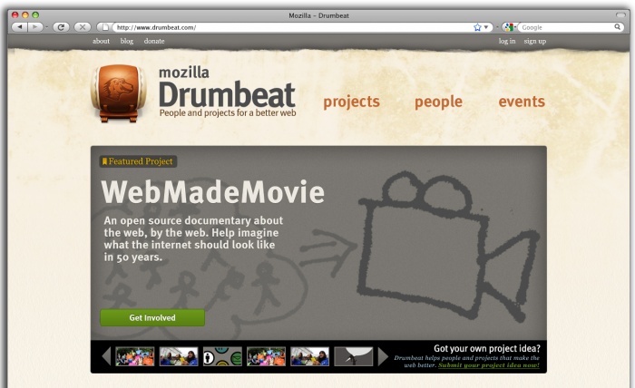
WebMadeMovie
Notes for next iteration:
- This imagery is from Mark's blog post doodle
- Brett Gaylor / Mark Surman may have additional suggestions for imagery.
- Might be nice to have something a little more kinetic and "multi-media" feeling. More like a mash-up.
Privacy icons
Notes for next iteration:
- Need to add "Get Involved" button
- Can we come up with alternate imagery? The eyes seem a little creepy
- Aza's original "making privacy policies not suck" blog post has some imagery, but its kinda technical flow-charty
- Anyone aware of other slides / assets we can borrow imagery from?
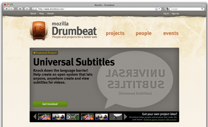
Universal Subtitles
Notes for next iteration:
- Nicholas: Do you have any suggestions for imagery / artwork?
- There may be imagery to pull out of this video demo
- Also some imagery / screen grabs in these File:Universal-subtitles-overview-slides.pdf
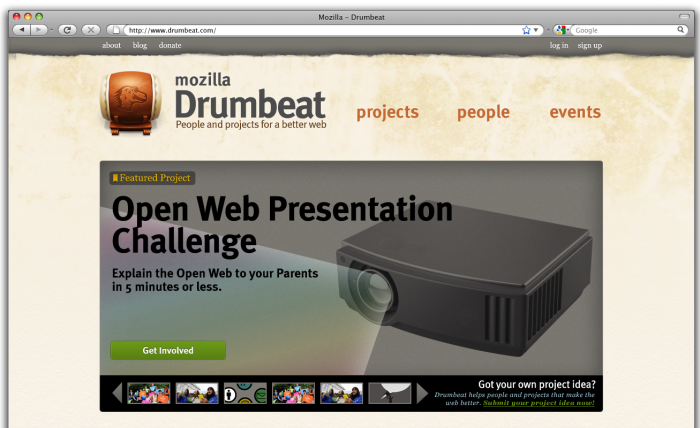
Open Web Presentation challenge
In the end this would not be a photograph; it would be illustrated to match the style of the other feature boxes
Notes for next iteration:
- Ned, love the boldness of your illustration! But I don't think it's quite the right fit. We don't want to send the message that presenters are total nerds. Kinda the opposite of that.
- Let's use some snippets from some of the open web presentations that have already been made? e.g., from Singapore. On Mark's blog here and also here
- Also potential Flickr event photos here
- Would really like to get a human face / human element into this one. To stress the real-world aspect and show off that we have a real community of presenters.
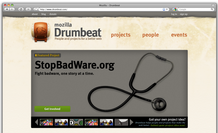
StopBadWare.org
In the end this would not be a photograph but an illustration to match the treatment of the other feature boxes.
Notes for next iteration:
- MAX: Do you have any artwork / suggestions?
- Max's slides are here
- Note that there is also a logo / wordmark for StopBadWare that we can use. First slide in Max's presentation.
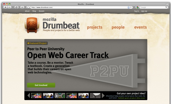
P2PU Open Web Career Track
Notes for next iteration:
- In general, would like to get more human faces into these feature foxes, to warm up the page and stress human element
- Try this image here?
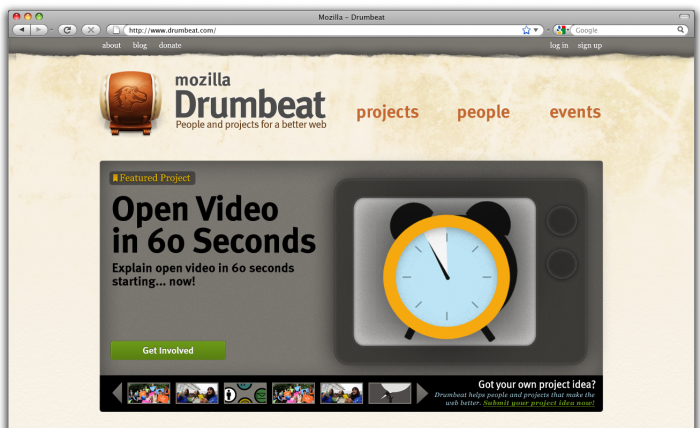
Open Video in 60 seconds
NED: First iteration still to come
Label: Featured Project
Headline: Open Video in 60 Seconds
Subhead: Explain open video in 60 seconds starting... now!
Potential imagery: ?
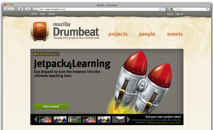
JetPack4Learning
NED: First iteration still to come
Headline: Jetpack4Learning
Subhead: Using Jetpack to turn the browser into the ultimate teaching tool.
This one is pretty rough, but I think really we should see if we can repurpose this banner to fit our feature box style: http://design-challenge.mozillalabs.com/jetpack-for-learning/index.html (also:  )
)
Maybe we can get the source file or have Jetpack's designer prepare a feature box for us.
