Extension Manager:UI Update oldversion
Contents
Background
This wiki will serve as a planning page for a redesign of the Add-ons Manager for Firefox 3.7.
The add-ons manager has been largely unchanged in Firefox, while the scope and functionality of add-ons has increased dramatically. Especially in light of new add-ons functionality and projects, such as Personas and Jetpack, the add-ons manager could be improved and redesigned in order to better assist users personalising their browsing experience.
Past work
Madhava worked on redesigning the add-ons manager in 2007, and posted his work here. He also designed much of the current add-ons manager for Firefox 3, which is largely unchanged today.
Madhava's goals for the project were similar to ours, with major goals including better integration with amo, greater task orientation, and increasing consistency in the design. His minor goals focused on information hierarchy and prominence of items, as well as giving the user more useful information about their add-ons and add-ons inventory.
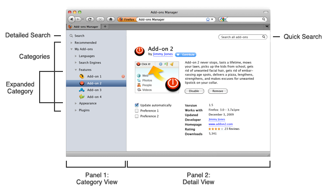
Madhava's recommended design was a two-panel window which showed add-on inventory on the left, and detailed information about a selected item on the right. He simplified the category names of add-ons into more intuitive words: features, players, languages, search engines, and themes.

Madhava's wiki describes how add-ons would easily download from within the add-ons manager through controls in the right "expanded view" panel. After installing an add-on and then restarting, the user would see the add-ons manager with the add-on they recently installed highlights, its options visible in the right panel for easy configuration.
Prioritized Goals
There are five main areas of the add-ons manager that this redesign will involve:
- 1. Maintaining and Configuring
- Allow users to quickly locate the add-on they want to inspect
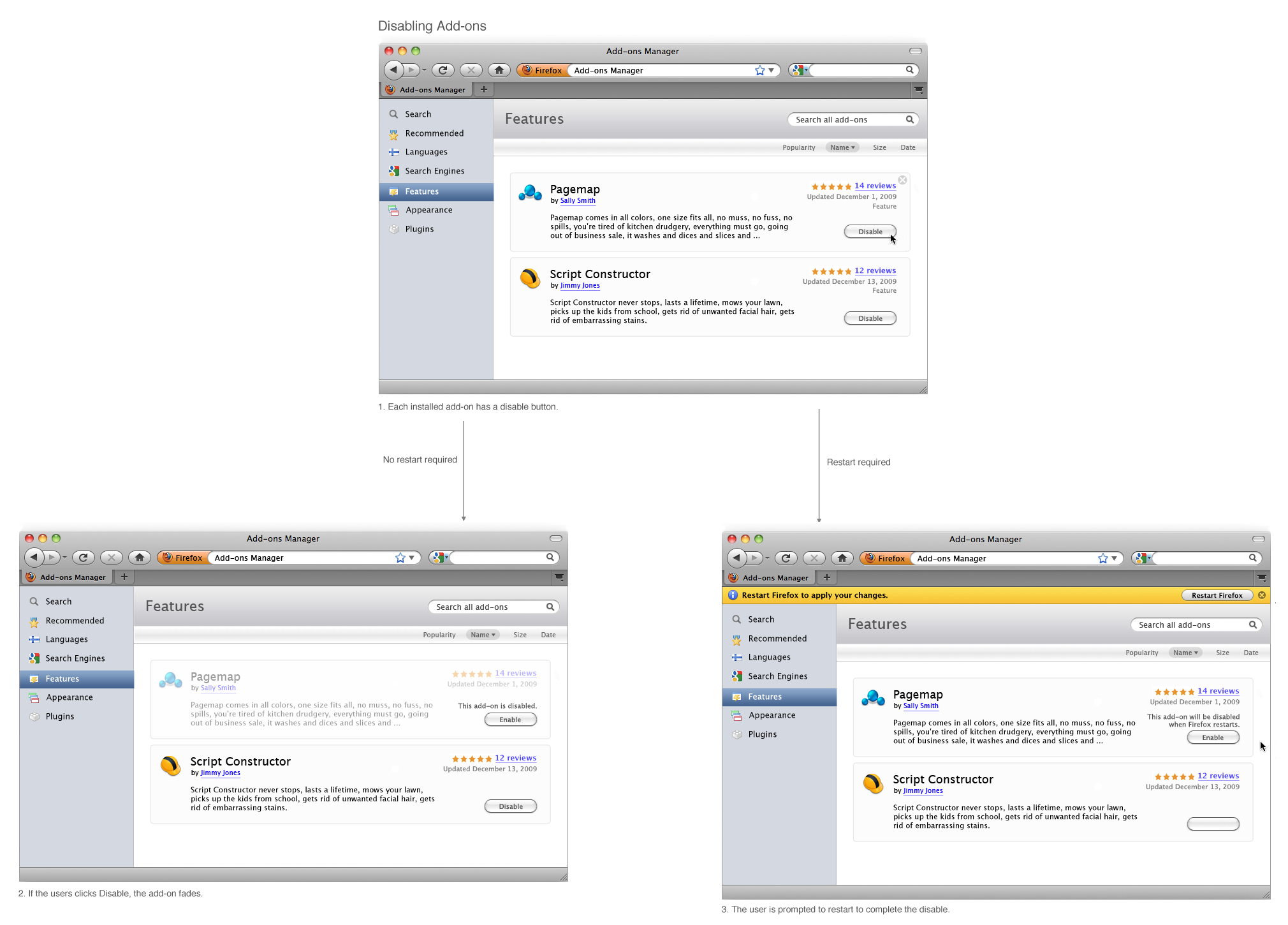
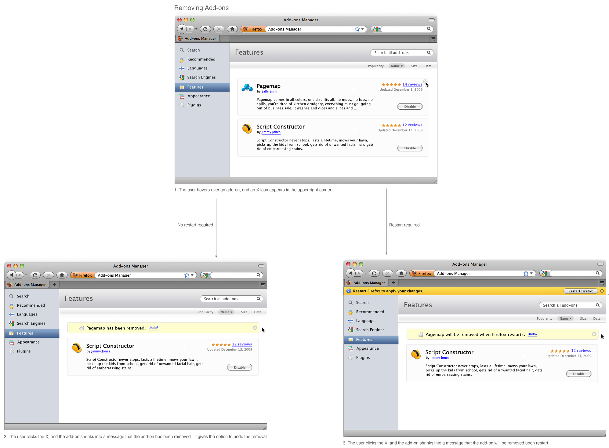
- Provide simple, usable controls for basic add-on operations such as disabling and uninstalling
- Allow new forms of add-ons, such as jetpacks and personas, to be maintained and configured easily alongside traditional add-ons
- (at best) Provide users with a consistent place to go for a particular add-on's preferences, or (at worst) provide users with a consistent place to go to launch a particular add-on's preferences
- User questions addressed:
- "What add-ons do I have installed?"
- "Do I have Foxmarks installed?"
- "How do I disable Flash?"
- 2. Updating
- Indicate to the user that updates are available without blocking the startup of Firefox
- Allow the user to choose silent updates if they prefer, and for those updates to happen without interfering with browsing
- User questions addressed:
- "What add-ons have an update available?"
- "Is there an update available for Flash?"
- "How do I keep my add-ons up-to-date automatically without getting notices?"
- "Which add-on was updated recently and has stopped Firefox from working correctly?"
- "What updates have been made to add-ons and what was in those updates?"
- 3. Installing
- Streamlining the install process to as few steps as possible
- Providing the user with a clear indication of the process and what actions are needed, especially in the face of possibly differing install experiences per add-on (restart required vs not)
- User questions addressed:
- "How do I install this add-on?"
- "What is the next step to install this add-on?"
- "Did my add-ons install successfully?"
- 4. Discovering
- Providing a compelling first run experience to new add-ons users, including showing what add-ons can do in a way that makes sense to non-technical users
- Allowing users to search for add-ons from within the Add-ons manager, only requiring a visit to AMO when greater community involvement or information is sought
- User questions addressed:
- "What are add-ons?"
- "Why would I want to install an add-on?"
- "What add-ons can help me with my 5000 tabs?"
- 5. Troubleshooting
- (possibly) Provide a way to rank add-ons by size, RAM, etc to see if disabling one would give a significant performance boost
- (possibly) Use some heuristics to determine if a particular add-on is causing problems
- Give clear communication and instructions if there is a security problem with an add-on
- User questions addressed:
- "Is an add-on causing Firefox to crash?"
- "Are there any security vulnerabilities in my installed add-ons?"
While a cohesive redesign will likely touch all of these areas, the first iteration of the add-ons manager redesign will consider tiers of importance in where to direct efforts and design.
|
Tier One: |
Tier Two: |
Tier Three: |
| 1. Maintaining and Configuring | 2. Updating | 4. Discovering |
| |
3. Installing | 5. Troubleshooting |
The goal of this project is to substantially improve the basic functionality of the Add-ons Manager (tier one), turn current "interruption" areas into integrated parts of the browser (tier two), and provided added functionality that will benefit add-ons users (tier three).
A successful but less ambitious redesign in the first stage would substantially improve basic functionality and fix current problems, but would leave added feature enhancements to future versions.
The minimum level of success would be to substantially improve the basic functionality of the Add-ons Manager, while developing a plan of action for fixing current problems and adding new features.
Current Add-ons Manager
Positives
- Pre-populated Featured Add-ons
- The current design's constant inclusion of five featured add-ons provides a benefit especially to new users, by giving them both an idea of what add-ons can do and possibly suggesting one he is interested in downloading. This also provides a huge benefit to the developers whose add-ons are featured
- AMO-wide Search
- The add-ons manager allows users to search through all add-ons on AMO, get search results back within the add-ons manager, and install them - all without visiting AMO. This is excellent functionality for people who know exactly what add-on they want to install. Unfortunately, because this feature is not very discoverable, many experienced users are not aware it exists.
Negatives
- Category confusion
- Add-ons are currently categorized by terms such as "extensions" and "add-ons," which are similar to each other and not necessarily meaningful to users. While some separation of add-ons by category is probably necessary, expanding the correct category is currently the only way to find a desired add-on. This leads to the common current user behavior of clicking categories until he finds the add-on he is looking for, rather than finding it obvious where the desired add-on will be.
- Finding an add-on is difficult
- related to the above, currently category selection and then scanning is the only way to locate a particular add-on. In many cases, the user knows exactly the name of the add-on he wants to find, but not what category it is in. Compounding this problem, users sometimes go to the Preferences page first, which handle similar issues as many add-ons.
- Little room for add-on information
- Add-ons are currently displayed in one line each, with a one sentence description. Potentially useful information such as the author, size, or options for an add-on are not displayed.
- Redundancy, especially in installing updates
- Currently the category pages say if updates are available, and a separate Updates tab does as well. A "Find Updates" button on category pages links to the Updates page.
- Inconsistency
- The current add-ons manager looks very much unlike other parts of Firefox's UI. The user encounters interactions in the add-ons manager that they do not see anywhere else in Firefox, leading to the user taking longer to complete a task.
Redesign Themes
Distraction and Interruption
A large theme in the add-ons redesign will be the attention of the user - especially when to insist on it and to what degree.
A common criticism of the current add-ons manager design is that it demands the attention of the user too often, and especially when the user is engaged in another task. For instance, when the user launches Firefox, he often is presented with an add-ons manager window announcing that updates are available and suggesting that the user download them at that moment. Since the user is launching Firefox, it's reasonable to assume he has a task in mind to perform and that his intention is unlikely to be installing add-on updates. The appearance of the add-ons manager window over the main Firefox content area presents a break in the users' workflow by forcing him to take an action before he can begin the task he intended.
The balance of when the add-ons manager should be prominent and when it should recede from focus will be a challenging one to strike. The management of add-ons itself can be thought of as a "background" task, removed from everyday browsing, much as the Preference menu should be. Aside from some maintenance and configuration of a user's add-ons, the user should expect add-ons to perform their intended function without requiring much care or maintenance on their part.
As with bookmarks, preferences, and many other parts of Firefox, some users will want to optimize and micromanage their add-ons manager to tailor-make the best browsing experience for them. Others will want to install a few add-ons and never have to deal with the add-ons manager ever again. A successful add-ons manager redesign will allow an add-ons user to be on either side and have a good user experience. The current add-ons manager could be said to cater to the micromanaging add-ons user: it often alerts users of new updates and provides many configuration options for individual add-ons. Ideally, if a user wants updates for a particular trusted add-on to be installed silently and automatically, he should have this option.
Some of the add-ons manager functions should not disrupt the user unless summoned, other should give notifications subtly, while others need to divert the attention of the user to them.
Functions that should not disrupt the user:
- The appearance of the add-ons manager itself. While there may be links to the add-ons manager within the browser (for instance on the Home Tab), the user should not see the add-ons manager unless they've summoned it.
Functions that should give notifications subtly:
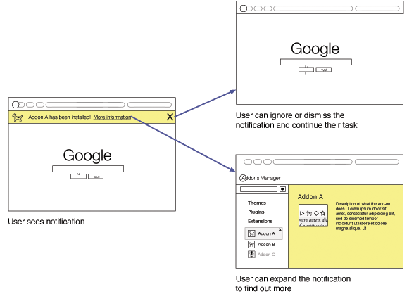
- When updates are available. The availability of updates should not get in the way of user's browsing experience or present obstructions that force the user to act. The user should be given the ability to make updates for a particular add-on or all add-ons install automatically.
Functions that should actively seek the user's attention:
- Steps in the add-ons installation process. Each step should actively focus the user's attention on the next step. Anyone should be able to install an add-on after four shots of whisky.
- Confirmation that a user has chosen to uninstall an add-on, as well as any warning about preferences that will be lost as a result.
- Notification that an add-on has been automatically disabled or uninstalled because of a security vulnerability, as well as a link to more information about the specific case.
One way current applications handle the tasks which should give notifications subtly is by providing a small cue which, if the user choose to act on it, launches into a dedicated task related to the notice. This way, once a user sees the cue, they can choose to ignore it or switch tasks to find out more about the cue. In the add-ons manager redesign, this would be the transition from a subtle notification to the add-ons manager itself. The balance to strike is to not make the cue too distracting for users who want to ignore it, but to also make it noticeable enough for users who wish to act on it.
Focus on Tasks rather than Add-ons
Add-ons are one of the biggest benefits of using Firefox over other browsers. While other browsers are beginning to offer add-ons and develop communities around them, none of them yet come close to approaching the diversity and scale of Mozilla's add-ons community. However, only about 30% of Firefox users currently have any add-ons installed.
While getting every Firefox user to install add-ons is not the goal, making them more accessible to more users would benefit both users and developers. A common criticism of the current add-ons manager is that it is easy to find an add-on by name, but less so by functionality. This redesign will seek ways for users to find add-ons based on how they browse or functionality they want rather than only by add-on type.
Wireframes
Storing/Managing Add-ons
Two-Panel System
The default Add-ons Manager view will be in a two-panel basic hierarchy view within the content area of the browser. Add-on categories, search, past searches, and recommended add-ons will be in the left panel, and expanded view will be on the right. This increasingly common format is a familiar layout in operating systems and applications, and follows a larger planned design plan for Firefox's auxiliary controls.
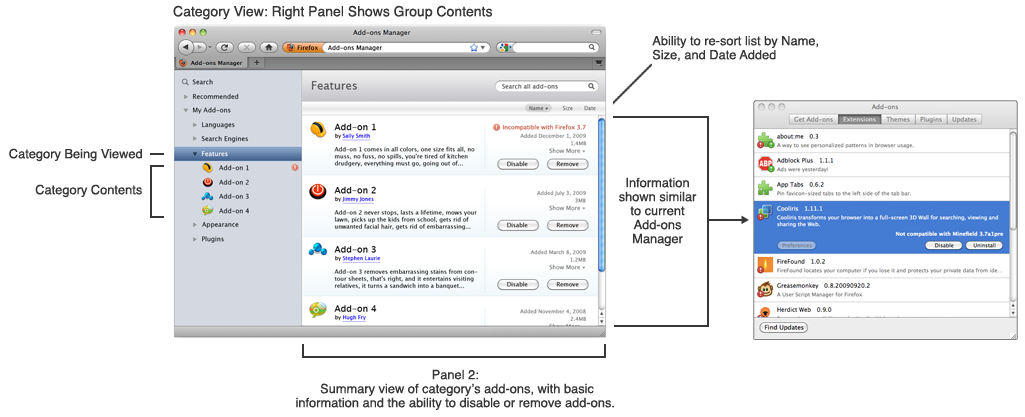
For viewing installed add-ons, the Detail View in the right panel will either show the contents of a category or an individual add-on, depending on which is selected. Viewing the contents of a category will show a summary view of the add-ons, with basic information and the ability to disable or remove an add-on. This gives the user the ability to quickly browse the contents of a category with more information than the list in the left panel provides. The information shown will be similar to what's in the current add-ons manager, but will allow for sorting by categories such as size and date added.
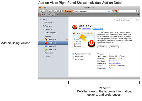
When the user selects an individual add-on, the right panel displays the add-on's information, options, preferences, and the ability to contribute to its developers.
Searching for and Installing Add-ons
Disabling Add-ons
= Removing Add-ons
Team
- Sprint lead
- Boriss
- Development
- Unfocused, Mossop
- AMO liaison
- Nick and Fligtar
- Other contacts
- Jetpack:
- Atul, Aza
- Personas:
- Suneel Gupta, Amy Zehren(?)
- Firebug:
- Firebug team is currently designing a new install/update solution for Firebug extensions. Let me know if anyone is interested in discussing it. jjb
Planning
Target Release
Firefox 3.7
Status
This project is currently in the planning and early design phase. The participants in the Sprint are gathering requirements and meeting with Add-ons, Jetpack, and Personas developers and planners to determine what changes need to be made to the add-ons manager to reflect the longterm goals of Firefox.
Mossop is currently rewriting the whole motherfucking API.
Resources
Past work
- 3/2006: Extension Manager UI Comments from developers on redesign ideas
- 7/2007: Firefox:Add-ons Manager UI: Madhava's two-panel proposed design
- 12/2007 Add-ons Manager UI interim rev2 Scaled back version of above, one panel design, very similar to current
Posts
- 12/11/2009: Redesigning Firefox’s Add-ons Manager
- Automatic Updates I totally agree with the automatic updates. The FInd Updates feature is a geek thing. There could be an option merged with “automatically update firefox”. But be careful with add-ons not hosted on AMO, this could lead to serious security issues if the domain name was bought by another person. Plus, sometimes updates remove or break features. Normal people are not “update addicted”, they just want things that work. It would be interesting to make the difference between minor and major updates, or better, let extensions developpers say in the update feed “this is a feature and/or bugfix and/or security update”. Then, one could decide “This extension works, I never want to update it” or “Only where bugfixes and security issues are available”, and so on. Undo an update is another interesting point. - Snap
- I’d really love the add-ons manager UI to expose which add-ons are not successfully checking for updates, as I have a fair few installed from external sites. - Takoosh
- At Tool/Add-ons, you’re very much on the right track. That’s the logical place for new users to go and we need more TLC. What’s the difference among the four headings? In “Get…” if FireShot is an Extension why is it under “Get Add-ons”? If not recommended, why five stars? Got room for the “Browse All…” and “Browse All Recommended…” with “Recommended” above the other one and BOTH links together at the top or bottom? None of the ones that popped up for me were recommended, so why do they pop-up? “Recommended” scrolls off the lower page and some will miss it.
- If I do a search for “color tabs,” should be search results be ordered on “Recommended” then alpha with other not recommended in alpha below recommended?
- In Plugins, what is “MetaStream 3 Plugin 3.2.2.26 MetaStream 3 Plugin r4,” what did I do to add it, and do I dare disable it? Firefox 3.6 may add a feature to monitor whether plugins are current, and perhaps that should be able to be checked from here.
- Flag add-ons not hosted on AMO. See: http://adblockplus.org/blog/extension-conflicts-2009-edition. These don’t go through the review process and should be seen as higher risk.
- Integrate Collections (RE: the Add-on Collector) by default. https://add-ons.mozilla.org/en-US/firefox/add-on/11950. Collections are huge.
- I would’ve actually consider of merging with AMO, to have a sort of hybrid like it’s done by http://www.feedly.com/
- My extension, Stylish, puts a new panel into the Add-ons manager. It was a pain to make this work and it's still kind of buggy. An easier way for me to integrate my items into the manager would be welcome.
- 03/12/2009: Relocating Firefox’s Add-ons Manager
- Given a sufficiently large canvas available to tab contents, as presumed and required by point 1, the current Add-ons Manager requires obscuring no more of the browser chrome than a tabbed one. However, a tabbed one does require that its tab be focused, which implies that other Web content tabs are not. This presents a problem if the add-on being managed is making alterations in the canvas of Web content, while there exists no benefit of unobscured browser chrome over the current Add-ons Manager. The net effect is an objective loss.
- tabs that belong to the chrome could be differentiated from web tabs. This could be a different background, different font, different favicon (or none at all), or some other way of differentiating the appearance. If web tabs looked like Stephen Horlander’s ‘Page Integrated Tabs’ mock-up, differentiating between them and the chrome would be even easier, as chrome tabs would retain the look of the rest of the chrome.
- The location bar could also be differentiated. The identity button could be made to look more chrome-like, or eliminated altogether. The URL could be replaced with a more readable breadcrumb trail (like Alex Faaborg’s ‘Personal URL’). Better yet, when Firefox 4 comes around, the whole Navigation toolbar could be eliminated altogether—a behaviour reserved for the browser and applications that are given permission.
- I think your mockup is way to complicated. I definitely like the idea of putting the manager in a tab, but you should not put more information there. Information like Compatibility, “updated” and so on should only be shown if the user explicitly clicks on it. I would suggest to show a list of all add-ons with activated/deactivated status by default like in the old dialog.
The rest is not interesting for most of the users and just raises the barrier for users by showing them a clutter interface they have to “learn
- let there be an “Overview”-mode/feature e.g. by selecting the “My Add-ons” in the sidebar shown in your mock-up, for a fast look on what’s there, which one should be updated, which one is installed, but disabled, etc -> maybe even similar to fenec or “Mr.Tech Toolkit” – compact-mode (I’d prefer fenec UI)
Bugs
- 256509 install without restart
