Firefox/Projects/3.7 and 4.0 Theme and UI Revamp/Visually Appealing Windows Applications
From MozillaWiki
Visually Appealing Windows Applications
This is sometimes a hard area to explore. Windows applications are not known for their visual design savvy. There are however a few applications that rather nicely designed (visually if not functionally).
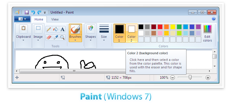
- Paint (Windows 7): A shocking selection perhaps. Relative merits of the Ribbon UI aside, Paint for Windows 7 does look good visually. There are few stand out elements:
- Tabs - Simple, smooth and they flow into the rest of the Ribbon.
- Smooth Gradient - There is a nice smooth unifying gradient from the top of the tab to the bottom of the Ribbon UI.
- Small Icons on Buttons - The smaller icons for "Tools" are nicely positioned in buttons that have a tactile feel.
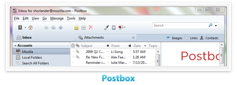
- Postbox: Even though Postbox elected to keep the Menu Bar, it minimized the visual impact of the menu bar by having the line separator fade out. Also notable is that as a cross platform application it fits in with the native look and feel of both OS X and Windows.
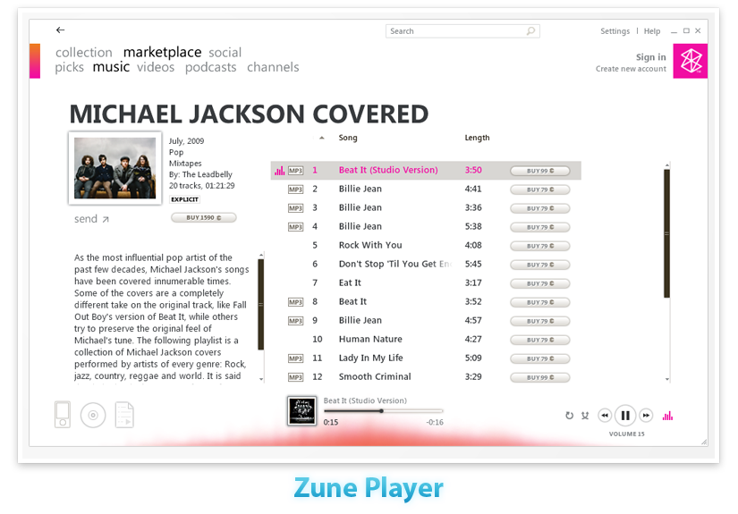
- Zune Player: The word "Zune" doesn't really evoke feelings of good design (industrial or visual). Yet the Zune Player application is quite attractive. Decidedly not native. It has a minimalist and streamlined look that fades into the background. The buttons look physical and pressable, but still soft. It has a simple back arrow, clear song controls and even a very nice subtle touch of a red glow on the bottom of the screen that gently pulses to the music.


