Firefox/Projects/Animation priorities
Note: Finished - became two child-sprints: Tab & Menu item animation and Find on Page improvements
Contents
Summary
The purpose of this sprint is to design and develop three key areas that we feel Firefox would benefit from animation:
- Tab tearoff
- Text search on page
- Movement of toolbar items within rows (UI elements, bookmarks, tabs)
Introduction
Animation in the browser is a tool, but not a goal unto itself. Wherever animation is used, it should be with a purpose and benefit to the user.
Like many web technologies, animation is a useful but easily abused tool. The early web and the dawn of the .gif format saw animation heinously overused websites, with blinking, spinning, and scrolling animations thrown in because they "looked cool." As the web stopped foaming at the mouth and begin the transition to what could be done to what should be done, animation became used more successfully as a tool. Some ways in which animation can be useful include:
- Making browsing feel faster
- Adding visual affordances to makes tasks more understandable
- Making the browser and tasks more visually appealing
To bring animation to Firefox, we decided to first focus on three key areas that we felt would give users the most benefit by adding animation. Out of many possibilities, we looked for places where animation would make interactions feel faster and help users perform tasks.
Next Steps
To implement these three areas of animation, first they should be divided into two sprints: one longer-term sprint for tab tearoff and tab movement, and one shorter-term sprint for find-on-page. The reason for this is that tab tearoff and tab movement both involve backend core development (roc & crew), while find-on-page can be done front-end (possibly firefox team). Though its contingent on who has free cycles, both sprints can be developed simultaneously.
Phase 1 (~1.5 - 2 weeks)
- Set up two separate sprints: tearoff and tab movement
- Have initial meeting with developers to outline what skills and time are needed to implement them
- (talk to Vlad first half of week 1)
- Find developers with free cycles and interest in the sprints (zpao?)
- Blog about the beginning of implementation (srsly)
- Tightening up wireframes in preparation for implementation
Phase 2 (~2 weeks)
- Detailed implementation plan begun based on meetings during phase 1
- Bugs created to track progress & are assigned
- Informal user testing to optimize for speed, transitions, magnitized locking distance, etc
- Wireframes finalized into mockups
Phase 3 (~.5 weeks)
- Patches written
- Final tweaks & testing, reviews & landing
Tab tearoff
Summary
Currently, tearing off tabs is functional... but that's it. There's little affordance to tell the user what is going on - if they've grabbed a tab, where it's targetted, and what will happen when they let go.
All of the browsers more or less treat tabs as real world objects. We describe them with real-world metaphors, like "dragging" and "tearing." And, we manipulate them like real-world objects we can, by rearranging and moving them. Thus, animation could help to reinforce this real-world metaphor while providing a visual affordance for how the tab is being manipulated.
Competitive Analysis
Design
Wireframes
Mockups
Text search on page
Summary
Currently, finding text on a page in Firefox can be challenging. The text is highlighted as the user types matching input, but this slow color change can be difficult to detect - especially when the highlight is similar to the background color. A subtle animation as the user types input could direct the user's attention to the word they are trying to find.
Competitive Analysis
Design
Wireframes
Mockups
Movement of toolbar items within rows (UI elements, bookmarks, tabs)
Summary
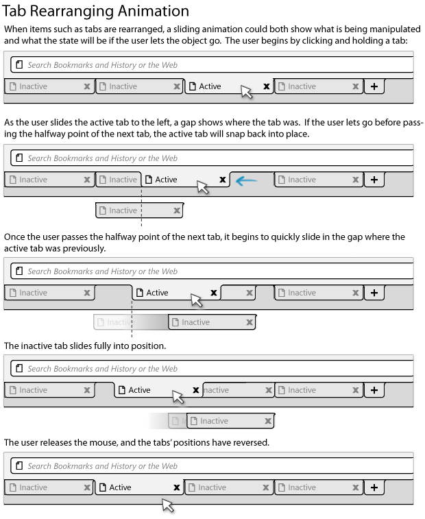
The first area we feel could benefit from animation is the movement of toolbar items within their rows on the Firefox chrome. This includes button like Home and Reload, the bookmark bar, and tabs. Currently, these items can all be shifted and reordered, but little visual indication is given. For tabs, only a thin strip shows where a dragged tab will be dropped.
By adding animation to the process of rearranging items, not only will Firefox feel more lightweight and adaptable, but it will be more visually clear what the user is manipulating and how the UI will be changed by letting go. For instance, animations of tabs being arranged is essentially live preview of tab rearrangement: if a tab is slid to the right and an animation shows it doing so, releasing it only makes permanent what is being shown.
Competitive Analysis
Design
Wireframes
Mockups
By adding animation to the process of rearranging items, not only will Firefox feel more lightweight and adaptable, but it will be more visually clear what the user is manipulating and how the UI will be changed by letting go. For instance, animations of tabs being arranged is essentially live preview of tab rearrangement: if a tab is slid to the right and an animation shows it doing so, releasing it only makes permanent what is being shown. This is similar to the tab animation motion currently in Safari and Chrome.
Because tab tearoff and tab rearrangement would utilize similar mouse movement, some thresholds should be added to prevent users from accidentally performing the wrong action. A “soft snap” could make tabs within a region of the tab bar slide, and falling outside that region causes them to tear off.
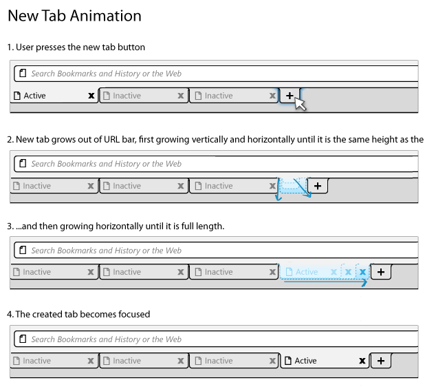
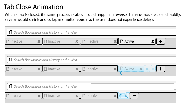
Slight animation could also give newly created tabs the feeling of organic growth into the browser.


