Firefox:Add-ons Manager UI
Scaled-back version for Firefox 3: Firefox:Add-ons_Manager_UI_interim_rev2
Contents
Add-ons Manager
Goals of the redesign
- Major
- Greater task orientation
- Greater ability to start the process of finding and getting add-ons from within the browser proper
- more integration and/or sharing of features with AMO (ie. ratings, descriptions, etc.)
- decrease (or eliminate) tabs that are sometimes there and sometimes not; a corollary - decrease the number of times the same add-on shows up in more than one tab/space (ie - a near-complete install in one place and a not-quite-yet selectable add-on in another)
- Minor
- ability to see more add-ons at a glance
- increase prominence of the user-actions available for each add-on
- more prominence to details about addons without digging into prefs
- Moving permanent restart button out of the lower-right-hand-corner (where it looks like an "OK/Cancel" button) and to a place where it's clearly the next step after installing an add-on
Current Design (2007-08-21)
The following mockups all make use of icons from the famfamfam Silk icon set: http://www.famfamfam.com/lab/icons/silk/
Newly Open Manager


This mockups depicts the case where a user who already has a few add-ons has just opened the Add-ons Manager. A maximum of three recommended add-ons are shown in the "Recommended" section -- users can install or dismiss these individually (using the in-line icons or buttons in the preview pane), or can dismiss the whole section.
If the user did not yet have any add-ons (though even a new user will likely have a few "Players" (plugins)) the categories in "Your Add-ons" would be empty. We should probably offer some visual indication that a category is empty (grey out the closed twisty control, perhaps).
Some category translation:
- Features = Extensions
- Players = Plugins
- Languages = Languages/Dictionaries (this deserves more discussion)
- Search Engines = as before
- Themes = as before
Searching for Add-ons


In this mockup, a user has decided to search for an add-on. He or she does so by means of the "Search All Add-ons" field and hitting enter -- the space below, previously occupied by the recommended list, becomes the search results space. It expands to the size of the coming content (5 lines worth of search results) and indicates that a search is in progress.
Focus would not actually jump to the first installed add-on, but I've shown it that way in the mockup in order to show the preview pane content for an installed add-on. The "Rate it" widget allows the user, unsurprisingly, to rate the add-on. "More Details" brings up the add-on's details page on AMO (all hyperlinks in the UI launch webpages whereas all buttons/icons launch Firefox UI). The buttons all correspond to functions currently available, though sometimes hidden, in the Fx2 Add-ons Manager.
Search Results


Here, a search having returned the top five results from AMO, the user can review the list. The preview pane contains the same information as it did for recommended add-ons. The user can install any of them by clicking on an inline install button or from the button in the preview pane. The full set of search results can be launched in a browser window by clicking on the "See all results" link. When the user is done with the search results, he or she can click the x in the search field or the close button at the bottom right of the result set.
[ Note: if the changes to put small "Get a related add-on" buttons throughout the UI (like the "Get Bookmarks Add-ons" one in the bookmarks sidebar) go through, this space is where we should put the resulting list. The search field could list the term/category we're filtering on so that we would be transparent about how the list is created. ]
Installing an Add-on


Here, the user has chosen to install one of the add-ons returned in by the search. The add-on in question leaves the list of search results, and shows up in its appropriate location in the "Your Add-ons" list with an inline installation-activity indicator and cancel button. More detail about the installation progress is shown in the preview pane (in practice, add-ons install fast enough that these won't be on the screen for very long).
This process is the same for recommended add-ons. Installs initiated from the web are never present in the upper list, of course -- they simply show up, installing, in the list of "Your Add-ons."
Install Complete - restart required


When the add-on's installation is complete, it is shown as visibly disabled [probably the same visual indication as for fully installed but disabled add-ons] and with some inline indication that a restart is required (final form TBD). There is also an inline button to remove the add-on (also in the preview pane) -- this is all that can be done to the add-on until a restart is complete.
On completion of the installation, a notification bar slides in at the bottom of the list offering the user a way to complete the installation.
[ note: this notification bar button takes the place of the permanent restart button in the add-ons manager. For cases where the user dismisses this bar without restarting, we should add a "Restart Firefox" item to the File menu. ]
Post-restart - single new add-on


Post-restart, Firefox launches and the Add-ons Manager comes up on top. In the case where a user had installed only one new add-on, that new add-on is selected (we pre-scroll down to it) and it's options are therefore all visible in the preview pane. The user can configure if he/she wants to, and then closes the manager. The most important reason to have the manager up with the add-on selected is simply to give feedback that the restart actually accomplished something. For the new user, it also helps by demonstrating where they have to go in the future to configure add-ons.
In this case, because the user never dismissed the search results, they are still there post-restart, minus the one that was installed.
Post-restart - multiple new add-ons


In the case where multiple add-on installs have been completed by the restart, the manager comes up with the first of the new add-ons selected. All the other new add-ons are highlighted/glowing (conceptually, the first one is, too, though you'd never see it because the selection highlighting takes precedence) and do so until they are selected or the manager closed. In addition a notification bar comes up to let the user know how many new add-ons are installed.
Older Redesign Versions
- 2007-07-23 redesign: Earlier version of this document
Install from Web
Current Task Flow: Install from AMO (and whitelist)
- User clicks on an AMO "Install Now" button
- The modal confirmation dialog appears
- Issues: The dialog is (a) too intimidating, (b) verbose, (c) confusing
- Add-ons Manager is launched in the temporary "Installation" view
- Progress indication goes by (usually too fast to see)
- On completion, the text changes to "Restart to complete the installation"
- User clicks the "Restart Firefox" button or goes on with his/her life
- eventually, the user restarts
- Issues: the position of the permanent "Restart Firefox" button makes it seem like it must be pressed to close the dialog (as with an OK or Cancel button)
- Firefox comes back up.
- Issues: If the installed add-ons pop up prefs panes, they are there; if not, there's no indication that anything has happened, successfully or otherwise
Current Task Flow: Install from Elsewhere
0. User clicks on something to start an install or the page just pushes it
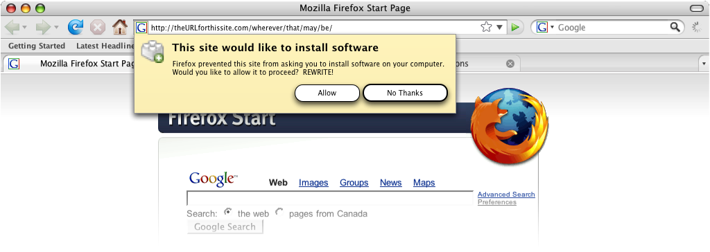
- Notification bar appears to let the user know that Firefox has stopped the page from installing something. The users can click the button ("Edit Options") or dismiss the notification bar
- If the user clicks the button (END otherwise), a dialog appears that lets the user add the current site to the whitelist of sites that can install software (this whitelist is going away); user does so and closes the dialog
- Issues: overly complex UI (many extra concepts introduced); the user may not want (in fact, likely doesn't) to whitelist the site for eternity
- User is dropped back on the original page and must figure out how to restart the install (click button or reload page, depending on the situation)
- Issues: no sign of what to do next -- we've abandoned the user
- The modal confirmation dialog appears
- Issues: The dialog is (a) not intimidating enough (differs from the last case), (b) verbose, (c) confusing
- from this point on, the process (and corresponding issues) is the same as in the previous case
Plugin Install
Suggested Designs
Friendly Confirmation
Drive-by Blocker
Revised - option 1 (no whitelist):

Revised - option 2 (whitelist):

New favicon-based notification concept (more about this here: mockups)
Scary Confirmation
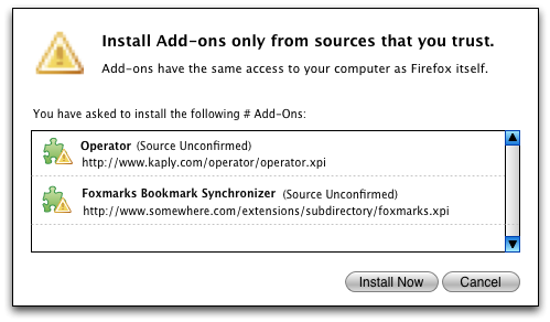
The rationale behind this redesign is to elevate the warning, rather than the list or reiteration of the identity of the add-on, to primacy in the dialog. The user (should) already know what he/she is installing, so its presence is just as context for the new information (the warning) above.
Notes:
- (Source Unconfirmed)- this takes the place of "Unsigned" in the implementation. If it were signed, the name of the source would be in parentheses.
- the URL should be selectable
Previous Designs
Ideas from Feb-May 2006: Firefox:Extension_Manager_UI


