Gaia/Design/BuildingBlocks
From MozillaWiki
Contents
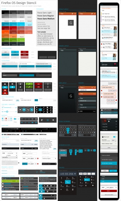
Design Stencil Kit
What's the Firefox OS Design Stencil Kit?
- The Design Stencil Kit is a Photoshop file containing all Firefox OS UI components in vector format. Use it to quickly create the layout of your Firefox OS app by just dragging these components to any Photoshop document. This layered PSD file also contains editable effects, fonts and shapes so you can easily customize the standard Firefox OS UI components to fit your needs.
Downloads
Overlay Menus
Action Menu
Usage:
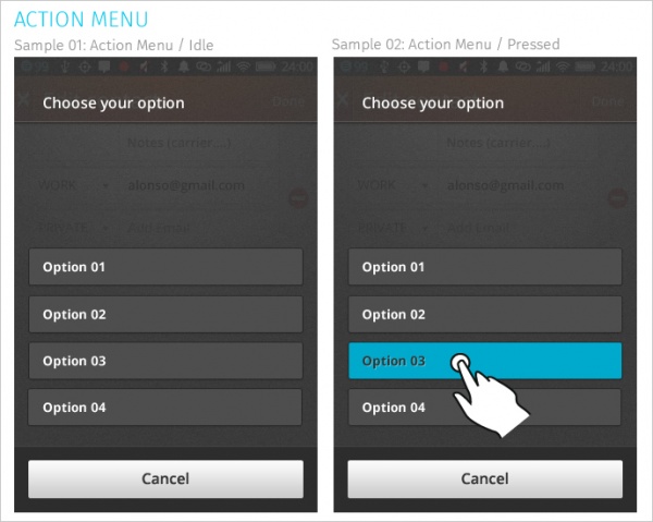
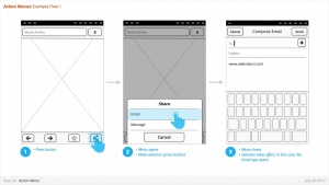
- The action menu presents a list of actions related to the App content.
Characteristics
- Are opened from buttons within App content. These buttons are often inside Toolbars (eg: Browser's "Share" button).
- Contain 1 or more items.
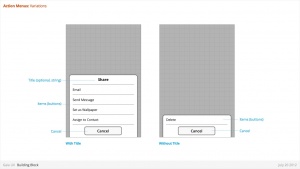
- Expand in height to accomodate contents, to a maximum of the screen height, at which point contents scroll. Best practice is to include maximum of 5 items + Title.
- Title strings are optional.
- Are closed by:
- Selecting one of the actions.
- Pressing "Cancel" button (verbiage TBD)
Downloads
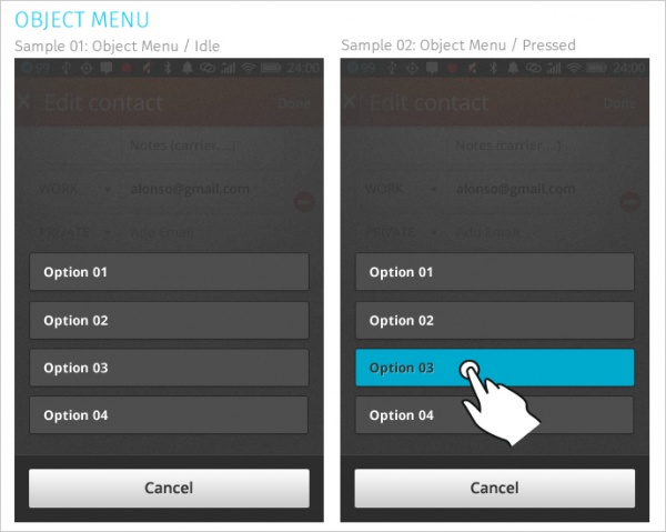
Object Menu
Usage
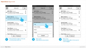
- Directly manipulate objects without having to open them and navigate deeper into the hierarchy.
- Deleting a photo by selecting it's thumbnail, instead of having to open the full image.
- Flag an email by selecting it's preview, instead of having to open the full email.
- Call a Contact by selecting their name, instead of having to open their detailed information.
Characteristics
- Accessed by user press-and-hold on selectable object (eg: list row, phone number, URL, etc)
- Menu appears after X seconds.
- Contain 1 or more items
- Expand in height to accomodate contents, to a maximum of the screen height, at which point contents scroll. Best practice is to include maximum of 5 items + Title.
- Title strings are not included (unlike Action Menus)
- Are closed by pressing "Cancel" button.
- Reuse the Action Menu interface.
- Future (v2):
- Menu will explicitly tie itself to selected element by opening immediately above or below, shifting to fit into the available screen real estate.
- Selected object element will be highlighted (e.g.: darken surrounding content?)
- Explicit "Cancel" input may be removed in favor of pressing on empty screen real estate to close.
Downloads
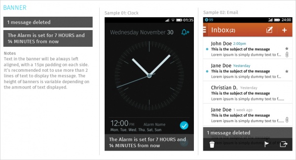
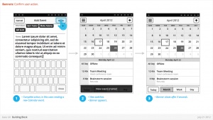
Banner
Usage
- Relay information to the user.
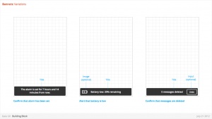
- Confirm a user action
- Alert to a system event
Characteristics
- Most common used after Multi-Select edit, to confirm user action, and optional provide "Undo" input. eg:
- Deleting multiple photos from (Gallery)
- Deleting multiple emails (Email)
- Moving multiple emails (Email)
- Are positioned at the bottom of screen, covering underlying content.
- Appear for X seconds then automatically disappear.
- Can include an input, eg: "Undo" (optional)
- Can include an image (optional)
- Can either be part of an App (eg: a "photos deleted" Banner is associated with the Gallery app) or the System (eg: a "Low Battery" alert).
- Ideally would be designed to prevent two Banner appearing simultaneously (eg: If two Banner appear at same time, newer replaces older).
Downloads
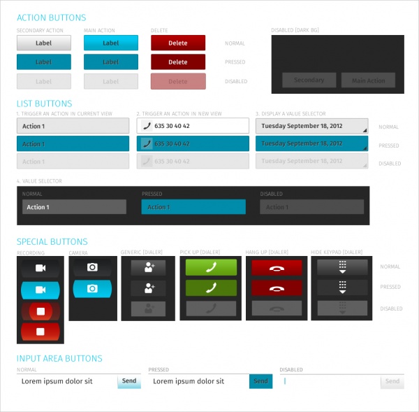
Buttons
Usage
- Allow users to perform an action when tapped. The action is communicated using text or an icon.
Characteristics
- Have two components: visual target and hit target. The hit target is always larger to assist users in hitting the target.
- States:
- Normal
- Pressed
- Disabled
Types
- Action buttons - used when there are only a few actions and a list is not required. The main action button uses a highlight colour.
- List buttons - used when displaying a list of actions or to trigger the display of a value selector
- Input field buttons - used to perform actions with input fields
- Special / custom buttons - used for specific actions including recording, dialing, and others.
Downloads
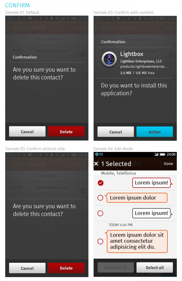
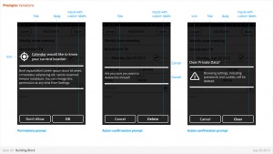
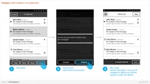
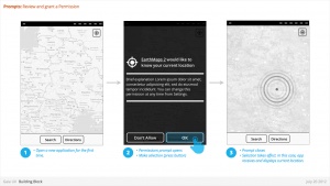
Confirm
Usage
- Prompts user to take action.
- Confirm a deletion
- Respond to a system event (eg: restart device after a SIM card swap)
- Grant or deny a permission
Characteristics
- Modal: occupies the screen and requires user input to clear.
- Consists: of
- Title
- Body (optional)
- Icon (optional)
- Input: Confirmation.
- Can customize label string
- Input: Cancel (optional).
- Can customize label string
Downloads
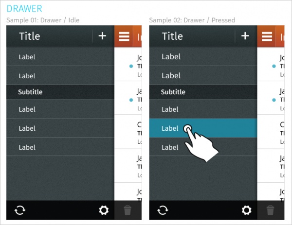
Drawer
Usage
- Panel that transitions in from the left edge of the screen and displays the main navigation options.
Downloads
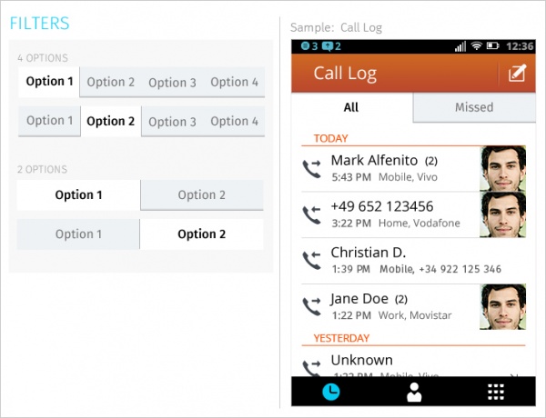
Filters
Usage
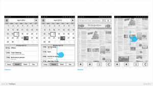
- Secondary Navigation
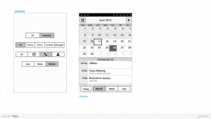
- Filters can provide a second set of tabs, where tabs are already present.
- Data Filter
- Filters can be used to enable the user to view a single set of data in a different lens.
- eg: in Calendar, the filters they allow user to view time in different scales, from Day to Month).
Characteristics
- Horizontal sequence of buttons.
- Only one button is Focused at a time.
- Best practice is to place filters within Toolbars, so they do not flow with the content.
- Left, Middle and Right buttons can be styled uniquely.
- Width: variable, depending on number of filters required within a single set (see Numbering). Should establish a maximum width, however.
- Numbering: minimum 2, maximum 5.
- Can be populated with icons or text, but not both. Because of the smaller height of a filter (versus a tab), text is the best practice.
Downloads
Headers
Usage
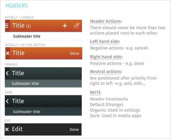
- Labeling the active view.
- Providing top-level navigation and inputs for the active view.
Characteristics
- Horizontal full width bar that appears at top of screen in most apps
- Floats above content, with option to flow with content in some rare cases (eg: Browser).
- Heading text provides name of current view.
- Optional: heading text string can include text (eg: current unread email count)
- Present in most applications
Downloads
Lists
Usage
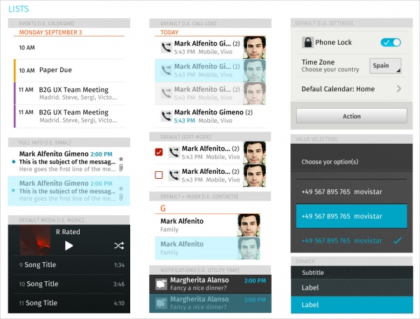
- Displays an enumeration of a set of items.
Characteristics
- Varying heights (1—3 rows)
- Varying contents (from text only to image + text + button)
- Are composed of rows, and section headers
Types
- Action row (click anywhere to trigger input)
- Status indicator row
- Button row
- Link row
Downloads
Progress & Activity Indicators
Usage
- Providing user with visual feedback that a process is active.
Characteristics
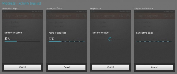
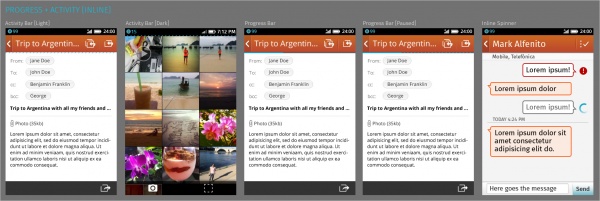
- May include an animated visual element, a text label, or some combination of the two. The progress and activity indicators may be used in modal windows or Inline, together with content or next to it.
- Modal: They're used when the phone cannot be interrupted while loading data.
- Activity Bar: Used when an unknown amount of data is being downloaded.
- Progress Bar: Used when a known amount of data is being downloaded. When this process is paused for some reason the empty part of the bar will go from solid to the candy bar style so the user has feedback on the process that is taking place.
- Spinner: Used when data is being sent.
- Non-Modal: Displays a looping animation, communicating to the user that the process is active.
- Activity Bar: Used when an unknown amount of data is being downloaded. Note that the activiy bas is background sensitive and there is an option for light screens and another for the dark ones.
- Progress Bar: Used when a known amount of data is being downloaded. When this process is paused for some reason the empty part of the bar will go from solid to the candy bar style so the user has feedback on the process that is taking place.
- Inline Spinner: Used when data is being sent.
Downloads
Scrolling
Usage
- Vertically slides text, images and/or video across the device's display.
Characteristics
- There're two types of scrolling components:
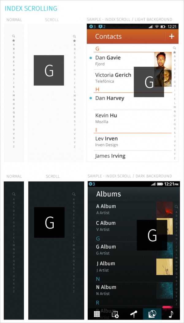
- Scrollbar: It's automatically displayed on the right-hand side of the screen when the user starts scrolling through content. It should be always used within the scrollable content area and should never be painted over other components like headers or tab bars.
- Index scrolling: It's always displayed on the right-hand side of the screen and it's always visible, no matter the user is scrolling through content or not. Is always used for alphabetically ordered lists, like contacts or music. If the user starts scrolling directly over the component the system will switch to a "fast scrolling mode", making it possible to go faster to the selected letter in the alphabet.
Downloads
Seek Bars
Usage
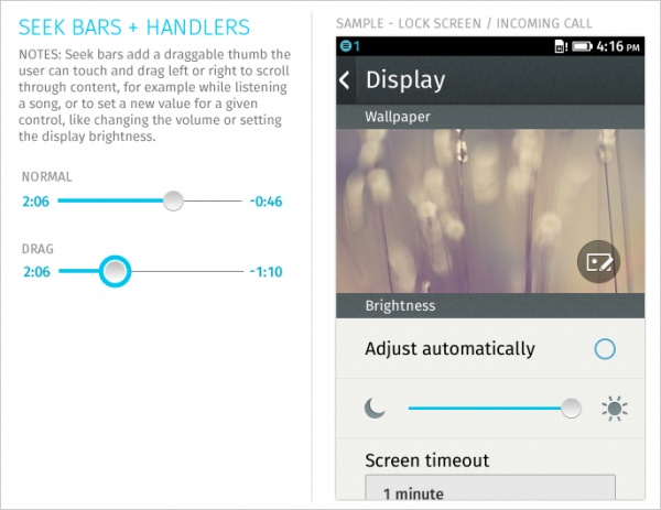
- Scroll through content (i.e. a song or video).
Characteristics
- Consists of track and knob (button w/ normal and pressed states)
- Optional images for left and right values
- Can be horizontal or vertical
Downloads
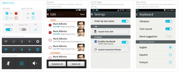
Switches
Usage
- Activate/Deactivate an item. It's also used to select an element within a list.
Characteristics
- There're three different types of switches:
- On/Off toggle: Used to activate/deactivate functions and settings. It's recommended to always use it as a default component to toggle the state of a given function, for example in settings applications.
- Radio Button: Always used next to a list item to select it from a list of options when there's a list of 3 or less options to select from. If the list is bigger you should use a Value Selector. If the only section in a screen is a single choice list, it's also possible to use radio buttons instead of a value selector, which would involve having a screen only to display a button which would trigger the value selector.
- Checkbox: Usually used in edit mode to mark content and to activate/deactivate a given function. It's recommended to avoid using them in long lists. If you need to use a component to let the user activate/deactivate a function it's better to use the on/off toggle. The default checkbox is blue, while the red one should only be used to mark content that will be deleted.
- Important: It's recommended to avoid the use of radio buttons and checkboxes in long lists and/or the same screen. In case you need to use a component to activate/deactivate a system setting or toggle a function state, you should use the On/Off toggle. Check boxes may be used to mark items as selected (like in edit mode) or next to an input area to remember a password.
Downloads
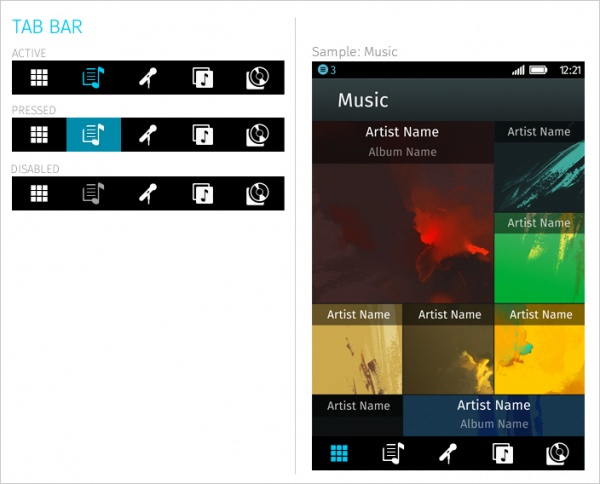
Tab Bar
Usage
- Allows multiple instances to be contained within a single window. Tabs are used as a navigational widget for switching between sets of views.
Characteristics
- Fill the full horizontal width.
- Number between 3—5.
- Positioned at bottom of screen.
- Can contain various elements (buttons, filters, indicators, etc).
- Versions:
- Text + icon
- Icon-only
- States:
- Normal
- Pressed
- Active
- Disabled
Downloads
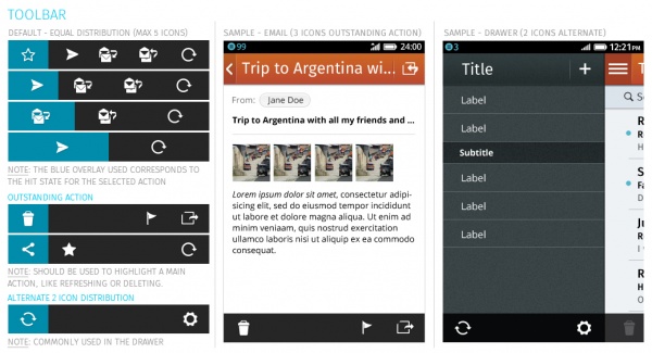
Tool Bar
Usage
- Contains actions, indicators, and navigation associated with the current view.
- Delete selected items (button)
- Refresh content (button)
- Enter “Edit” mode (filter)
- View “Favorite” contacts only (filter)
Characteristics
- 100% width. Fixed height.
- Does not scroll with content. Floats above.
- Should be positioned at the bottom of the screen unless Tabs are also present. In that case, should be positioned at the top.
- Can contain various elements (buttons, filters, progress/activity indicators, etc).
Downloads
Value Selectors
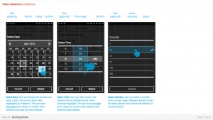
Usage
- Provides a way for the user to select one of more values, usually from a Form interface.
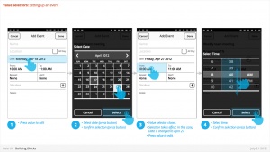
- Most commonly associated with forms (eg: Setting up a Calendar event).
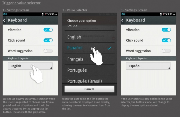
- Value selector is the default component that should use to display a list of items. Alternatively It would be also possible to use a regular list with radio buttons, but this option is only recommended for lists with 3 or less elements.
Characteristics
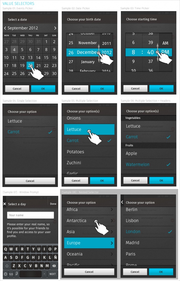
- There're two categories of value selectors depending on the kind of information requested:
- Date + Time:
- Events Picker: Used in apps like calendar to set up events.
- Date Picker: Used to set a date.
- Time Picker: Used to set an hour.
- Date + Time:
- Selection Lists:
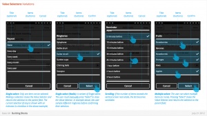
- Single Selection List: Used to select one item from a list.
- Multiple Selection List: Used to select one or more items from a list.
- Selection Lists:
- Important: You should always use the correct list button to trigger a value selector. Basically it consists of a standard list button with a gray arrow on the bottom right corner. The label used in the button should not be generic, but the currently selected option. When the user clicks the button and selects a new item in the value selector, the label used in the button will change to reflect the new selected option.
Downloads
- Link to "Date Picker" CSS in Github
- Link to "Time Picker" CSS in Github
- Link to "Single/Multiple" CSS in Github
- Source PSD (.zip)
Input Areas
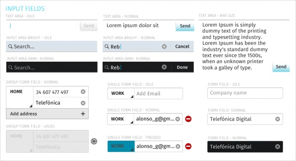
Usage
- Allow the user to type text. They can be either single line or multi-line. Touching a text field places the cursor and automatically displays the keyboard
Downloads
