Labs/Bespin/DesignDocs/Editor/PieMenuAndNot
From MozillaWiki
< Labs | Bespin | DesignDocs
This is the next step in the pie menu action design. Phase one was: merge the dashboard with the editor all via the pie menu action. Phase two is cleaning up based on usage. This phase should be short enough to be done in a fairly compact time frame:
Pie Menu
A user can invoke the pie menu via right click, or a keystroke (Ctrl-M say). Lets split up the two types of invocation:
- The pie menu will always be summoned at the same place, in the middle of the page.
- Arrow keys will take you to the various pieces of the pie and that slice will summon the correct action (e.g. load up the command line)
- When you select the slice, should it disapear?
- Pro: Get to your action quick and it hides off. Don't take up space.
- Con: If you make a mistake you have to summon up the pie again which could be annoying
- Escape will close it.
- If via click, the pie appears with the cursor in the middle
- Do smart things based on where the click is... e.g. change side if on the edge of a page)
- Q: show an [x] to allow a kill via mouse?
- As you move your mouse over in the right direction, it will kick the action off.
- There should probably be a middle zone that doesn't trigger an action (have to move X pixels away from the center for it to count)
Direct Actions
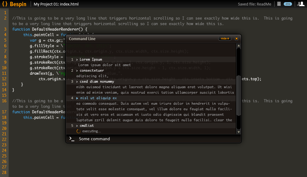
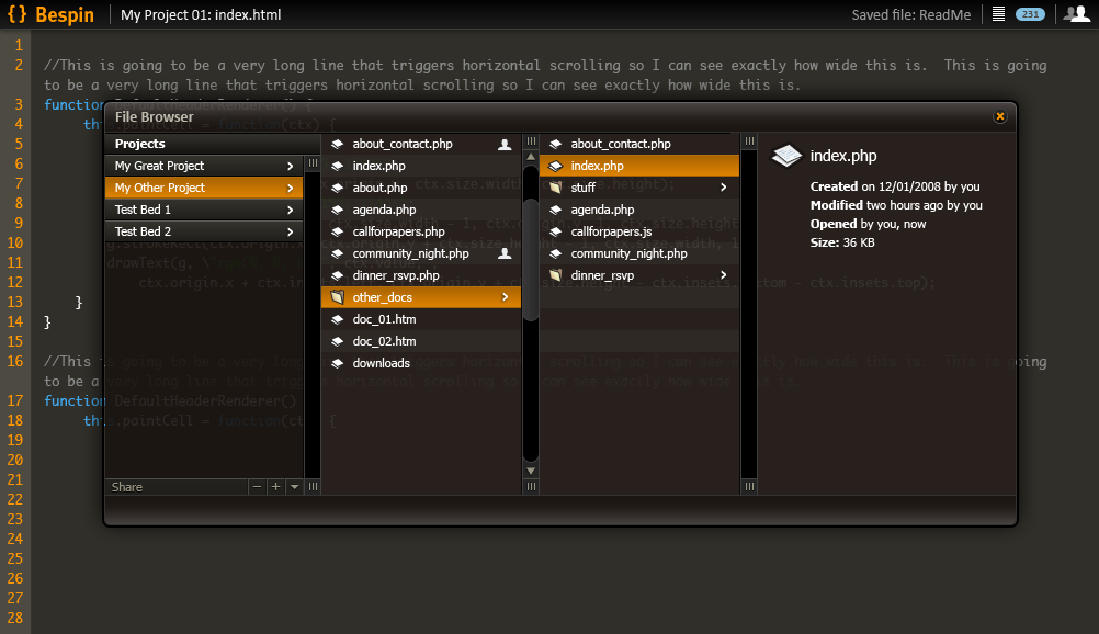
When you want to just go to the command line, or the file browser, you can do just that. The toolbar buttons of shortcut kick you directly into the component that you want and there isn't a pie around.
Could play with having a mini pie representation in the popup UIs so you can get to it. For example, jumping between the file popup and the command line could make sense.

