Labs/ConceptSeries/StudentOutreach/AshesiCollege/MAPD
Contents
MAPD
Our project is to design meaningful and valuable mobile phones for use in the future.
Team Members
Background Research
In order to design a mobile phone that would be meaningful and valuable to users in the future, we decided to interact with users of iPhone, Nokia and BlackBerry phones. Through our interaction with them, we tried to find out their pain points and wishlists. We also found out what features they would like to have in the future if there were no technical boundaries.
Existing Problems with the 3 brands we focused on:
BlackBerry:
→ It is not easy to use the Bluetooth on the phone.
→ All drafts, sent and received messages appear in one folder.
→ Numbers contained in a text message are not callable links. Thus, the user will have to copy the number from the message and paste it on the desktop/home screen and before he or she can call.
Nokia:
→ All document and files in QuickOffice are read only without the purchase of a full license. (QuickOffice is like Nokia’s version of Microsoft Office)
→ Files received by Bluetooth are stored in the inbox. When the user chooses to save the received file in a memory location, it only saves a copy in the chosen location. This leaves a copy in the inbox. This creates duplicate files and the user will have to delete the copy of the file in the inbox.
iPhone:
→ Users find it difficult to send blank messages.
Why these problems exist:
BlackBerry:
→ The BlackBerry is believed to be designed for professional use only. The main things that people send with Bluetooth are entertainment or media files. Hence, professional usage of the phone does not often involve sending media files.
Nokia:
→ The phone permits its users to only read files with their office applications, QuickOffice, because it is for sale.
iPhone:
→ The phone does not allow its users to send blank messages because since it is a touch screen phone, users can accidentally touch send without typing what they want to send. This is a means of preventing that error.
The design problem
To design a meaningful and valuable mobile phone for use in the future.
Understanding needs and establishing requirements
In our data gathering exercise, we interacted with real users to find out the pain points and wishlists they had concerning mobile phones. This was done through a one-to-one interview. We asked them the following questions:
- Apart from making and receiving calls, what do you use your phone for?
- Are you able to browse on your phone? If yes, is your phone's screen big enough?
- Do you use all the apps on your phone? If no, why do you still have them?
- Tell me about yourself and describe a typical day in your life.
- What do you wish mobile phones would be able to do in the future? (without regards to technological boundaries)
- What do you dislike about your phone?
Personas and Scenarios
The personas below were created from the information we gathered during the interaction we had with the users of each brand.
PERSONA 1: BlackBerry User
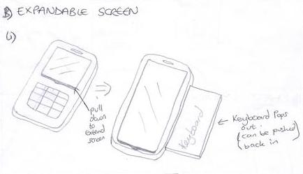
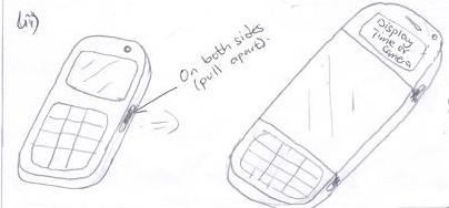
Sara is a 20 year old university student. Her favourite colours are grey, red and black. She is pursuing a degree in Computer Science. She owns a BlackBerry smart phone; her first smart phone. She uses her phone to make and receive calls, send and receive messages, plan her day and calculate things. She does not access the internet on her phone because she prefers to do that on her laptop since that has a bigger screen. She also doesn’t access the internet on her phone because she cannot have access to it without paying for the BlackBerry Messaging service. Sara wishes she could access the internet without the service since that is possible with her basic Nokia phone. She finds it very inconvenient to have to take out her laptop every time she wants to access the internet. Another thing she would love is if she could browse in 3D on her Smartphone in the future. She hopes this would make it possible for her to watch her favourite movies and new releases online. With a bigger screen, she also wouldn’t have to do a lot of scrolling and the thought of that makes her happy. Sara does not use the applications for creating spread sheets and presentations but still has them on the phone just in case she has to use them one day. Sara likes the music player on her phone. She likes the fact that she can create playlists and continue listening to a song when she closes the application and opens it again. She likes the fact that the various versions of the BlackBerry are different from each other because it gives her a variety to choose from within the same brand of phones. She finds it difficult to transfer files using Bluetooth. She does not like the fact that the messages are stored in one folder and not grouped according to inbox, sent, drafts and suchlike there. Sara wishes that her phone’s browser would allow her to change its themes. She also wishes she had webcam functionality on her phone. Sara loves to look at clothes online. She makes her seamstress sew them for her if she loves them. To show the style to her seamstress, Sara has to take her laptop there. Sara thinks that even if she was able to access the internet on her phone, the screen would not be big enough for the seamstress to see all the details. This has happened to Sara before. She showed the picture to her seamstress on her friend’s phone. Based on her experience and the inconvenience of taking her laptop to the seamstress, Sara wishes she could expand the size of her phone in the future by either unfolding some parts or stretching it. Sara does not find the icons on her phone easy to understand. As compared to other phones Sara has used, saving a contact received in a message is relatively difficult. In general, Sara does not find her phone user friendly. She wishes she could have an e-book reader and an internet explorer browser on it. She also wishes she could compile her code on the phone since it has a notepad. This would help her to do her assignments anywhere without necessarily carrying her laptop around. In the future, Sara wishes that the outline of her phone would not show when it is in her pocket. This is because she thinks that would be cool. She also wants this feature because it would make it easy for her to convince boys that she does not have a phone if she does not want to give out her number. Sara also thinks if she is approached by a thief, it would be easy to convince him or her that she does not have a phone since the outline would not show.
SCENARIO 1
Sara wants to send a media file to her friend’s phone. She knows she has Bluetooth on her phone. She locates the file and looks at the options she has for that file. Even though she finds the option to send via Bluetooth, she realizes that she cannot search for phones to send the file to. After checking her settings and failing at several attempts to fix this problem, she asked another BlackBerry user for help. She learned from the person that she had to pair her phone with the recipient’s phone from her settings before she could send a file to him or her. Sara thinks this process to be too long.
SCENARIO 2
Sara needs to send a code she has written to her group members to compile and debug since it cannot be done on her phone. Sara tries to access the internet with her phone but is unable to do this. She finds it strange that her smart phone cannot access the internet. Upon making a few inquiries, she finds out that she has to pay for the BlackBerry Messaging service before she can access the internet. She does not have her laptop around so she is unable to send her work and is very worried.
SCENARIO 3
Sara receives a phone number as a message. She wants to save the number. She checks the available options for the number but realizes that unlike other phones, her smart phone does not recognize the number as a telephone number. Because of this, Sara has to copy and paste the number on the home screen for it to appear as a number about to be dialed. After doing this, she gets the option to save the number.
PERSONA 2: iPhone Users
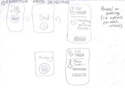
Maureen is an iPhone user. She is 23 years old and a university student. She is conversant with many smart phones. She uses her phone to make and receive calls and send and receive text messages. She also uses her phone to play games, record and keep track of her menstrual cycle. She has a lot of applications on her phone so that it can be beneficial to almost everybody who uses it. She likes the fact that she can put a password on her applications. Maureen likes the button on the side of the phone that allows her to put the phone on silent easily. She uses her phone to access the internet a lot. She cannot use her phone to create spread sheets and presentations because the phone’s software has not been updated. She also doesn’t find it easy to redeem an iTunes gift card in the iTunes store. Maureen does not like the fact that the phone heats up easily when she receives or makes a call. Because of this, she always has to use the speaker phone when she receives or makes a call. Maureen wishes that the applications for detecting moods could be more accurate. She also wishes that in the future, it would allow her to set actions for it to perform based on her mood. For example, if she was hungry, it would ask her to choose a meal and call her favourite restaurant or mother to have the meal made for her. Another example is if it could provide inspirational or motivational messages when she is sad. Maureen discovered last week that there is a difference between the interface of the facebook application on her phone and the interface of the one online (i.e. www.facebook.com). This is because the home/ main menu part of the application has the various sectors of the site as different menu options to choose from. For example, on the Facebook website one can see the profile, home, chat, mutual friends, messages etc on each page (except full navigations into a particular sector). However, the Facebook application has a home page where one can choose where he/she wants to go (i.e. New Feed”, “Profile”, “Friends”, “Messages”, “Notifications”, etc). After choosing any of the menu options, one gets only the items that pertain to that sector. This also applies for the Skype application on her phone. Maureen likes using the applications and wishes that in the future, the entire web would be in the form of applications on her phone.
SCENARIO 1
Maureen wants to buy an application from the iTunes store for her iPhone. She has already bought this application on her laptop but does not have her cable in school with her. She searches for the application in the iTunes store and finds it. Maureen taps on the install option and is asked to enter her username and password for her account. She enters her details and a message appears telling her that she will not be charged for the application since she has already paid for it before. Maureen was excited to find this out. She thought her account balance would reduce since she was buying the application on a different device.
SCENARIO 2
Maureen needs to send some very important information via blue tooth to Tracy. She switches her Bluetooth on but cannot find Tracy’s device. After a couple of attempts, she finds it but is not able to pair and send the information to Tracy. Maureen goes to the iTunes store and purchases about three Bluetooth applications to try and send the information. She eventually gives up. Every iPhone user she asks for help with this problem is unable to help her.
SCENARIO 3
Although it may sound strange, sometimes it may be necessary to send a blank text message. A clear example was when Maureen wanted to activate her MTN internet settings; she was required to send a blank message to 686. However, the iPhone only unlocks the send button (which enables you to send a message) only when the user has typed in some text; so how then could Maureen send a blank message? After several attempts to find a way to send blank text messages, she gave and opted to take out her SIM card and activate her internet settings on another phone. Subsequent talks with her friends lead her to raise this issue and there came the solution! One of her friends, Yaa, told her that it is possible to send a ‘seemingly’ blank text message. By hitting the space bar in the message field, the iPhone seizes to recognize the message field content as empty. This finally unlocks the send button.
PERSONA 3: Nokia Users
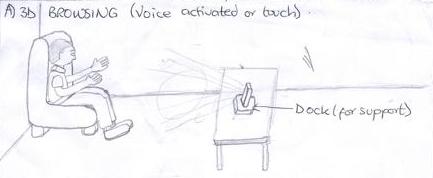
Darren is a 20 year old university student who owns a Nokia N8 and a Nokia N97. Although there are a few issues he has with his phone (Nokia N8), he really enjoys his user experience. He complains about how his phone freezes or becomes slow when a lot of applications are opened. Another issue was that, he could not mute the shutter sound when taking pictures and an annoying red light appeared whenever he was recording a video. Darren wishes his phone was waterproof, had a longer battery life and was a bit faster to respond to his commands. He was unhappy about the fact that he could not “go back” or “cancel” whenever he didn’t want to continue a process that he started. With Darren’s N97, he does not like the way it synchronizes his music; the playlists on his laptop do not reflect on the phone. He also compares the phone to a Windows 97 computer because the touch screen is not very sensitive. He has this problem because he has used an iPhone before and compares that to a Windows 7 computer. He also doesn’t like the fact that he has to buy a license to use the word and excel applications on the phone. Without the full license, all his documents can be viewed but not edited. Apart from these problems, Darren likes this phone. Darren is really comfortable with his phones and does not find them complicated to use because he has used a BlackBerry, an iPhone, a Nokia E75 and a Nokia 3220. He uses his phones for making calls, sending messages, checking his email, planning his day (i.e. using memos and drawing up schedules), doing school assignments, watching DSTV, playing games, listening to music and a whole lot more. He loves Gospel and Country music (e.g. Kenny Rogers, Dolly Parton – “jolie” et cetera). Darren wishes he could have his music library online so that the memory on his phone can be used for storing school documents. In the future, Darren wants to be able to download memory space on his phone. Darren is impressed with his browsing experience on his N8 but wishes it would become more exciting. Due to the fact that Darren uses his phone to download a lot of music, he would love it if there was a database of songs on the internet which is regularly updated and allows quick downloads. Since Darren drives and is on the internet most of the time, he would like his phone browser to be voice activated. For example, to go to Google, he just says ‘Google search’ and states what he wants to search for. When this is done, the browser should be able to read aloud the search results. Generally, he prefers to use his phones for everything as compared to his laptop. He also wishes his phones could have an application which diagnoses illnesses accurately and prescribes medication.
SCENARIO 1
Darren is at a restaurant and needs to edit an assignment and submit it before the deadline but he cannot use his N8 since the battery power is low. His only option is to use his N97 but he can only view documents in Word, Excel and other office applications. These applications on his phone required him to purchase a full license to be able to view and edit documents.
SCENARIO 2
Darren is hanging out with his friends and exchanging music files via Bluetooth. He realizes that every time he receives a file, it comes as a message. He then has to go into his inbox and open the message. This gives him the option of saving it on the memory card. When he selects yes, it saves the files on the memory card and still keeps it as a message in his inbox. This takes up space. He thinks this a very long and unnecessary process.
SCENARIO 3
Darren is driving when he gets a call from a company he wrote a business proposal to. He is asked to check his mail and reply within the next 10 minutes because it is an emergency. Since he is on the motorway, he is unable to pull over and check his mail on his N8. However he manages to get onto the internet and opens his mail. He tries to read the message he has received. Darren finds it hard reading the mail because keeping his eyes off the road and on the phone would result in a very fatal accident or his arrest. After a couple of useless attempts to read his mail, the 10 minutes are up and he receives another call saying his proposal has been turned down due to his inability to clarify a few pressing issues. Darren is really upset and wishes his browser was fully voice activated.
Concept
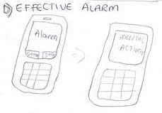
Borrowed ideas from alarms that ask users to perform a mental activity before they go off.
Prototypes
1st ITERATION:
Prototype 1
3D BROWSING:
Pros
Cons
Prototype 2
EXPANDABLE SCREEN:
→
→
Pros
Cons
Prototype 3
EFFECTIVE MOOD DETECTORS:
Pros
Cons
Prototype 4
EFFECTIVE ALARMS:
Concept borrowed from "Math Alarm" [5]
Pros
Cons
Phase Outputs
Feedback and Impact
Feedback by industry professional Penny Hagen
This project identifies a number of ways in which current phones do not cater to the needs of expectations of users and points to opportunities for potential new features. There are some great first iterations presented here and there is a clear link between the persons and scenarios and the concepts being explored.
There is great diversity in the concepts and it's clear that the different ideas from the interviews, personas and scenarios are being explored, some in combination. It would also be excellent to see the presentation of concepts explored in different ways, e.g., their use in different scenarios. Single static sketches can only convey a small amount, and they aren't able to convey user experience or use over time (which is how interaction works), so wireframes of different states, more annotation, scenarios or story boards can be useful for this. For example whilst the expansion of the screen can be shown in a technical context, it would be interesting to see how it effected the current display when activated. Similarly it would be great to see how the mood applications would be used in everyday life. Another way to expand out and build on these would be to evolve some of the insights from the research as themes (rather than specific features) that could be built upon and explored (perhaps with some of the participants themselves). For example, I particularly enjoyed Sarah's invisible phone concept - how could this be explored less literally as a start point to investigate and reflect on the role of mobile phones and personal security for example? Looking more broadly at how phones fit into and support everyday activities and putting a focus on the activities that people do - rather than the features or functions of the phone - would open up further opportunities to develop or spring board of the initial ideas.
A couple of questions that were prompted by reading the presentation on the Wiki - Why these particular phones and users? i.e., What was it that made these people or 'users' important to, or indicative of future users? - How were the conclusions about "why the problems exist" drawn? What is the rationale or basis for the reasons being proposed?
General feedback for MAPD and Apps (from Penny Hagen)
Interviews are a great way to interact with users and gain an understanding of what people think about different things. One of their limitations is that people can only tell us what they remember or what is top of mind, so they don't necessarily get us to the depth of how people interact with technology (or other things) in their daily life. In addition, as I am sure you've heard before, often what people say they do is different to what they actually do - this is not intentional, its just that we don't constantly observe ourselves or own behaviour - so interviews can be good for getting at explicit information but they rely on people having a good, reflective sense of their own practices but often we have to work a bit to access to things that people themselves aren't aware off.
To help people delve into this kind of detail for example, we can try asking them to describe a recent time when they used their phone, or were frustrated with their phone. Getting people to talk in examples often moves us beyond the obvious. Also, try asking "why" more often - not just "what" i.e why do people use or prefer particular things, people may use things for reason quite different to that which we expect. It can also be useful at times to use a kind of primer before the interview that helps to sensitise the participants to their own behaviours and attitudes. I.e., asking people to record for a day or two what they are doing with their phone, this helps to make things that are implicit more top of mind at the interview. Habits and rituals in particular are hard for people to identify in an interview, but a diary or primer prior can sensitise them more deeply to their own practice, and help them to share them with you.
We also need to be mindful of asking very specific questions in the interviews as these can limit the kinds of information people will share. (Though of course sometimes specific questions are very appropriate). Often its good not to embed assumptions into the questions. For example, rather than immediately exclude the making and of receiving calls, letting people describe in their own words how they use the phone, and what they consider to be most important (and then following up with prompts or more specific questions) might allow some surprising things to come out, as people describe their phone using their own language and in their own way. A technique I have used before is to ask people to give you a "tour" of their phone and the most important features.
Feedback provided by Thomas Arend PhD, Lead Product Manager, Mozilla Mobile:
Well, hello there, team MAPD - Diane, Kwame, Michelle, and Prince. Thank you for working on this project and for allowing me to share a few comments below:
- MAPD
I like your mission: short, clean, concrete. My question would be around specific aspects of a "mobile phone" - are you thinking of smart phones or feature phones (which don't have web access). Are we talking about improving telephony / voice or video communication, or is this about web features, or all of the above? - Background Research
This section is really nicely structured and contains some great and well documented insights! Nice motivation of your research background. It remained unclear to me how you chose those phones, though (random? market significance? why no Android phone? Any specific pain points with these phones? Coincidence and availability?) - Existing problems
Are those the *top* problems you found or all problems? What kind of problems were you looking for? In which scenarios? With which users? I really like the fact that you looked at all phone functions, incl. text, phone calls, file exchange and sharing, bluetooth, etc. - Why these problems exist:
Do you know for sure or are those your assumptions? And: how are these insights valuable for your research (e.g. you can address root causes). - Understanding needs
This is great. It would also be helpful to add background info on the group of people you interviewed: demography, expertise level, phones they use, their use cases, location and setup of your interviews, etc. This may add context to your findings. - Personas and Scenarios
Those are great and cover your three areas very well. But are they representative of the use cases you want to cover with your design idea, that may well reach beyond those three concrete devices? Also: personally I prefer much shorter persona descriptions - just enough to get to know the type of user better, without going into too much detail which phone feature they like or hate. The scenarios contain a lot of design detail (e.g. "Maureen needs to send some very important information via blue tooth to Tracy") - keeping that much more abstract can help design a more innovative solution. So, in this example, you may want to consider saying "Maureen needs to share information / data with Tracy" - they both probably don't care whether this happens via bluetooth, wifi, email, NFC, or something else, as long as it is painless, intuitive, and quick. I suggest to describe concrete user needs, but without describing parts of the current solution, in order not to bias the outcome of your research and design approach and so as to not limit your creativity. - Prototypes
I can see some amazing ideas here, and I love the visuals! Great job. I am missing some context here: how do those prototypes meet user needs and requirements from your personas and scenarios? What exactly do those prototypes mean. Maybe explain the essence of the respective prototypes in a short sentence, each, and explain which need it meets. Pros / cons can only be seen within the given context.
Great Job!! Feel free to contact me anytime at thomas@mozilla.com if you have any questions or additional comments. Thanks!
References
Ken Development, "Math Alarm", <http://itunes.apple.com/us/app/math-alarm/id305800928?mt=8>
