Mobile/Archive/Awesomescreen 3.0
Contents
Summary
Fennec 4.0 revised the original simple aweseomelist to better incorporate the multiple search engines and quick access to bookmarks, history, and desktop tabs. The overall presentation, though, is still overwhelmingly about people doing search; for example, the pre-search view of the screen uses a search-result-type list.
The idea behind this project is to present a more browse-oriented version of the awesomescreen before the user has started to search. A related goal is to see what other of the user's data we can usefully incorporate here (badging? shared data?); another is to try to elevate the idea of webapps from being just another bookmark.
There will be related work associated with the Tablet-optimized UI project.
Current Status
In design/mockup generation mode.
Next Steps
- Finalize designs
- start prototyping
Related Bugs
Team
- Project Lead:
- Design: madhava, new guy
- Team Members:
Designs
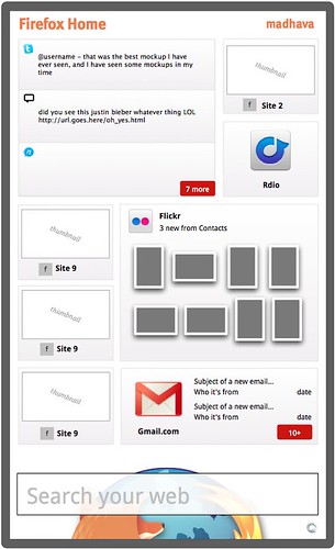
Some of this design work started in the context of reworked Firefox Home, which is, in a sense, the awesomescreen without a web-browser. The following mockups de-emphasize the search field in a way that we wouldn't want to do in the Firefox Awesomescreen itself.
This is a concept at the "lots of extra content" end of the spectrum:

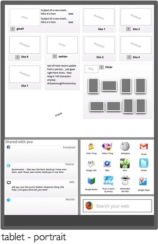
And could expand to include a lot more on tablet-sized device:

Goals/Use Cases
- Teach the world to sing.
Non Goals
- Perfect harmony