Support/Q2HelpfulnessTests
This quarter we gave ourselves the goal of increasing the average helpfulness score of knowledge base articles by 2%. There are two basic ways to approach that – make articles more helpful (obviously) and get more people to an article that helps them on the first shot (thereby decreasing the likelihood of rating an article unhelpful).
Our plan is to run multivariate tests on the support home page (getting people to the right article) and on 2-3 of the top support articles (making things more helpful) is to run A/B tests on the start page and one article that incorporate many changes. Once we get results from these tests we may create new tests to refine our findings.
Articles to use for the test
- How to set the home page is the most popular article (64607 views, wk of 4/19) and has a helpfulness rating of 57%.
*The Profiles article is our 5th most popular article (24640 views, wk of 4/12) and has a helpfulness rating of 37%
Article tests
Changing KB Article language
The current KB articles do a good job of speaking directly to the user and answering their questions. We'd like to test what impact changes to the language of the article have. For this test we'll work on rewriting each article, making these changes:
- Remove unnecessary information - There are almost always lots of tangential pieces of information related to a topic that could be presented. We should look to remove or not include anything that isn't necessary to solve the problem and get the user on their way.
- Use non-technical terms where possible - As SUMO contributors we're familiar with many technical terms and abbreviations. We shouldn't assume that people using the KB are familiar with any of these terms. We should explain things in as plain and simple language as possible.
- Use a conversational or friendly style - The articles should read more like your friend is explaining something to you and less like you are sitting in a lecture.
Here's the opening paragraph of the Profiles article:
- Firefox saves your personal information such as bookmarks, passwords, and user preferences in a set of files called your profile, which is stored in a separate location from the Firefox program files.
- Note: This opening paragraph doesn't include any information about what a user should expect to find in this article. That info is included in the rewrite below.
Here's an example of the kind of rewrite we propose to do:
- Did you know that all of the settings you make in Firefox, like your home page, what toolbars you use, saved passwords and bookmarks are all stored in a special profile folder? It's true. This article will tell you why this is a good thing, where you can find your profile folder, and give you links to related articles.
San-serif vs serif type
We'd like to test whether changing the body text of articles to a sans-serif font makes them easier to read.
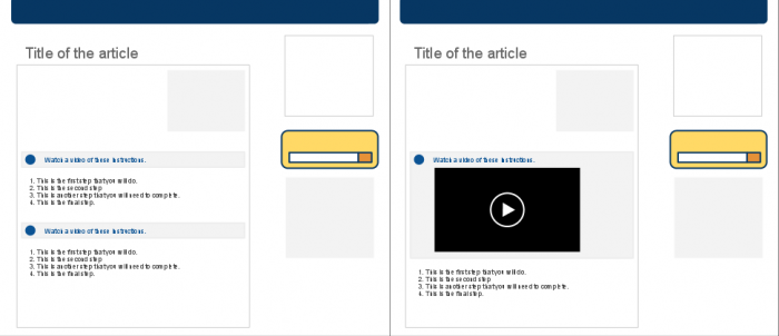
Embedding screencasts inline
Screencasts can be very helpful. We'd like to test if embedding them inline will encourage more people to watch them when available. None of the articles we're considering for the tests currently have screencasts so they'll need some created before the test can be run.
Changing KB Article layout
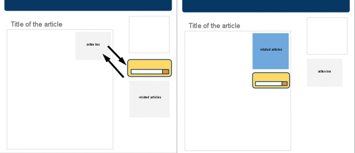
Currently, KB articles have an "Actions" box at the top giving people the option to edit or translate an article. While this is nice option that helps to reinforce that the KB is a community effort, it may be a distraction for someone trying to solve a problem. Instead we'd like to test whether swapping the related articles and search sections with the actions box will help people get to the correct article faster.
Here is a work in progress version of this. With changes listed below:
Changes to html:
- Swapped postions of actions box with related items and search in html.
- Added .bodybox and removed .box to the related items div
- Added .bodybox-search and removed .box to the search div
- Changed class on actions box from .bodybox to .box
- Commented out .bodybox-inner div on the actions box
- Added .actions-box to the actions box
Changes to css (added styles to head):
- added clear:right; to .bodybox class
- removed background color from ul.showfor_nav
- created .bodybox-search
- created .actions-box
Other variations to KB article layout
Some other variations we'd like to test:
- Move just Related Items to the Action Box space instead of both Related Items and Search.
- Move the TOC into the Actions box space and move the Actions box to the sidebar below the other items.
- Move all three items (Related Items, Search & TOC) to the Actions Box space.
Start page tests
Start page speed test (optimized graphics).
Start page layout test.
Improving performance
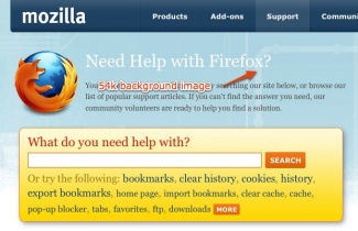
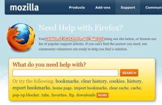
Improving page load times should make using and navigating the site easier and therefore help prevent people from becoming frustrated while searching for a solution. After looking at the size and loading times for various elements of the home page, it appears that removing the large background image (54k) at the top of the page will make the biggest impact. The screenshot examples below are very subtle because there is actually a tiled image (4k) behind the large background image.
Removing the background image changes the character of the SUMO home page quite a bit. Another option might be to use a more compressed version of the image. Here's an example of the image compressed to about 18k.
Start page:
Articles:
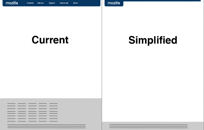
Another test we'd like to run is simplifying the page header and footer. This would get rid of a lot of unnecessary information (the links to the rest of Mozilla aren't crucial since the site is about getting help) on each page, making it easier to find what's important.
Browsing Categories
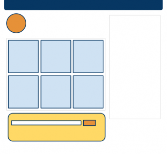
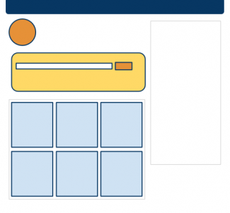
Another idea that might help get people to the correct article faster would be to offer a better browsing option. Currently the home page is designed around searching with an additional list of popular articles for users who prefer to browse. One idea we'd like to test is to replace that list of popular articles with a few category sections. They could have headings like Crashes, Troubleshooting, or Tutorials with a short description of what other things are included. These would then link to a category page. We might also test whether categories work better above search (mockup on right).
- Proposed/Possible Categories
- Bookmarks
- How to set the home page
- Bookmarks
- Awesome bar
- Using Firefox
- Bookmarks
- Tabs
- Awesome bar
- Private Browsing
- Privacy
- Cookies
- Cache
- Private Browsing
- Clear Recent History
- Customizing Firefox
- Customizing Fx with add-ons
- Unable to install add-ons
- Add-ons Blocklist
- Personas
- Personas do not work with Themes
- Troubleshooting
- Basic troubleshooting
- Firefox crashes
- Pop-up blocker
- Website doesn't load
- Problems with Facebook
- Edit options to add Adobe to the list of allowed sites
- Bookmarks
Article titles as questions
People often form their search queries as questions. We'd like to test whether listing articles titles as questions (that correlate with the questions that people search for) gets people to the right article faster. We would test this using the current start page layout, changing the wording of the list of popular support articles.
Another variation of this would be to add article titles as questions to the category pages that will need to be created for the Browsing Categories test.
