Thunderbird:Pane Reduction
The Thunderbird 2.0 Roadmap lists 'UI Face Lift for the 3-pane Window' as a major goal of Thunderbird 2. The following is an idea for consolidation of Thunderbird's 3 panes into a single pane. (Click Discussion to discuss, or vote for the concept at https://bugzilla.mozilla.org/show_bug.cgi?id=346227 if you like it.)
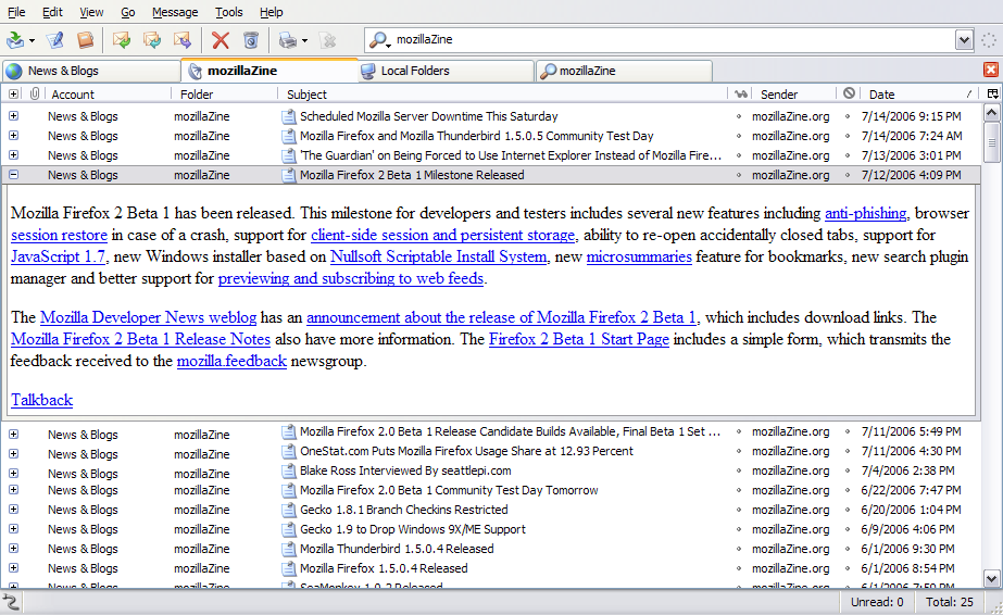
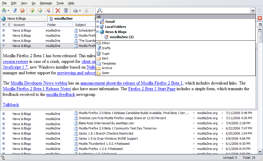
With message tags being introduced in Thunderbird 2, accessing messages is less about knowing where a message is in an account folder and more about being able to quickly select appropriate tags. Assuming account messages can be considered tagged with the account name and that Sent messages can be considered tagged with the 'Sent' tag, typing in the account name and 'Sent' can be quicker than selecting the Sent folder of the account in the Folder pane. Thus, the first change is to morph the Folder pane into a Tagbar that sits to the right of the Toolbar icons.
Clicking the arrow on the right end of the Tagbar would drop down a scrollable list much like the original Folder pane, such that when the 'Sent' folder of an account is clicked, the account name and the 'Sent' tag would appear as text in the Tagbar. RSS feeds would be folders under the 'News_and_Blogs' account. The Tagbar would also contain terms such as 'Unread', 'People_I_Know', 'Recent_Mail', 'Last_5_Days', 'Not_Junk', 'Has_Attachments', as well as custom tags that the user has defined.
Most of the time, I leave my message header bar in the compact state, so that it occupies one line. I have noticed that this compact message header bar essentially duplicates the information in the Mail pane. The information in the compact message header bar is used as a segue between the Mail pane and the Message pane. Thus, the second change is to have the entries in the Mail pane act as drawer handles that display the message. Thus the Mail pane morphs into the Message pane as the drawer opens after the compact message header is clicked. Of course, the Thunderbird 2.0 Roadmap lists 'Conversations' as a major goal, and so the Message pane would show expandable entries for each message in the conversation and the entry for the current message expanded. Other messages' entries could be expanded to get context for the message. When the message is read and the compact message header bar is clicked, the drawer would close and the Message pane would morph back into the Mail pane. This dynamic UI is familiar as having drawer functionality and intuitive as fitting with normal reading habits.
These two changes meet the criteria for a 'fresh user interface for the 3-pane', and additionally maximize the screen real estate for each task. Currently, only messages are tabbed for the Thunderbird 2 Roadmap, but under this new interface, the entire dynamic Mail-Message pane could be tabbed, making Thunderbird appear much more like Firefox, and yet while making UI improvements. The user would never have to use more than one tab (and the tab bar could even be hidden if only one tab is open), but for those users who want multiple views into their mail, they could enjoy multiple contexts in an easily accessible interface.

