User:Dria/Places Mockups
Contents
One-click Bookmarking
The "star icon" system exemplified by Flock is a good start for one-click bookmarking, although it does have some issues.
The benefit is that this is a true "one-click" bookmarking system by default. Default behaviour is such that clicking the star icon turns it from blue to orange and creates a simple bookmark. Clicking the star (orange) a second time brings up the bookmarking dialog, where the user can change the Title, add tags, keyword, notes, etc.
As shown below, however, the simple colour change is problematic in that it's not that drastic a visual change. For colour-blind folks it could be an issue, and I'm not sure what other accessibility issues there may be.
Bookmarks Sidebar
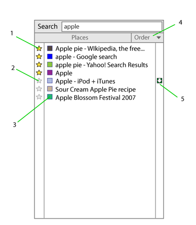
Integrate Bookmark and History search, returning results from both, with default weighting such that bookmarked pages are shown at the top of the results list:
- Yellow star = bookmarked. Clicking a yellow star brings up the bookmark dialog (ctrl-D equivalent) for modifying Name, and specifying a folder, tags, keyword, etc.
- Greyed star = not bookmarked. Clicking a grey star here adds the history item to bookmarks.
- Favicons
- Order by drop list (see next mockup)
- Possible integration with Download History -- if a file was downloaded from the URL, this icon would indicate such. Clicking the icon brings up Download History or open the OS file manager to that file's location.
Search results could also return Folders and Tags as well -- I haven't mocked that up yet, however.
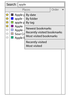
A simple drop menu could allow users to sort all bookmarks or Places search results in different ways:
This could also include "By Downloads" for just a list of URLs from which files were downloaded.
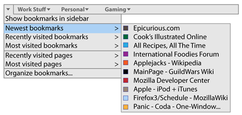
Just an idea to add a small drop menu to the Bookmark Toolbar...
Each sub-menu could have a "View all..." option at the bottom (after the default 10 items) to open the full list in the sidebar.


