User:Tro/Firefox 4.0 Mac Theme Mockups
From MozillaWiki
< User:Tro
These are WORKS IN PROGRESS, NOT FINAL! THEY ARE FOR DISUCSSION!
Feedback is entirely welcome and encouraged. Hit the discussion button at the top :)
(For 3.7 Mockups: User:Tro/Firefox 3.7 Mac Theme Mockups)
Contents
Mac Theme Mockups for Firefox 4.0
Large Back Button
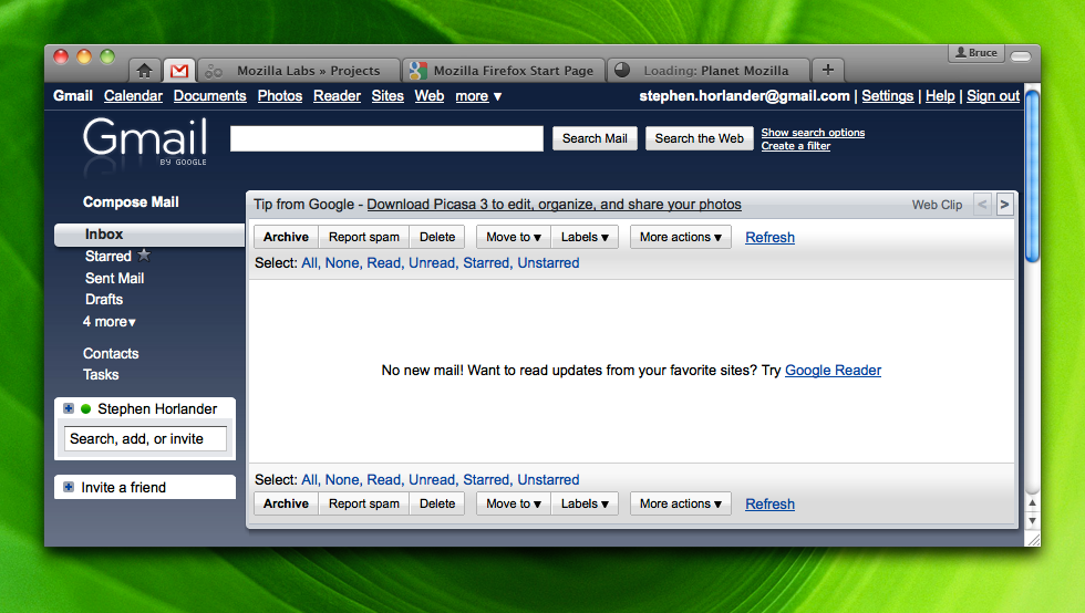
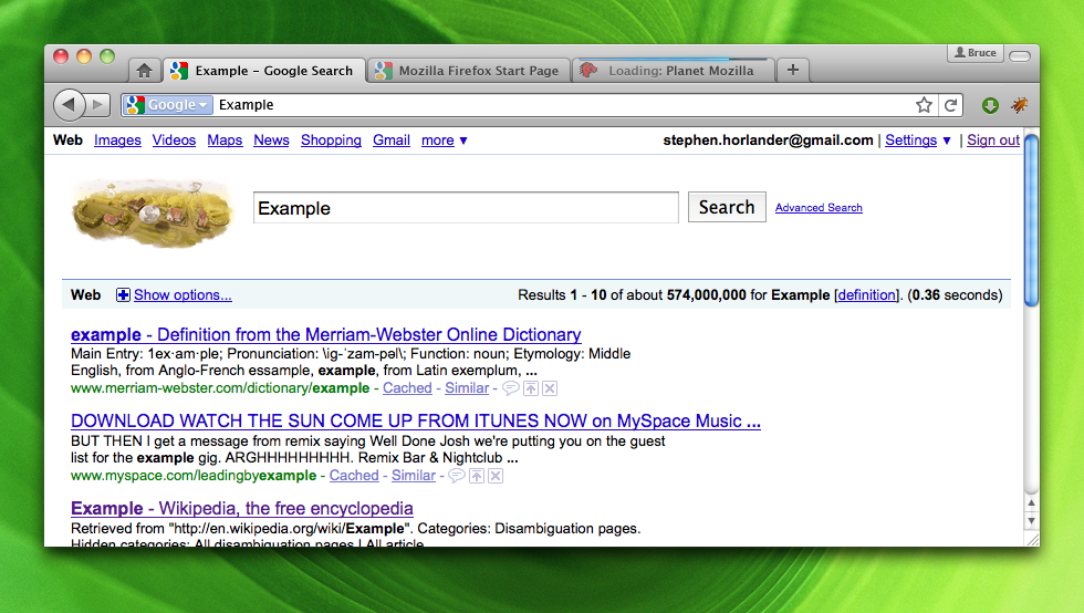
Style changes from 3.7 to 4.0 are fairly minimal except for new elements that must be styled:
- Extensions Area: Proposed idea is to be stylistically different from the rest of the toolbar. Lighter and slightly raised.
- Profile Button: The Profile button can be seen in the upper right of the mockup. The idea is to be attached to the window, much like a label or a tag.
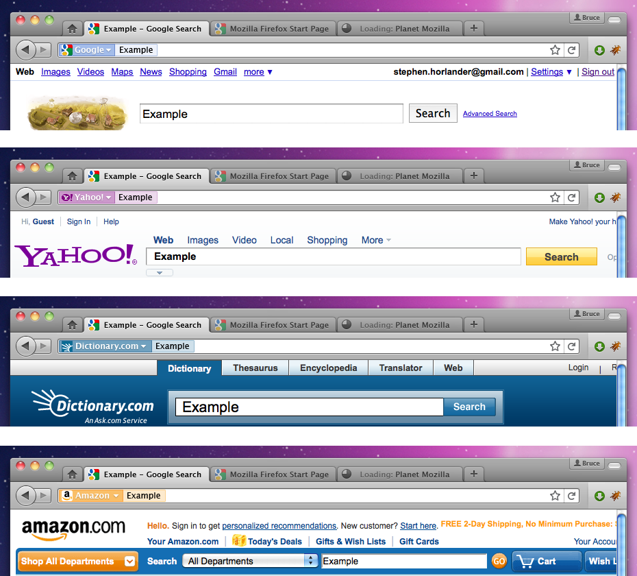
- Search Selector Style: This area is still not fully developed. An idea is to have the search selector change color based on which search is being used.
Small Back Button
Darker Background
 An alternate version with a darker background. This would make active tabs stand out more.
App-Tab Example
 How an App-Tab could look. No toolbars for navigation since all navigation is self-contained in the web app.
Potential Styling for Various Search Types
 This is an area that is not yet fully developed. Potential styling for search selectors in the combined location+search bar could change color based on which search engine you are using.


