Firefox3/Theme/MacOSX
This wiki page is for posting and discussing mockups of Firefox themes for Mac OS X, enjoy :)
The related Bugzilla ticket is Bug 397723.
Contents
- 1 Glass + Metal, 3 proposals (2007 09 29)
- 2 New buttons on previous proposal (2007 09 29)
- 3 Evolution of previous proposal
- 4 Bottom of window with inline find open
- 5 Unified Glass + Metal, 2 proposals (2007 09 29)
- 6 Some inline find options
- 7 More general usage
- 8 Some suggestions from discussion page
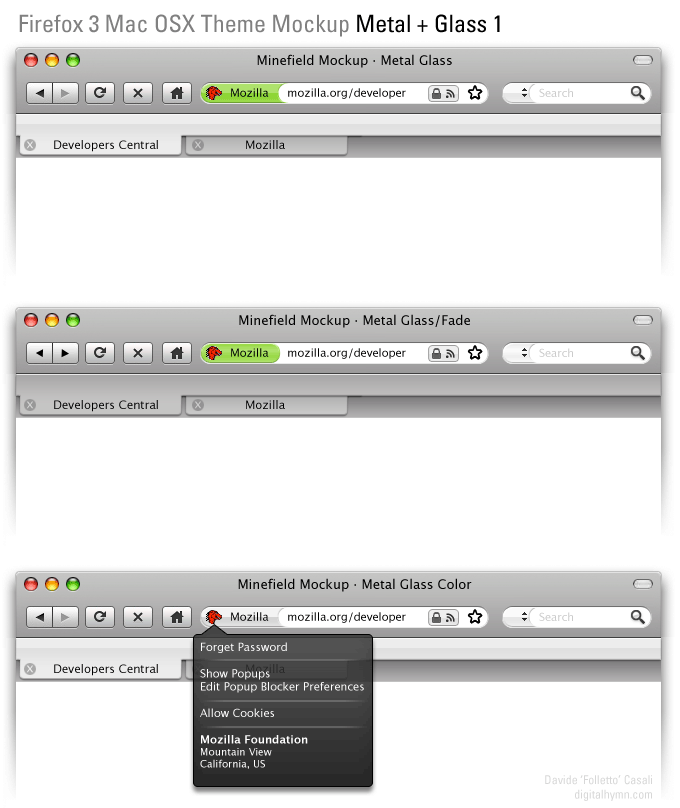
Glass + Metal, 3 proposals (2007 09 29)
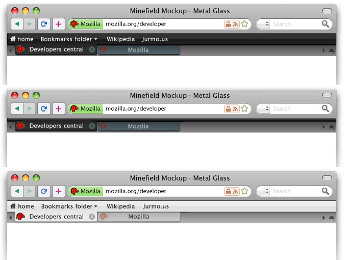
Just a rapid mockup, to support visually some discussion on the Bug 397723 topic. I've tried to add some colors to the icons, but I scrapped them since I couldn't find any interesting solution. :P --Folletto Malefico 22:18, 28 September 2007 (PDT)
New buttons on previous proposal (2007 09 29)
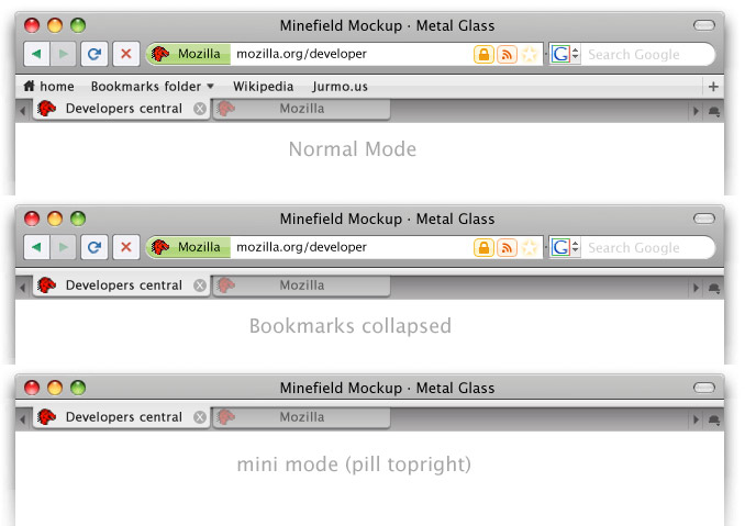
Using previous proposal but with tighter spacing, different buttons inspired by new/macbook apple keyboard, color on buttons for better intuitive browsing and a bookmark bar collapsed mode. Also using leopards new trafficlights. JurMous 03:17, 29 September 2007 (PDT)
Also tried out the more sparse buttons. (combining stop/reload, home to bookmarks and + for bookmarking like safari) Black and white options Black is inspired by the new iMac and iPhone Glass/metal combo. JurMous 05:41, 29 September 2007 (PDT)
Edit: Uploaded new version with correct nav and a black with bookmarks collapsed. JurMous 07:39, 29 September 2007 (PDT)
Evolution of previous proposal
It seems that white is preferred for default skin on which I will continue. Black will be a separate download then.
- Less rounded borders on location: more efficient on space
- draggable thumb to control width of location/search
- separated lock and feed icons. They should animate in when needed for attention (grow pop style)
- the stop button is back (although I prefer stop and reload in one)
- the add bookmark button is placed on bookmark bar as +. More logical.
- Although there is a second option of the invisible glowing star on the location bar. What is better location or sometimes hidden bookmarkbar. And what if you use delicious as I do?
- Pill super minimised mode design for presenters with preopened tabs.
JurMous 14:44, 29 September 2007 (PDT)
Bottom of window with inline find open
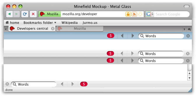
- Always black glass for visibility
- Red matches indicator for visibility
- Status text small with blue thumb
- below top of the window was too busy.
JurMous 16:12, 29 September 2007 (PDT)
Unified Glass + Metal, 2 proposals (2007 09 29)
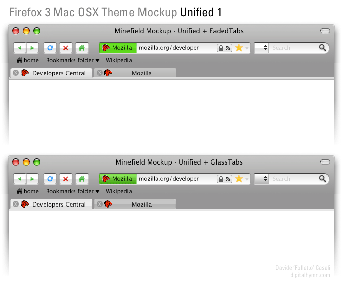
A little test on some other type of tabs-bookmarks-toolbar integration. Still not satisfied, while I think that this approach is a bit better.
- Completely unified toolbar.
- A light visual hint to valorize "back" over "next" button.
- Back to square location bar. Seems better and more efficient.
- Home alternative on the bookmarks bar. Thinking about it, why we need a home button at all? It's just a special bookmark.
--Folletto Malefico 16:33, 29 September 2007 (PDT)
Some inline find options
- Blue, white, brushed metal at bottom and top
- New color for stop and the green.
- Square location bar
- Removed +
- I don't like the prev next buttons yet, should be cleaner. But this is more for general look testing.
More general usage
With all the none rectangle favicons and special icons I tried to create a more generic view. JurMous 03:37, 30 September 2007 (PDT)
- Only RSS on this site
- This site has no confirmed identity.
- Square favicons
- Is a favorite.
Some suggestions from discussion page
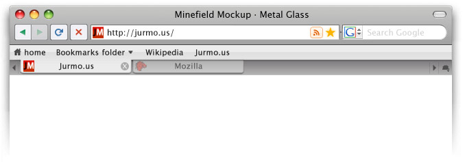
- tabs linked to content. I prefer them linked to bookmarks like earlier because OSX standard (Safari and new Terminal in Leopard) and cleaner unified look. Connected to bottom somehow the browser looks sad... Connected to top happy! :p
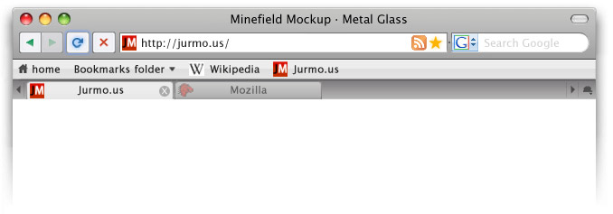
- Favicons on bookmark bar. I think it is too busy. OSX skin should look clean. (I should have picked something else then wikipedia. Maybe something blue would proof point better)
- Active reload button. This is how I imagined it. Glowing. (should fade this image in so illusion of activation will be there) For hovers.
- Some color to the search selector. I think it is too windows now...
- Standard RSS icon. It looks slightly out of place I think. Like previous one better and is close enough to standard I think. (lighter look)
Comments are welcome on discussion page.
JurMous 10:44, 30 September 2007 (PDT)
