Michael's Notes
I'm going through the whole SUMO experience and taking lots of notes as a Firefox user and as a SUMO contributor. I'll also be looking at how other great support systems work. These are my raw notes and ideas.
Just to be clear, SUMO is pretty awesome and when I learned how it gets done my admiration only increased. All notes, ideas, suggestions, etc. are all about how to improve on something great.
Contents
- 1 Raw Audit Notes
- 1.1 Getting started with SUMO
- 1.2 Contributor Experience
- 1.3 User Experience Videos
- 1.4 Ideas from other places
- 1.4.1 Help Article Tabs
- 1.4.2 How-to, overview, or tutorial videos
- 1.4.3 Quickly narrow down forum posts for answering
- 1.4.4 Badges, Points, Reputation, Stats
- 1.4.5 SUMO Video Converter
- 1.4.6 Screenshots with Flickr-like notes
- 1.4.7 User focused blog - kick ass with Firefox
- 1.4.8 New user mode/extension
- 1.4.9 Crash reporter suggests a KB article(s)
- 1.4.10 Different templates for different KB Articles
Raw Audit Notes
These are my notes from research, personal observation and from doing some user experience testing. From these notes I'll be generating recommendations for things we can change now and recommendations for things we can include in the new KB PRD. These are not presented in any particular order and items are not assigned any kind of importance.
Getting started with SUMO
- Can't find the help menu or people don't know to look in the help menu. I think the help menu is associated with OS built in help which is generally pretty crappy. They don't really expect to be taken to a website. We need other ways to let people know about the support site.
- Mac help menu has a search but that doesn't search SUMO - it searches unrelated documents on your computer.
- Searching - in general you have to think about what to type - how specific should you be? Need good browsing options.
- In a test search results keyed on the word "not" and listed random forum topics resulting in lots of searching through the forums (and not the KB - because the search offered only searched the Forums).
- The search should have picked up on "passwords" instead of "not" and show https://support.mozilla.com/en-US/kb/Username+and+password+not+remembered as the first result. We really need to take a closer look at optimizing the search results.
- As a result of the poor search results, the tester ended up in an almost endless forum thread loop, which isn't an ideal problem-solving experience (if a KB article exist for the problem, it's always better than specific forum threads)
- SUMO start page doesn't really tell the story that it's made by the community. That info is in a tiny box in the sidebar.
- The word crash doesn't appear anywhere on the SUMO start page yet it seems like a pretty big deal if you look at live chat or twitter.
- If you have Firefox quits or crashes as your problem and you go to SUMO you see lots of problems but not quits or crashes - so what do you search for? What is it called? Is it (crashes) called something else because it's not listed on the page with all the other problems?
- Suggested searches in the big search box seem to me like they should take me to a category page, i.e. the "Bookmarks" category page – not a search results page. When I click a link I expect to go to a page not search results. Yes the link is in a search box/section but still it seems off to me.
- Search results are kind of overwhelming. After finding SUMO, I have to figure out what to search for and then I have to weed though a thousand search results!
- What is up with the navigation on the top right? It's different on the start page and all the internal pages. Why?
- When you try to follow the right hand navigation in order you get skipped around - it's very disorienting.
- Navigation in upper right - "Get Personal Help" confusing wording
- All the main SUMO pages have a big yellow search box at the top even when the supposed purpose of the page is not searching. Also some of those search boxes search different things - that's not obvious at all. I didn't notice that until many many times through those pages.
- Difficult to tell where the search results take you - Article or Forum (they are not distinguished from each other).
- Clear and straight-to-the-point language should be the general theme of the whole website.
- We have rainbow dolphins on mozilla.com - the language of the site should compliment it.
KB Articles
- Language of the articles - We have rainbow dolphins on our home page! The articles should match that tone while still be respectful and considerate of the fact that people are having problems with Fx.
- Overall article design above the fold should be about helping you determine if you are in the right place - highly scanable!
- I'd like to see related articles and search in place of the actions box. We're doing this for the helpfulness tests.
- Also I'd like to see the related articles have the option of being manually set.
- Platform specific screenshots are good! They help let you know you are in the right place.
- Opening paragraph needs to quickly help you determine if you are in the right place. That can be used in conjunction with related articles and search being located in the actions box spot.
- Article page titles need to match what you clicked on to get there. It's really confusing to click on a link called "Awesome Bar" and be taken to a page called "Location auto complete"
- People don't seem to read. Embed videos directly and put them above the instructions. We will be testing this.
- Contributors should get credit on videos (like they do on articles, translations, forum posts).
- I think we should point people to related tutorials to help prevent future SUMO use. This can maybe be done as part of related articles or maybe as a recommendation at the end of an article.
- Video doesn't play when clicked - you have to click play (so two clicks to see the video). This can be solved by embedding the video inline.
- Without narration it's hard to know when the video is over.
- Without narration you can't explain choices in the video (in this case it was clear recent history - there were many items that you could clear that weren't explained)
Support Forums
- When I go to the support forum it just looks like a search page! I question whether I'm in the right place or not.
- There is only a tiny tiny link on the support forum home page to the actual support forum. This is like trying to find the phone number for a company and they hide it 18 pages down somewhere to discourage you from calling. That pisses me off.
- I'm not sure about this popup survey on the support forums. It has the behavior of spam.
- Support forum initial survey gets in the way of what I expect. I expect to see a forum and search for my problem. Instead I have this crazy long thing to click through.
- Support forum survey - step 3 - Ask this? or Next step? - This is way too much thinking going on here - it's REALLY frustrating.
- There are various search bars around that search different things (KB or Forums or KB+Forums) but they all look the same. It's possible to not realize this and get stuck in a loop of just searching through the forums while missing KB articles that could solve your problem.
- Links to mozillazine website not very helpful - bad layout, looks confusing.
- Answer to a question (with Windows listed as OS) gave windows specific instructions. A tester using a Mac got lost trying to follow the instructions because the menu choices are different.
Live Chat
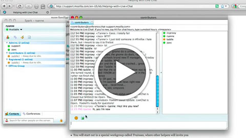
- Where is live chat? - Way too hard to find.
- It would be great to support options with icons
- Live chat closed - please come back later. No other information is easily visible. The live chat hours are listed in the sidebar. It took a long time to discover them there. Why are they not displayed right there where the we're closed message is?
- Live chat closed message should show you the next time it's open.
- Live chat - click for more options takes you to the same page(?) with the hours? That's incredibly confusing.
- Asking which extensions you use on login? Can they be detected? Do you have to list them all.
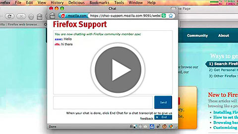
- Nice that it tells you where you are in line.
- Link to KB while waiting - will is open in a new window or will it knock you out of the queue? Maybe it should tell you.
- Tester found it to be a good experience (for being a helper) to see the process from the users side.
- "Agent typing" notification is helpful
- I'm curious why they had the tester try a strange video site instead of something like YouTube that most every user with a video problem would be familiar with.
- Smart that you can email yourself a transcript of the chat.
- Sent transcript message could be more obvious.
Contributor Experience
- How do you even find out about being a SUMO contributor? It's really hard to find. Just that little ad on the SUMO start page (but the people heading there are there for help not to be helpers).
- Mozilla main navigation - Support > Firefox support = Community > Support!!! That's crazy. Community > Support should go to "How to contribute" or some such other contributor get started page.
- Link from Mozilla.org just takes you to the forums - we need something better than that.
- How to Contribute page is not very inviting. Besides missing a header (can we fix that ourselves?) it's just a list of stuff. It needs a video for sure. It needs some specific things to do to get started. It needs to make finding other contributors much easier.
- How to contribute page layout - Needs a video, needs to tell a story. Hi > watch this > register > talk to these people > go help people.
- Each subpage needs to be better - way too much reading. They jump right into the details without giving much of an overview or motivation for starting.
- Why do we have a Google Group/email list AND a contributors forum AND IRC? Isn't the forum and IRC enough? I didn't even know about the email list.
- Contributors forum looks just like the support forum. That's confusing. You should be able to tell you are in a different place. It's needs it's own theme or something - maybe a graphic for now.
- Mibbit IRC gives you a security warning! Is there any way to have that not happen? Or tell people that's it's ok?
- The SUMO blog is boring :(
- SUMO twitter looks abandoned - are we going to use that or switch to firefoxcares?
- It drives me crazy how many times a day I get logged out of SUMO.
KB Contributor
- Improve the knowledge base link takes you to Contributing to the Knowledge Base.
- Contributing to the Knowledge Base has "What to help?" as a section.
- Again my feeling with all of the contributor documentation is that it doesn't lay things out clearly. What should I expect. Where do I start? Then what do I do next?
- It's suggested to go to the contributor forum and read helpful comments threads but I don't understand what to do next. Do I just go around implementing all user suggestions?
- Screenshot and Screencast documentation needs to be updated. Should have some good tutorials for making good sceenshots and screencasts - not just how to insert them in the wiki.
- It would be great if we can get a tool like the video converter specially written for SUMO use (it's just a simple GUI for ffmpeg2theora).
- Flash videos are required but there are no instructions for creating a flash video.
- There is a section on "Making edits" with the first step of: Go to the knowledge base article you want to edit. How would I know what article to edit? How would I know what edits to make?
- Why are there crazy random folksonomy tags listed when you edit an article?
- What is the allow HTML check box for? Will that allow HTML in the article I've edited above? If so, why not put that before the editor? Also, if you can use HTML why do we have to use wiki markup?
- As much as it's a pain to use wiki markup it's an extra pain that the KB wiki uses different wiki markup than other Mozilla wikis.
- What if I don't know how to use IRC?
- There are lots of things only linked from the sidebar that you get when you are logged in. Given that I often get logged out multiple times a day this is a real problem because I forget that's where they should be.
- Also there are multiple menus in the right sidebar and they are poorly organized and designed - it's a real chore to find things there. In fact, it makes me angry trying to use that thing.
- Why is the whole process for requesting and reviewing articles hidden on a forum that you can only get to by going to the contributors forum and clicking the link in the sticky forum thread?
- What is the difference between KB Policies and Best Practices?
- I know there is a style guide page but couldn't find it for the life of me. I had to use advanced search to get it to turn up.
- I'd like to take a well written article as an example and mark it up with what I was thinking/the reasoning behind everything.
- Chris walked me through configuring dynamic content, themes and modules and all I can say is that it made Drupal look like the poster child for ease of use.
Forum Contributor
- Tester said that she usually goes to unsolved topics or topics with no replies and then searches for topics she can answer, i.e. "video." In our forum there was no way to whittle topics with no replies down to "video." She had to manually scan subject lines.
- Quotes from tester: "Am I allowed to just type in the answer here?" "Do I have to register?"
- Timestamp - It's not clear what it is. Maybe it should say "Posted on" before the timestamp to make that clear.
- Once the tester got to the forums, she got right to work but didn't get any info or message from the SUMO community welcoming or thanking her or giving her any kind of guidelines.
- After previewing a forum response you have to put in a second captcha to submit/save the response.
- Providing forum support page: Not sure where to go – Contributor forum? No real sense of what the next step is - answer questions, talk to people in the contributors forum. Should you introduce yourself or should you register?
- Where do you register? Login? Not sure if that is right. Oh that has a link to register. It says you don't have to register but do it anyway.
Live Chat Contributor
- Seems daunting when first looking at it. I'm not at all sure what to expect as a live chat helper.
- Video introduction could really help explain what the experience is like and why it's fun.
- Vital documents are incredibly hard to find and then have confusing name - "issue guide" vs. "troubleshooting guide" - what's the difference?
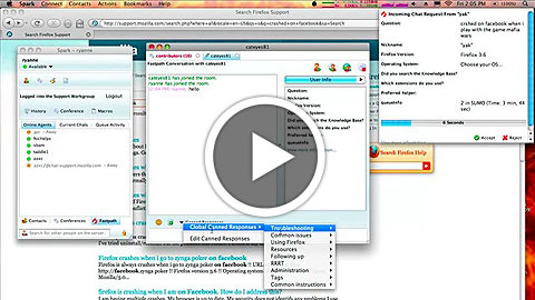
- Need centralized Live Chat helper dashboard. (this week's issues, links to other documentation)
- Documentation text should be a personal call to help - convey that people love doing live chat. We should record user testimonials at the summit.
- Even though tester is already signed up for a SUMO account and has seen the how to contribute page she still has a really hard time getting back there. How to contribute is missing from that top right navigation on the SUMO start page but is present in the other navaigation that takes it's place when you move to another page.
- The tester was confused about what spark (there were multiple options) to download
- confused about spark being or not being a mozilla thing - asked about chatzilla
- spark dmg didn't have install instructions (drag to applications)
- Tester worried about the overall process - doesn't know what to expect but is doing it because we asked.
- It's unclear (except for the tab name) to the tester where she is. She questions whether this is a chat room for helper or for people that need help.
- Tester afraid to ask questions.
- Tester has to type in IRC commands without knowing about IRC or that she's in IRC - so they don't make sense to her
- When a new helper is invited to a chat they can't see the most important parts of the interface
- zzxc tries to explain things in IRC but tester doesn't have the options that he's describing
- Tester added to someone's chat but without the important interface elements and without being able to see the question it seem of limited use.
- Another helper (there are 2 on this chat) told the user to use keyboard commands - didn't help
- other helper gave better but still vague instructions - didn't help
- Then tester gave more specific instructions including where to look for the menu and then the user was able to fix their problem.
- What do you do when the chat is over?
- Incoming request notification - bad placement on Mac + no control over placement
- Not clear at all how to control incoming request notifications
- Main Spark window not open wide enough by default to expose all of the interface - it took a long time to discover this.
- For new LC helpters It might really help to have some orientation videos that walk you through common tasks like troubleshooting extensions or picking the right canned response so that they don't have to discover this process on the fly while helping someone.
- Basic troubleshooting video would be good for everyone!
Localization Contributor
- Documentation - no hello, how are you. It just jumps right into it. Looks daunting.
- "Go to the article you would like to translate. Here is a list of articles." That page says only 85% of articles are translated but doesn't show any articles as needing to be translating.
- Docs mention adding screenshots but don't link to instructions for adding screenshots.
- No mention of style or writing guidelines - do you ever run into situations where things don't translate directly?
- I'll need to work with Kadir on this. I haven't set that up yet.
User Experience Videos
- Dylan - finding answers to questions and finding more information about Fx features (Ogg video 25min).
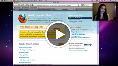
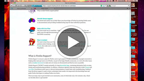
- Ryanne - answering a question on the support forum and finding out more information about getting involved as a community member (Ogg video 24min).
Ideas from other places
Help Article Tabs
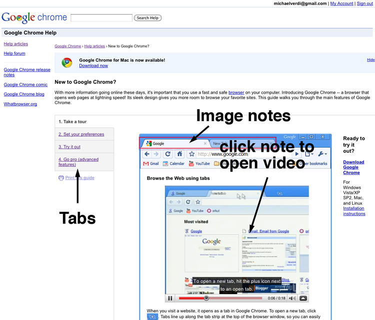
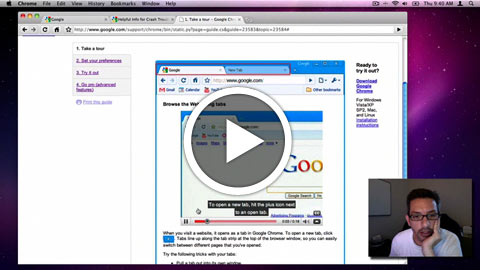
I like this idea from the Chrome support site. I think it's pretty poorly designed but the idea is worth investigating.
- Here's the page I'm talking about.
- This is also similar to an idea on Microsoft's site where additional or advanced information/steps are hidden in a collapsed div.
- Here's a video of me walking through it (Ogg video 3min):
How-to, overview, or tutorial videos
LOTS of support sites have these, including the sites for Chrome, Safari and Internet Explorer. I'd love to see us have some on SUMO. I'd especially like to offer them at the end of a related KB article. Take the Bookmarks article for example. It has a nice screencast at the beginning that gives you a great basic example of bookmarking pages. At the end of the article it gives you LOTS of links to related articles that will show you just about everything you can imagine about bookmarks. Since this article is general information about a Fx feature and not a solution to a specific issue, it would be great is to have a bonus top Fx features/make your life easier video embeded here (and on other articles like this).
- Apple has a nice Safari video explaining it's top features (Ogg video 4min)
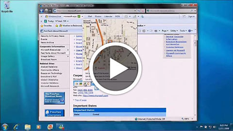
- Here's an IE video that was featured on the front page of their support site (Ogg video 1min)
- Here's a great Firefox video that highlights features but doesn't go into enough detail (Ogg video 1:45)
Note: Howcast has talked to Cheng and I about wanting to make a couple of videos like this. It would be great if they did but I think we should have some whether they come though or not.
Quickly narrow down forum posts for answering
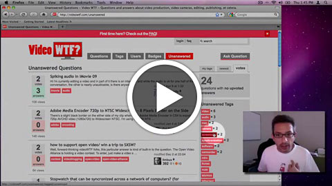
Being able to narrow down the field of posts to look through is especially helpful if you only have a short time to answer questions and/or you have a special area of expertise.
Badges, Points, Reputation, Stats
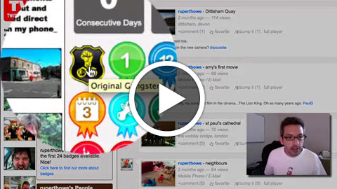
I'd love to have some automatic way to recognize contributor achievements. It would be nice to try to inject a little bit of fun or whimsy into answering questions.
This idea on a whole other level would be to make SUMO into a game in the way that Jane McGonigal talks about them. Video - http://input.graymattergravy.com/post/456614213/prostheticknowledge-jane-mcgonigal-gaming-can
SUMO Video Converter
It's one thing to ask people to contribute text but it's another thing altogether to ask for special encoded videos. It would be great to have a super simple, no fail theora (or VP8!) encoder for screencasts. Miro makes a desktop app and Firefogg is an addon - both are open source and basically add a GUI to ffmpeg2theora. We should have a SUMO (app or addon) that optimally encodes things for the KB with drag and drop simplicity.
Screenshots with Flickr-like notes
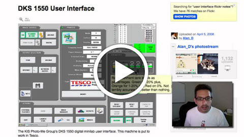
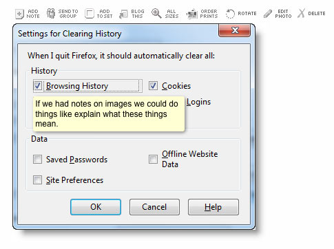
Instead of having contributors mark up screenshots in an image editing tool, we could build a notes tool right into the article editor.
Also having a feature like this would integrate with the Chrome tab idea. In that there was a screenshot of an interface that linked to videos.
User focused blog - kick ass with Firefox
This is another idea about going beyond solving immediate issues. Maybe those cool videos I mentioned earlier could also live on a blog that collects great tips for getting the most out of Firefox. This is not the super technical things like messing around with about:config but easy tips that we all learned from living and working with Firefox.
Here's two examples from Deb Richardson's blog:
New user mode/extension
What if there was an extension or Fx mode that turned on information buttons or extended tool tip like UI elements that linked to relevant support articles?
Crash reporter suggests a KB article(s)
When Firefox crashes it would be great if the crash reporter could give users a link to relevant (I'm not sure how much info the crash reporter "knows") KB articles – Firefox crashes at the very least.
Different templates for different KB Articles
Not all articles have the same type of information to display. We should different templates designed to best display a particular kind of article. For example a general, how to use a feature article could have a different layout from a troubleshooting article with multiple sets of steps.
