Mobile/UI/Designs/TouchScreen
Contents
Touch Screen UI Designs
The Touch Screen UI design has the following goals:
- 1-2 taps for most frequent activities
- Finger taps -- no stylus required
- Familiar (to desktop users) where possible
- Intuitive
The design proposals described below attempt to meet all these goals.
Touch Screen UI Design V1
Update: Some changes being considered:
- Replace the Bookmarks screen with a Places screen that allows access to bookmarks and history, a la FF3 desktop.
- The chevron in the URL textbox will not launch a history screen - options are typed URLs, most frequent URLs, or a combination.
- Feedback already posted below.
Main Screen
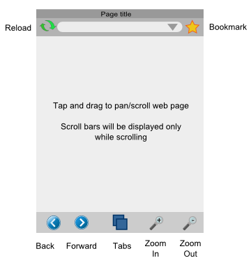
The main browser screen is shown at right.
The toolbar at the bottom contains the most frequently used functions - back/forward, zoom in/out and tabs. This toolbar cannot be hidden, and is generally present in all browser screens. The buttons may sometimes change depending on the screen.
Web page content is displayed in the center panel, and can be scrolled/panned directly by dragging. Scrollbars are normally not shown to maximize screen real estate, but can be shown during scrolling to provide a visual cue of the overall page size. (Suggest persisting scrollbar on screen for, say, 3 sec after panning, allowing user to then drag scrollbar. This provides much faster scrolling through long documents since with such a small screen, getting to bottom of long document takes many many pans on an iPhone.)
At the top of the screen is a title bar with a hideable toolbar beneath. This toolbar has a reload button, a URL bar, and a bookmark button.
This UI layout enables quick 1-touch access to the most frequent browser activities.
Comments
| Comment | Discussion |
|---|---|
| I'm not sure if this belongs in the comment section but I've created another wiki entry containing a few design notes for smaller screens... just a few notes and a few mockups. Basically, I tried to come up with a structure that could be used on anything from a 160x160 numpad-device to a 640x480 touchscreen while sticking as closely as possible to the usual cellphone UI conventions... It's not finished yet (for example there are no notes so far on how the numpad could be used to get to far away UI elements without continously hitting the direction buttons) but maybe you can get a few ideas from it. --Hansschmucker 11:30, 3 February 2008 (PST) | |
| It may be tough to tap the title bar with your finger without hitting the URL bar by mistake. | True, this will probably be frustrating. --Venky
I know its never been a popular idea, but there's also the option of combining the titlebar and urlbar into one thing. Only show the url when its being edited. That actually should compliment Places match-the-title-or-url abilities. -DD2K |
| One thing to consider is simply scrolling the title bar off the top of the screen when you scroll down through the page, as the iPhone does. | Another option is you can just drag the title+toolbar away to the top, and it vanishes. The key here is to distinguish between a tap and a tap+drag. --Venky |
| One of the design principles/goals for the original Firefox was to maximize the amount of space available for web content. I think that is a very good goal to have as it makes you think about what is really necessary to have on the screen all the time. So one option to consider is to have the "cannot be hidden" items, be available through e.g. a transparent icon (perhaps an embossed Firefox icon as TV channels use) that when tapped will bring up these "cannot be hidden" items. /Christian | Another way to pull the title and toolbar back into view would be to scroll to the top of the page, then, once you have reached the top of the page, keep scrolling, which brings you to the title and tool bar. To keep people from accidentally bringing up the title and toolbar, there would be a distinctive "click" sound when you reached the top of the page and couldn't scroll up it any farther. Then you would just scroll up a little more, and the title and toolbar would appear. It would be intuitive. |
| Many smartphones (incl all Windows Mobile 5+ devices) only have 2 smart buttons at the bottom. It would be logical to offer just two options in the bottom button bar. And map zooming to a tap-drag button on the top bar or the scroll wheel/updown buttons on some devices. Or at least visually highlight the button that is bound to the smart buttons.
Another option would be to have a history context menu and a zoom context menu. The smartnutton would activate the respective option. The D-pad or a tap+drag would then result in the requested action. Not that I don't like the easy accessibility this design offers, it just doesn't match any of the UI design principles used by the hardware vendors atm. /JesseHouwing |
|
| It seems to me that the zoom in and out would be much more useful as a slider. -Nick | It may be better to have just a gesture for zooming, similar to picsel browser, so the browser can be operated with one hand. Perhaps having a flick and natural scroll like in PocketCM to move throughout the page and if the picsel gesture is copy written then just making a clock wise circle with your thumb to zoom in and counterclockwise to zoom out. |
| I did not see this covered, but I would like to be able to tap and hold on a link or image in a web page and have a menu pop-up just like when a link or image is right-clicked in the desktop version of Firefox.
Some of the items I'd like to see in this menu include:
--Kpr 01:03, 8 February 2008 (PST) |
|
| I'd like to be able to zoom in and zoom out on images too instead of only text. Furthermore, I would like to be able to zoom in on text and images as much as I like without any limitation. --Kpr | |
| Will there be a way to drag-select text for copy and paste? Potentially a mode where this is the default action for tap and drag? --JimPark | |
| I didn't read this anywhere, but for the G1 there was a Tetris game that you could choose which button did what to the tiles, like I would decide the rolly ball to flip the tiles, tap to drop them and slide to move them side to side. Something along those lines. So when creating this for the G1 which I hope you will, you can have it where we can choose which button or function does what. And I think the rolly ball would be best for zooming in and out!
-- : [[Kokoroneko 07:28, 2 February 2009 (UTC)]] |
|
| I really wonder how this is going to work in Landscape Mode, as this draft of the button bar seems to take away a lot of screen space, once the screen is turned by 90deg (assuming it remains at the bottom of the screen)... You might reduce the size of the buttons and place them at the right hand side of the screen.
2ndly: Do the Buttons really have to be that much bigger than the common Windows Mobile Softkeyboard? --Lukx 22:00, 3 February 2009 (UTC) |
|
| It looks to me like the toolbars will take up alot of space (as other people seem to be saying). I'd just like to throw out there the idea of having the toolbars be "embedded" into the webpage, so the top bar will be above the content of the webpage and the bottom one below it, so you'll have to scroll to the top of the page to access the top toolbar.
IDK if that's really doable, but if so it might at be done just with the bottom toolbar (personally I wouldn't access those features much). Alternatively the "press and hold" (or equivalent of a double click) might reveal a menu that gives you the options of the toolbar(s). --Modred11 07:21, 28 October 2009 (UTC) |
Maximized Main Screen
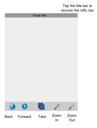
The URL toolbar may be hidden by tapping on the title bar. This increases the display area for the web page.
Tapping the title bar again re-displays the URL bar.
Comments
Mobile phones screens are SMALL. The full screen mode should be a real full screen : no title, no URL, no buttons, no Windows/Palm/Symbian/Mac bar, no scroll bar, NOTHING but the web page. Of course, double-tap should turn full-screen off. And a popup menu should appear on a long-tap to offer common items (bookmarks, URL, previous/next, quit, refresh, ...).
In addition, a x-small font should be available in the browser.
URL Entry Screen
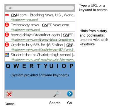
Tapping the URL textfield opens a new screen as shown to the right. This screen displays a textbox at the top that displays the currently entered text. The user may enter a search term or a URL.
Below the URL/search-term text field is a panel that display hints from browsing and search history and bookmarks that match the entered text. The number of hints shown depends on the display height but in any case the height of each entry field will be sufficient to allow easy touch access. Note: Clicking on any hint will immediately launch that URL.
The system provided software keyboard is displayed below the hints panel. This is optional and is displayed only on touch screen devices that do not have an integrated QWERTY keyboard.
The toolbar at the bottom has a new set of buttons. The "cancel" button returns to the main screen, the "go" button launches the URL entered, and the "search" button invokes the user-defined web search engine with the text entered as the search term(s).
Comments
Page Load Screen
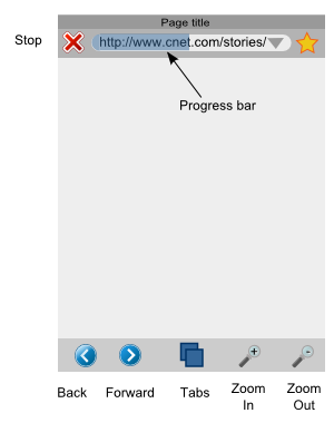
When the user clicks "Go" or "Search" in the URL entry screen, the browser displays the page loading screen.
This screen is essentially identical to the Main screen, except that the "reload" button is now a "Stop" button, and allows the user to cancel the request.
Page download progress is displayed in the URL box.
Comments
| Comment | Discussion |
|---|---|
| Changing of the reload to stop has a really nasty effect; talk to any iPhone user and you will likely encounter them griping about it. The issue is that you start a page load, decide to stop, and while that command is moving your hand to click the stop button the button changes to reload, so you end up reloading the page you tried to stop loading. Very confusing, and annoying. --Heikki | It is probably a good idea to have the stop button switch to an intermediate disabled reload button (having a visible difference in color with the real reload) for a couple of seconds before becoming a reload button.
If the user presses the button just as it is changing state from stop to disabled reload, nothing will happen. Two seconds later, he will be able to reload the page for real,. There probably isn't any real world usage where the user needs the real reload button less than two seconds after the page has loaded. --Pat Good idea, Pat. I was thinking along the same lines also. --Venky |
History on Main Screen
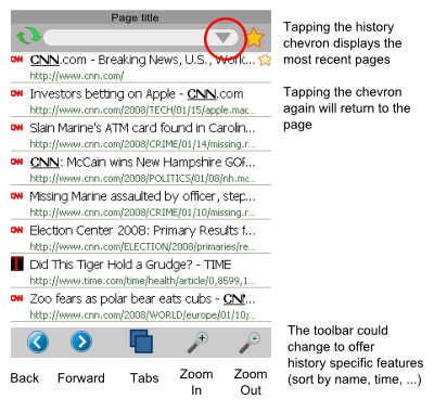
To allow easy access to browsing history, the URL box includes a history chevron at the right.
Tapping the history chevron displays the most recently viewed pages. The list is displayed with the most recent page at the top.
For discussion:
- The toolbar icon at the bottom can show different buttons that allow the user to sort the history list in other ways - name, frequency of access, etc.
- The title bar and URL bar can be removed in this screen to make more room for history items.
Comments
Bookmarks
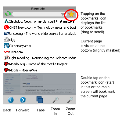
The bookmark button allows one tap access to bookmarks. The bookmarks are displayed as a list that can scrolled easily by dragging.
This design assumes that mobile users do not typically have many bookmarks that are organized in folders.
Double-tapping the bookmark icon will add the current page to the list of bookmarks. This can be done either in the Main Screen, or in the Bookmark screen.
For discussion:
- The toolbar at the bottom can show different buttons for bookmark-specific functions such as sorting by name or frequency, display folders, etc.
- The title bar and URL bar can be removed in this screen to make more room for bookmark items.
Comments
| Comment | Discussion |
|---|---|
| In Firefox 3 (desktop), a single click on the star adds a bookmark. Introducing this inconsistency should only be for a very good reason. Can we look for alternatives on this one? | This is possible. We could have a single tap bookmark the current page, and a double tap open the bookmarks.
The reason for the proposed design is that we more often access bookmarks than create bookmarks, so use 1-tap to show bookmarks, and 2-taps to add. --Venky |
| If a single tap on the star opens the bookmarks list, then please add a "plus" (+) button in the bookmarks list to bookmark the current page. I do not think double tapping the star to bookmark a page is very intuitive.
Furthermore, consider changing the star to a book icon to make this functionality more clear and make it look different than Firefox 3 since it is acting different than Firefox 3. --Kpr |
|
| Please allow the bookmarks to be searched. --Kpr |
Tabs Screen
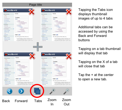
Tapping on the "tabs" button in the Main Screen brings up the Tabs Screen. This screen displays thumbnails of up to 4 tabs and allows the user to tap and select a tab.
The back and forward buttons in the toolbar can be used to scroll/pan across additional tabs if present.
Tapping on the + icon at the center creates a new tab, and automatically selects it, returning to the Main Screen.
For discussion: Scroll/Pan can also be done by dragging the screen. The toolbar can also display a different set of buttons that are more relevant to the tab operations.
Comments
| Comment | Discussion |
|---|---|
| The use of Back/Forward buttons to navigate among sets of 4 tabs is not intuitive. What about adding left and right arrows at the left and right sides of the screen in a row with the plus sign? | True. In hindsight (being 20/20), we should have removed the titlebar, put only X (cancel) and + (new) buttons in the bottom toolbar, and let the user scroll by dragging left or right in between the thumbnails. What do you think? --Venky |
| I think "Tabs" should be renamed to "Pages" since there really are not any tabs like we are used to seeing in Firefox. For devices with bigger screens, please consider adding real tabs to the top of the Main Screen. These tabs can be named "1", "2", etc. to save space. --Kpr |
Mockup
A XUL mockup is available at [[1]]. Not all features described above are working, and the XUL/JS code is experimental.
To run the mockup please type:
firefox -app <path to where its unzipped>/touchscreenbrowser/application.ini
To do
- Main Screen
- History chevron in URL box
- Scrollbars while panning
- Zoom-to-fit on page load
- Is there a simple way to do this?
- Make zoom really scale the page. Currently, we do not scale, just relayout
- URL Entry Screen
- Selecting from a hint
- Scrolling hints via dragging
- Software keyboard
- Search button
- Page Load Screen
- Progress bar
- History on Main Screen
- Bookmark Screen
- Tabs Screen
Comments
| Comment | Discussion |
|---|---|
| I'd like to be able to select text on a web page and copy it. --Kpr | |
| Please consider adding View Page Source support. --Kpr | |
| Tap and hold pop-up menu support similar to right-clicking in the desktop Firefox.
Consider including in the menu:
See my comments under the Main Screen section above for tap and hold on a link or image. --Kpr |
|
| Please add a mode to optimize how a web page or column is being viewed in order to minimize / eliminate scrolling right and left, even when zoomed in. --Kpr |
