Mobile/UI/Designs/TouchScreenUserContribHansSchmucker
Contents
Alternative UI concept for FFMobile
This page is an attempt to add some fresh ideas to the current mobile UI for Firefox. Note that it isn't official, it's not scientific and it doesn't look as professional as work done by a real designer. It's just an interested user's notes. Nothing more, nothing less. I'd love to hear any comments on the Talk page.
Considerations
The current sketch for a mobile UI seems to focus very much on current WindowsCE PDA interface conventions and as such largely ignores touchscreen smartphones. In my opinion this is a bit of a flaw because at the time FFMobile reaches the market there's the very real possibility that real smartphones (i.e. ones where the smartphone functionality will be embeded in a standard phone interface instead of the phone functionality being embeded into the PDA interface) will be widely available. As such it's worth considering an interface that can be shared across devices including touchscreen, non-touchscreen, high-resolution and low-resolution devices.
UI resemblence
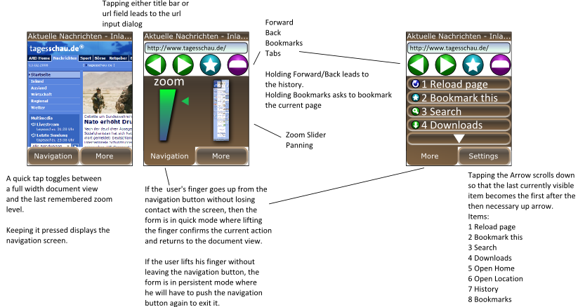
Instead of making a full fledged PDA interface, it's important to remember that a common scenario for the UI could be that it's running on a very small interface. So maximising the available screen real estate is important. In fact, on many of todays cellphones it's expected that the application hides additonal functionality behind two to three buttons which either are directly mapped to hardware buttons or can be tapped without using a pen on touchscreen devices.
Pro and Cons of a clean main screen
Freeing the main UI of anything but the document view has of course the advantage of offering the most space for actually displaying the document, but it also has the important disadvantage that every action will take at least two commands: 1. Enabling the menu via one of the big buttons and 2. Performing the desired action.
Additionaly, some information that isn't included in the document view isn't visible until the user enters the corresponding menu.
Nested Menus
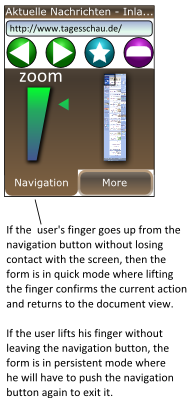
With nested menus each action consists of two commands and using standard interface elements this cannot be overcome. However, if we add a form of simplified gestures to the mix where the user presses on the navigation button but releases over the value or command that he wants to see changed or performed we get an interface that is still self-explanatory but can be handled by the experienced user by memorizing these strokes.
Invisible location problem
Another problem with the clean UI approach is that the location of the current document isn't always visible to the user. In order to get around this problem, we first have to realize of what use the location is to the user. The first is quite obvious: The location is often necessary to really identify a page if the title is not descriptive. Then there's the security aspect of the user verifying the supposed location after following a link.
These points can easily be solved by inserting the document location into the document, much like the iPhone does. Additonaly, such information can be conveyed on a loading screen.
To be continued
These noted are a work in progress and more will be added lateron.


