Mobile/UI/Designs/TouchScreen/Proposal4
Here is another proposal briefly discussed on the March 17th conference call.
While we like the embossed logo idea in the previous proposal we felt it had aesthetic issues - the semi-transparent logo does not look good on all web pages, and sometimes merges with the content in busy web pages.
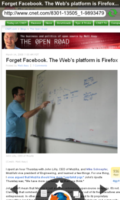
We propose a variant where the logo is opaque, and is only half visible at the bottom of the page. The logo is surrounded by a white border to clearly distinguish it from the web page.
Tapping on the logo activates:
- a quick access menu around the logo, which shows the top 3 frequently used functions
- back & forward navigation arrows
- the title and URL bar at the top
The wheel can be rotated with your finger to show other (less-frequently) used functions.
This design was named the "rising sun design" on IRC :)
Some feedback is already available on DougT's blog (http://dougt.wordpress.com/2008/03/17/a-few-mobile-screenshots/).
Submitted by Venky (irc:venky), Niranjan (irc:njan) & Xiaogang (irc:xzhou)

