Mobile/UI/Designs/TouchScreen/Spatial
This part of the proposal seeks to unify the concepts of bookmarks, tabs, and the starting page. It takes advantage of the strong spatial navigational skills that people posses.
Tabs
Opening Screen
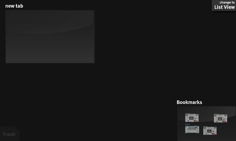
The browser opens to the spatial view. Your options are to click on new tab (see page's discussion), switch to list view (which won't be very exciting), or click on the pre-populated bookmarks section.
Clicking on the new tab zooms into the tab, and brings up the URL bar + pre-populated awesome bar (as per Proposal 8), possibly with an update visual style (todo: mockup).
Clicking on the change to list view switches to the list-style view (see below).
Clicking on the bookmarks section zooms into a spatial view of the bookmarks.
A note about the trash. Trash doesn't appear as above until there are tabs (or bookmarks, when looking at them) to get rid of. I'll come back to the full behavior in the next section.
Spatial View
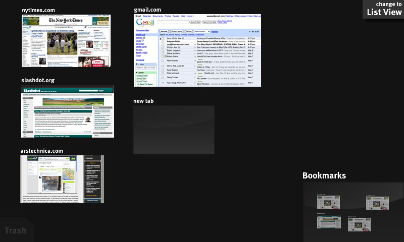
As new tabs are created, they arrange themselves in a loose grid as shown. Users can drag tabs between slots on the loose grid, with the dragged tab being inserted between the tabs at the drop location. Tab size is determined by the frequency of visits to the site (so larger tabs are also the more used tabs). It is important, however, that tab sizes don't shift around -- size is determined when a tab is opened and is fixed (relative to the other tabs) until it is closed. Varying tab size gets us three things: (1) It combats the all thumbnails look-alike problem, (2) It takes advantage of people's spatial navigation by giving stronger visual landmarks, and (3) It makes more frequently accessed tabs larger targets, and therefor faster to hit.
You close a tab by traging it to the trash. When dragging, the trash area becomes fully opaque and a border surrounds it (todo:mockup) showing that it is a drag target. After a tab is trashed, a button to undo the trashing appears (todo:mockup).
The same target-border appears around the bookmarks section, indicating that you can drop tabs in there to enable bookmarking of sites. When this is done, the tab should also remain in the position it was dragged from. Undoing causes
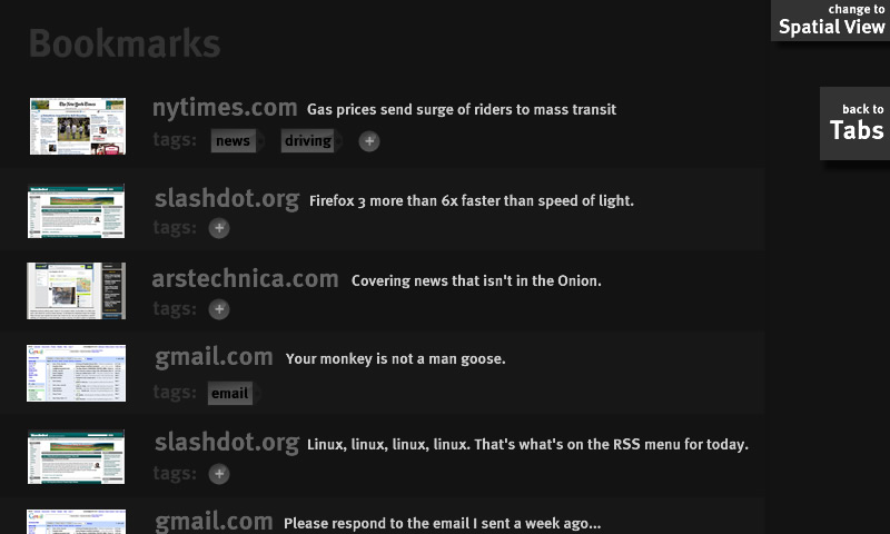
Clicking on the bookmarks section zooms in on the bookmarks.
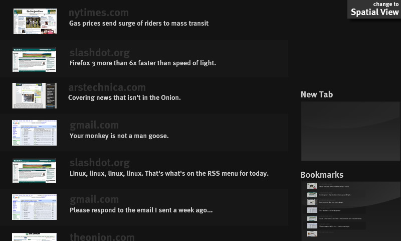
Clicking on the change to list view animates the display to the list view (see below). It only changes the view type of the current space. That is, you can have the bookmarks in list view and the tabs in spatial view.
List View
The list can be dragged/flicked up-and-down. New tabs are appended to the end of the list. Clicking bookmarks still zooms in on the bookmarks.
Bookmarks
Bookmarks form the long-term storage of frequently accessed pages (when not accessing them through the awesome bar).
Notes:
How to zoom out todo:mockup.
