Mobile/UI/Designs/TouchScreen/workingUI/desktop integration
Contents
Intro
This page is the working document for the user-experience of desktop-integration in Fennec. These features/abilities will be accomplished through Weave.
The following sections detail the types of integration with the desktop/cloud-data Fennec should have.
Bookmarks
Having synchronized bookmarks across all instances of one's browsing life is useful in general, but particularly powerful for mobile, where being able to draw on that list to produce smart awesomebar suggestions also helps to short-circuit the difficulty of typing.
Bookmarks show up in two places in Fennec, once in a searching context (the backing database for awesomebar suggestions) and once in a browsing context (a bookmarks list that a user will pan (swipe through).
Searching context (awesomebar)
Here, the user's full list of Elsewhere bookmarks should just be available through the awesomebar. Even though the list may be huge, it doesn't have to surfaced in its entirety for the user -- only matches are shown, so it should just work.
Some finessing may be required in that where a user goes frequently while mobile may be different than where he/she goes when at a desktop machine. In fact, this goes beyond just beyond mobile vs. desktop; a user's frequently accessed sites while at work may well be different than when at home, etc., which could through off the effectiveness of the current frecency algorithm, designed as it was with one instance in mind.
Browsing context (bookmarks list)
This is where it gets more complicated. The list of bookmarks from the desktop/elsewhere may (will?) be huge, with possibly deep hierarchies, and not well suited to a UI focused on physical panning/swiping through a list.
Perhaps not all desktop bookmarks should be shown? More thinking needed here.
History
History only shows up in one place in Fennec, that being as an information source for awesomebar suggestions. Some history may also show up in list accessible through the back and forward controls, but the primary use case there is to be able to skip back and forth in recent history without loading every page. History drawn from the desktop doesn't fit there.
History, as used in the awesomebar, requires no additional user-interaction, so should Just Work.
Tabs
It's useful to be able to get at a tab that you had open on the your desktop machine, but it's less useful for all of your desktop tabs to just show up in your mobile tab list (the simplest model) -- in many cases, there will simply be too many of them, most not relevant to your tasks while mobile.
The use-cases to concentrate one here are as follows:
- I was in the middle of a task at my desktop when I had to get up and go. I'd like to continue while mobile.
- this is especially true in the case of a page that has some state. If the page is just static, then reloading it (via navigating to it fresh, via the "recent things I was doing" aspect of the awesomebar) is as simple; if a form was half filled, or a location was moved to in a map where the URL doesn't change, then bringing up the tab is useful for continuation of a task
- What was that piece of information again? I don't remember how to refer to it otherwise (what it was called, where it was), but I do remember I had it open -- what was it?
In both cases, being able to see a list of all tabs that were open on the desktop (or other) system is useful. Rather than having all desktop tabs appear in the Fennec tab area, the user should be able to refer to a list of all Elsewhere Tabs, and select the one he/she would like to grab, at which point it is added to his local list.
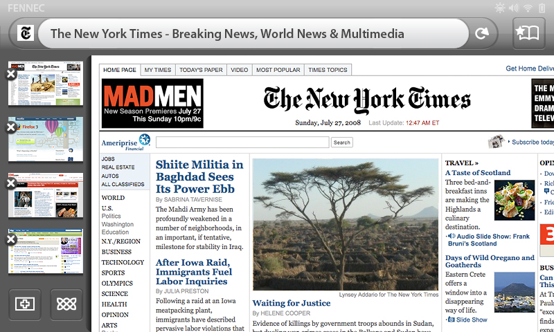
An additional useful way to support the first use-case would be to have the bottom tab in the Fennec tab area simply automatically be whatever was the last tab the user had open on his/her desktop machine. A user would learn that a way to pick up on the go is just, on the desktop, to open whatever he/she would like to continue with while mobile.
The following early screen design for this involves a "Weave" button (with the celtic knot icon).

The final design shouldn't reference the weave project/product directly (a user shouldn't have to know what "weave" or knots mean to get at more tabs. This button was used only temporarily.
Passwords
- Should Just Happen
Form Data
- Should Just Happen
Integration Preferences
In the prefs section:
- ON/OFF (with login or login separate?)
- Synchronize now