Mobile/UI/Designs/TouchScreen/Fennec 1.1+/Revised UI for Preferences
From MozillaWiki
< Mobile | UI | Designs/TouchScreen | Fennec 1.1+
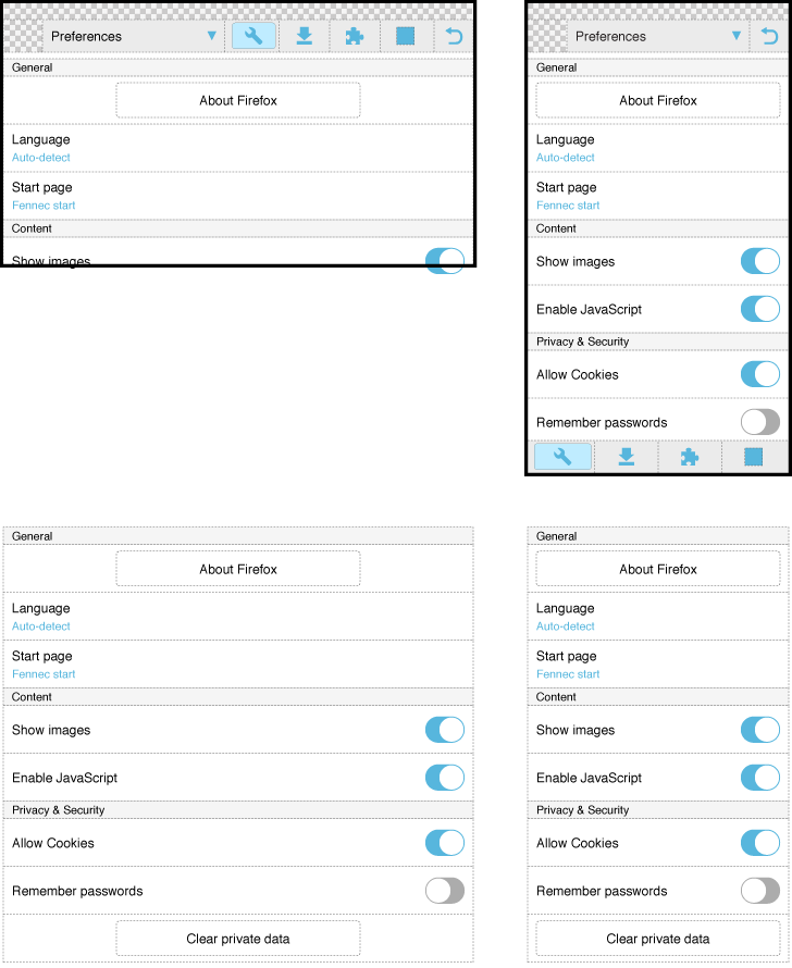
Layout of Preferences
In general, it would be good if each item would be interactive as a whole: Only the Switch option should make an exception:
- "About Fennec" (or should it be "About Firefox") and "Clear private data" could be buttons.
- Pop-up Choice list should work as they generally work on standard computers: Open choice list by tapping it, Select an option from the opened list by tapping it and Close the choice list by tapping outside of it. Current functionality (in version 1.1) to Confirm a single selection with the "OK" button is needless (or even purposeless). The choice list could take the full width of the view also in the closed state. For details, see Revised layout and functionality of Fennec Pop-up Choice list
- The switch option should support also changing its state by starting drag interaction over it.
