Mobile/UI/Designs/TouchScreen/Fennec 1.1+
Contents
- 1 Contextual Actions
- 2 Using interactive areas in webpages
- 3 Add Copy and Paste support
- 4 Changes for Portrait use
- 5 More space for add-ons
- 6 Chrome components revision
- 7 Session Restore
- 8 Awesomefill for fields
- 9 Form assistant revision
- 10 Panning document/canvas vs. text selection
- 11 Saving webpages
- 12 Find-in-page
- 13 Extended site menu
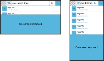
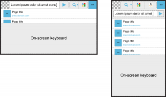
- 14 Accommodate a virtual keyboard
- 15 authentication UI
- 16 finger-friendly about:config (FIXED)
- 17 scroll indicators
- 18 Downloading and Opening/Saving files from Internet
- 19 controls for video
- 20 Feed subscription
- 21 Edit or clear site-specific prefs
- 22 Gesture Engine and UI
- 23 Improve discoverability of side-areas
- 24 Arbitrary/Continuous zoom mechanism
- 25 Links and fields are hard to tap
- 26 Replace modal dialogs with modeless alternatives
- 27 Shorter mobile-appropriate messages
- 28 More helpful network error pages
- 29 Animated transitions
- 30 Tab badges
- 31 Ability to pick web-based helper apps
- 32 See all history / visual history
- 33 Improved in-content theme
- 34 Support personas
- 35 Start page
- 36 Improved visibility of and access to add-ons catalog
- 37 Haptic feedback
- 38 Multitouch gestures
- 39 Full Screen / standalone apps / prism
- 40 weave vs. awesomescreen confusion
- 41 plugin-blocking / on-demand plugin activation
- 42 multiple per-domain search engine handling in the identity panel
- 43 Setting for Full screen mode
Contextual Actions
Open bugs
- bug 566225 – Contextual Actions: Integration with phone applications.
Mockup: http://www.flickr.com/photos/31068346@N05/4613291570/
Fixed Bugs
- bug 461854 - Need context menu UI
Some older work here: https://wiki.mozilla.org/Mobile/UI/Designs/TouchScreen/workingUI/CSM
Using interactive areas in webpages
Open bugs
- bug 441590 - can't scroll maps.google.com
- bug 460966 - mouseover css drop down menu doesn't work with fennec, but works with iphone
open bugs
- bug 460966 - mouseover css drop down menu doesn't work with fennec, but works with iphone
Pannable areas (i.e. maps)
General cursor-driven interaction
Add Copy and Paste support
We should have Copy (and Paste) support in Firefox Mobile.Direct communication with other applications offers a better User Experience than Copy and Paset(it eliminates excise) But C&P would give the possibility to exchange data with applications which (currently) don't connect with Firefox Mobile. It would fit into the existing aims for having a cursor support for webpages with pannable areas or general cursor driven interaction.
Changes for Portrait use
Open bugs
- bug 541015 - Support rotating between portrait and landscape on N900
More space for add-ons
Description:
Open bugs
- bug 496654 - let controls strip get wider, for use by add-ons
Awesome bar/view
<TBD>
Tabs bar (Left side pane)
<TBD>
Toolbar (Righ side pane)
<TBD>
Tools and Add-ons view revisions
Proposal A for redesigning the UI for Tools and Add-ons
Fennec should provide more space for numerous add-ons in the Tools UI, enable full-screen views for Add-on applications (such as Geoguide) with all standard UI components they can need (such as menu, toolbar, content area) and split the UI for searching/installing add-ons and managing installed add-ons so that they could be optimized for their purposes and used with different sizes of screens, orientation of device and text input methods (hardware and on-screen).
For more information, see
- Overview to the design for reorganizing the UI for Tools and Add-ons
- Option A for splitting the UI for searching/installing add-ons and managing installed add-ons: promotes the feature for getting new add-ons.
- Option B for splitting the UI for searching/installing add-ons and managing installed add-ons: a bit more traditional approach.
Proposal B for redesigning the Tools UI
In this proposal, the Tools UI has tabs for the main sections (Preferences, Downloads, Add-ons) similarly to current version of Fennec (version 1.1) but the layout is optimised to display the content in full width of the screen. Also, the Back button is moved to the top right corner of the view and the views would have a menu containing commands applying to all content of the currently selected tab (or subview of a tab). Tools UI could have four tabs (at max) and one of them could be e.g. a place for add-on applications.
For more information, see Revised layout for Tools UI with tabs.
The layout and content structure of the sections of Tools UI could be changed as follows:
- Revised UI for Preferences
- Revised UI for Add-ons (coming soon)
Chrome components revision
Session Restore
Description: Session restore - the ability to pick up what you were doing before a browser restart - is a very useful feature and a signature capability of Firefox. Session restore as-is from the desktop doesn't make sense on mobile though. Simply reloading all previously open tabs doesn't make sense in a data-constrained environment, on top of which the user is more likely to be interesting in a quick transactional interaction with the browser anyway.
Some possibilities for different approaches include
- providing a list of previously open tabs on a start page
- caching the previously open tabs and only actually reloading them on demand when the user switches to them
Open bugs
- bug 541421 - Session restore functionality
Awesomefill for fields
Description: Firefox project do make this the new autocomplete method: link - in 1.9.2
Open bugs
- bug 466770 - fix content autocomplete
Form assistant revision
Description: Form assistant should be usefull also when using Virtual text input methods which can take lots of screen estate (both in Landscape and Portrait orientation). Also, there is need to unify functionality of same type of components: e.g. make Pop-up lists to work more consistently with the Context-sensitive menus.
See Revised Functionality and Layout of Form assistant for proposal where Next and Previous buttons and all other components of Form assistant would take preferably only one row at max and be placed on the bottom of the view.
See Option B for Revising the Functionality and layout of Form assistant by placing the Next and previous buttons to the top of the view and the other Components of Form assistant to the bottom of the view.
Panning document/canvas vs. text selection
Description: The user should be able to pan doc/canvas in the view and select text in an text input element with the darg interaction (considered to be the most natural stroke for both actions)
See proposal for Interaction with Text input elements
Saving webpages
Description: I think the primary usecase here is just wanting a permanent off-line available copy of a webpage (so a receipt, or a boarding pass). It's probably not necessary, or very useful, to support full html+CSS+images saving out of a webpage.
Open bugs
- bug 465305 - Save page
Design proposals
- Proposal 1
- Put a "Save Page" option in the site menu (see Extended Site Menu)
- Just treat the saved file as a download, using a default download directory rather than opening a file picker, and use Fennec's existing download system: [[Image:|4351394977_d8bd245234.jpg]]
Find-in-page
Description: Access probably to be provided through the extended site menu
Open bugs
- bug 541817 - Fennec needs find in page functionality (CTRL+F)
- can't find the original bug
In addition to Larry, the site menu should contain options the desktop Firefox provides in the menus or elsewhere in the chrome. These options apply to content browser is displaying and can be provided by the content (such as subscription to feeds made available with link tag in the head of HTML file) or browser UI (such as Save as). The menu could contain options also for activating browser features such as "Find in page".
Design proposals:
- Proposal 1: Extended site menu
- comments on this proposal:
- the set of options should be vertically pannable once the number of options exceeds the available screen space
- sites can offer several feeds and search providers, but we don't want each one of these to get its own slot in the menu. In both of these cases, if the site only offers a single option, then tapping the associated menu item should subscribe to it or add it, etc. If there are multiple, the menu item explain that and bring up a selector widget.
- we have to make it visually clear that this menu is on top of the browser underneath and not another webpage (when there are enough options that it takes up the whole screen).
[[Image:|4351405309_0cf41b25c1_o.jpg]]
Where, if there are multiple feeds or search providers, tapping the option in the menu brings up a chooser overlay:
[[Image:|4352154856_5c61f69146.jpg]]
Accommodate a virtual keyboard
Description: full problem statement coming
awesomescreen layout revisions
Proposal A for Awesome screen layout revision
For more information, see Option A for Awesome screen layout revision.
Proposal B for Awesome screen layout revision.
For more information, see Option B for Awesome screen layout revision.
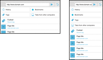
Proposal for Awesomescreen layout and content structure
For more information seeAwesomescreen content structure revision
authentication UI
Open bugs
- bug 436076 - Certificate Management
- bug 478938 - Add ability to choose client certs
client cert
Previous UI work: https://wiki.mozilla.org/Mobile/UI/Designs/TouchScreen/workingUI#Client_Certificates
username/password
previous UI work: https://wiki.mozilla.org/Mobile/UI/Designs/TouchScreen/workingUI#Username.2FPassword
finger-friendly about:config (FIXED)
Open bugs
- bug 540009 - revise about:config screen design for touch use
scroll indicators
Open bugs
- bug 461843 - Show indication of where on the page you are when scrolling
- bug 515166 - Support scroll indicators in XUL richlistboxes and scrollboxes
Downloading and Opening/Saving files from Internet
Description: Fennec should provide a setting in Tools > Prefs for opening files from Internet with or without a confirmation (i.e. "Opening <file>" dialog). Context-sensitive menu should contain "Save Link as" command. Fennec should inform the user about completed downloads (when URL was not sent to an appropriate handler application after link activation).
For more details see File download procedure and UI
controls for video
Open bugs
- bug 465839 - Controls for video content are missing
Proposals
- proposal 1
[[Image:|4352145250_b678e40771.jpg]]
Feed subscription
Open bugs
- bug 477714 - Provide UI for subscription to feeds (RSS, atom, etc.)
Edit or clear site-specific prefs
Description: There currently is not a way for users to undo site-specific choices they've made in response to prompts from Firefox. Examples include:
- remember passwords for this site
- block popups for this site
- exceptions for expired certs
- allow offline storage
- and more!
The simplest model for mobile would just be to let users clear all site-specific prefs, and this is what the listed bug proposes to do, via an extended site menu
Open bugs
- bug 456077 - No mechanism to edit popup preferences
Gesture Engine and UI
Open bugs
- bug 476425 - Add a Gesture Engine to Fennec
- bug 479975 - add an explanatory UI for the gesture engine
Improve discoverability of side-areas
Open bugs
- bug 478037 - allow zooming out to past the page edges so that controls are all visible
Arbitrary/Continuous zoom mechanism
Description: there is background in the planning documents for fennec 1.0 [here]
On multitouch devices, pinch to zoom is the defacto standard here, and we should do the same. On non-multitouch devices, we still need some way of zooming by increment, rather than to structure.
Open bugs
- bug 497479 - can't do a deep zoom into a paragraph of text
- bug 533560 - Volume control does not control zoom level
Links and fields are hard to tap
- tappable areas are larger than visible targets
- increasing size based on likelihood of tapping (awesometap)
- adjustments for capacitive screen
Replace modal dialogs with modeless alternatives
Shorter mobile-appropriate messages
More helpful network error pages
Description: Our current network error pages are unhelpful. We can help people avoid having to type out or correct URLs by doing some basic (and Places-leveraged) suggesting. See the desktop firefox project page:
https://wiki.mozilla.org/Firefox/Projects/Network_Error_Pages
Animated transitions
- bug 437957 - Animate zoom
Tab badges
Ability to pick web-based helper apps
Only a few are actually important. Candidates:
- RSS
- calendar
See all history / visual history
Description: Currently, Fennec (v. 1.0) has a limited support for Browsing history. The right-side toolbar contains Back and Forward buttons and you can search browsing history (based on text input) with the Awesome bar. The missing features are the alternative ways for returning back to a desired page you have visited recently (irrespective of which tab was used for it) or a longer time ago (e.g. in an already closed session) when you could not use the Back or Forward button for it or text input based awesome bar could not help you (because you could not remember site address, name, keywords etc). The desktop Firefox (3.5.x) provides lists of recently visited pages and all history, and you can also sort content in the Library. The features supported by desktop Firefox are useful for mobile too.
For more information see:
Improved in-content theme
Open bugs
- bug 516641 - Create better theme for web content form controls
Support personas
Start page
Description: For some background, see here: http://madhava.com/egotism/archive/005034.html
- Connection to Session Restore thinking
- Connection to desktop "Home Tab" work
Improved visibility of and access to add-ons catalog
Haptic feedback
Multitouch gestures
Two Fingers
basic set
- pinch to zoom
- two finger swipe downwards: jump to top of Web page/doc and show the top bar.
- two finger swipe upwards: jump to bottom of Web page/doc
- two finger swipe to the right: Back (one step in tab-specific browsing history)
- two finger swipe to the left: Forward (one step in tab-specific browsing history)
- rotate to switch between tabs?
Full Screen / standalone apps / prism
- full screen standalone for webapps - no sidebars, etc. - just a system toolbar
weave vs. awesomescreen confusion
Description: Fennec 1.0 provides the user with options for creating a new tab and opening a tab from another computer in the left-side pane (in the Main view).
- If the user tapped the ”New tab” button in the left-side pane, Fennec creates a new tab and opens the Awesome screen for entering a web address or selecting a web page to be opened in the new tab. Now, if the user wants to exit the Awesome screen, s/he can use the Back button in the top-right corner of the view for it. Note: panning the content horizontally does not bring the side-panes into the view in the Awesome screen.
- If the user tapped the ”Open tab from other computer” button in the left-side pane, Fennec creates a new tab and opens a web page that lists tabs available from other computers. Now, if the user wants to exit the list, s/he has to pan the left-side pane into the view and the select another tab. Note: if s/he would have pressed the (close) button in the top-right corner, s/he had closed the browser.
The behaviour detailed above can be really confusing from the user point of view, because sometimes s/he has to swipe the left-side pane to the view and sometimes press the button in the top-right corner to exit the view for selecting the content for the tab. It would improve usability, if the user could cancel the selection for the tab content in the same way in all cases.
See the proposal for fixing the problems above:
plugin-blocking / on-demand plugin activation
multiple per-domain search engine handling in the identity panel
Setting for Full screen mode
Fennec can be run on operating systems which reserve the top area of graphical user interface for showing a functional Status bar (or other suchlike short/flat element taking full width of the view) provided by the platform (cf. e.g. Android or Windows mobile). The system-provided Status bar can provide the user with useful functions and/or features but it also disables showing Fennec in full Full screen mode.
The user may want to use the Fennec
- with the system-provided Status bar because it provides useful functions and/or features she needs/uses frequently and she sees it as an advantage rather than an disadvantage that the element is shown constantly in the view.
- without the system-provided status bar because she does not see it as a critical feature for using the device (i.e. no added value for her) and she wants to reserve all screen estate completely for the actual content.
Because it depends completely on the needs of user whether the Fennec should run in full "Full screen" or not, browser should not decide on behalf of her to hide the system-provided Status bar but let the user user to decide what is best for her.
Fennec should provide the user with a setting for enabling/disabling the system-provided Status bar or other corresponding platform-provided functional element. The setting should be available in the browser settings.


