Mobile/UI/Designs/TouchScreen/Fennec 1.1+/Switch component
From MozillaWiki
< Mobile | UI | Designs/TouchScreen | Fennec 1.1+
Problem discription
<TBD>
Layout
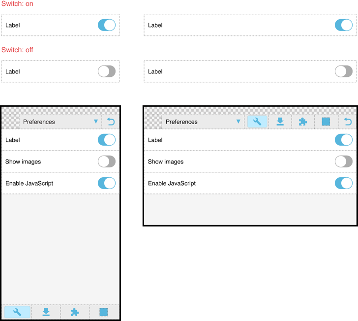
Instead of text, the state of Switch component should be indicated with colors (cf. indication of currently selected tab etc). In this way, the size of switch component does not depend on language and there is more space for the label text in all languages.
Opposite to the current version of Fennec 1.1, the switch would be
- ON, when the slider is on the right.
- OFF, when the slider is on the left.
Functionality
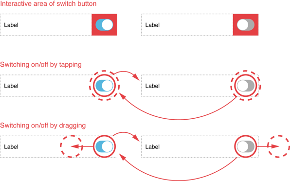
Only the switch component would be interactive - Not the label.
You should be able to set switch component on/off by tapping it and initiatiating horizontal drag interaction over it.

