Enterprise Event Dialog UI Specification
| Specification Status
|
| Author |
Christian Jansen
|
| Last Change |
Chris 06:30, 5 September 2006 (PDT)
|
| Status |
Preliminary
|
Abstract
This specification covers the UI of the Enterprise Event dialog. This includes the Event dialog itself, the Attendee dialog, the Time Zones dialog, the Reminder dialog and the Recurrence dialog.
References
Detailed Specification
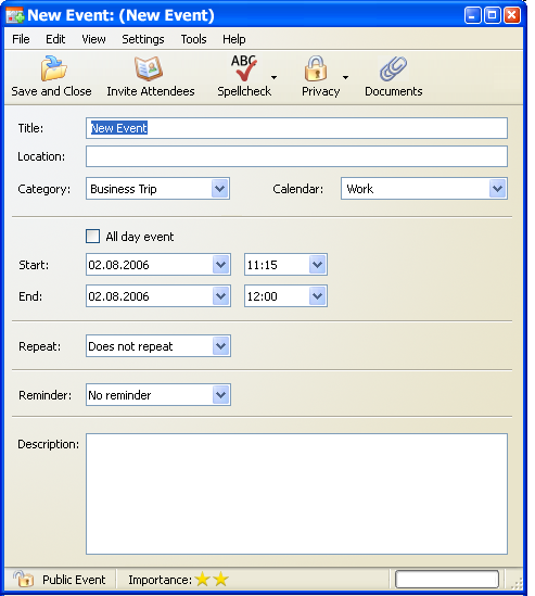
The Event dialog window consists of four areas.
From top to bottom:
- Menu Bar
- Tool Bar
- Working-Area
- Status Bar

The menu bar provides a set of menu items which are based on the menu structure defined for the Mail Compose window of Mozilla Thunderbird 1.5.
The menu bar has five menus.
| Item |
Sub Item |
KBD Shortcut |
Properties
|
| New >
|
Event...
|
Crtl+E
|
Opens the Event Dialog.
- Start date has to be set to the current date.
- Start time has to be on the next full hour. E.g. it is 9:40am the preselcted time has to be 10:00am.
- Default Event duration has to be 1 hour.
|
|
|
Message...
|
Ctrl+M
|
|
|
|
--------
|
|
Separator
|
|
|
Address Book Card...
|
|
|
| Close...
|
|
Crtl+W
|
- If any modifacation where made, an Alert has to occour before closing.
|
|
|
--------
|
|
Separator
|
| Save
|
|
Crtl+S
|
Saves the event.
- After successful saving the Event Dialog has to stay open.
- During save, the progress bar (of the Event Dialog) has to display the progress of saving.
|
| Page Setup...
|
|
|
Opens the Thunderbird Page Setup dialog.
|
| Print...
|
|
Ctrl+P
|
Opens the Thunderbird Print dialog.
- What to Print has to be defined.
|
|
|
--------
|
|
Separator
|
| Exit
|
|
Ctrl+Q
|
Exits Thunderbird
- All unsaved Events have to call an Alert before exiting.
|
| Item |
Sub Item |
KBD Shortcut |
Properties
|
| Undo
|
|
Crtl+Z
|
Every change has to be undoable.
|
| Redo
|
|
Crtl+Y
|
Every change has to be redoable.
|
| ------------
|
|
|
Separator
|
| Cut
|
|
Crtl+X
|
Applies to all text fields and combo boxes.
|
| Copy
|
|
Crtl+C
|
Applies to all text fields and combo boxes.
|
| Paste
|
|
Crtl+V
|
Applies to all text fields and combo boxes.
|
| ------------
|
|
|
Separator
|
| Select All
|
|
Crtl+A
|
Applies to all text fields and combo boxes.
|
| Item |
Sub Item |
KBD Shortcut |
Properties
|
| Toolbars >
|
Event Toolbar
|
|
Default State: Checked
|
|
|
-------------
|
|
Separator
|
|
|
Customize....
|
|
Opens the Mozilla standard "Customize Toolbar" dialog.
|
| Item |
Sub Item |
KBD Shortcut |
Properties
|
| Check Spelling...
|
|
Ctrl+K
|
- Opens the Thunderbird "Check Spelling" dialog.
- Spell check applies to "Title" and "Description"
|
| Spell As You Type
|
|
|
|
| -----------------
|
|
|
Separator
|
| Invite Attendees...
|
|
|
|
| Link to Documents...
|
|
|
|
| Timezone... |
|
|
|
| -----------------
|
|
|
Separator
|
| Importance >
|
|
|
|
|
|
None
|
|
|
|
|
Low
|
|
- Selecting 'Low' has to display 1 Bar in the Status bar.
|
|
|
Normal
|
|
- Selecting 'Normal' has to display 2 Bars in the Status bar.
|
|
|
High
|
|
- Selecting 'High' has to display 3 Bars in the Status bar.
|
| Privacy >
|
|
|
|
|
|
Public Event
|
|
- Default State: Selected
- Selecting 'Public Event' has to display the State 'Public Event' in the Status bar.
|
|
|
Show Time and Date Only
|
|
- Selecting 'Show Time and Date Only' has to display the State 'Show Time and Date Only' in the Status bar.
|
|
|
Private Event
|
|
- Selecting 'Private Event' has to display the State 'Private Event' in the Status bar.
|
| -----------------
|
|
|
Separator
|
| Show time as > |
|
|
|
|
|
Busy
|
|
- Default State: Selected
- Includes the event in calculating availability.
|
|
|
Free
|
|
- Has to be selected automatically, if event has the states "Private" or "All Day"
|
| Item |
Sub Item |
KBD Shortcut |
Properties
|
| Release Notes
|
|
|
TBD
|
| Thunderbird Help
|
|
|
TBD
|
| ----------------
|
|
|
|
| About Thunderbird
|
|
|
TBD
|
Tool Bar
The Event dialog window comes with a toolbar which contains six items.
| Item |
Sub Item |
Properties
|
| Save and Close
|
|
- Saves the event and closes the Event dialog window
- During save, the progress bar (of the Event Dialog) has to display the progress of saving.
|
| Invite Attendees
|
|
|
| Spell
|
|
|
| Privacy >
|
|
|
|
|
Public Event
|
- Default State: Selected
- Selecting 'Public Event' has to display the State 'Public Event' in the Status bar.
|
|
|
Show Time and Date Only
|
- Selecting 'Show Time and Date Only' has to display the State 'Show Time and Date Only' in the Status bar.
|
|
|
Private Event
|
- Selecting 'Private Event' has to display the State 'Private Event' in the Status bar.
|
| Documents
|
|
- Default State: Unchecked
- Opens the URL Dialog dialog.
|
Working-Area

Dialog
| Property |
State
|
| Type:
|
Application Window, Modeless
|
| Initial String:
|
- Case 1 (New Event)
- Case 2 (Editing of existing event)
|
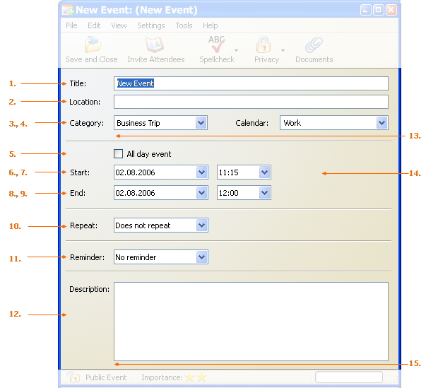
1. "Title" Text Field
| Property |
State
|
| Attribute:
|
Auto Complete
|
| Initial String:
|
- Case 1
- In case of creating a new event "New Event" has to be stated in the text field
- Case 2
- In case of editing an existing event the event title has to be stated in the text field.
|
| Pre Selected String:
|
- Applies to Case 1
|
| EN-US:
|
New Event
|
| Ger:
|
Neues Ereignis
|
| Label EN-US:
|
Titel:
|
| Label Ger:
|
Titel:
|
| Other:
|
Has to be spell checked if spell checking is ON
|
2. "Location" Text Field
| Property |
State
|
| Attribute:
|
Auto Complete
|
| Label EN-US:
|
Location:
|
| Label Ger:
|
Ort:
|
3. "Category" Drop Down List Box
| Property |
State
|
| Max. Visible Rows:
|
All
|
| Item Selected
|
"None", "Keine"
|
| Items
|
None, Keine
Anniversary, Jahrestag
Birthday, Geburtstag
Business, Gesch�ftlich
Personal, Privat
Vacation, Urlaub
Important, Wichtig
Must Attend, Teilnahme erforderlich
Needs Preparation, Vorbereitung notwendig
Phone Call, Telefonanruf
Travel Required, Anreise einplanen
----- (Seperator)
New Category..., Neue Kategorie...
New Category opens the Categories dialog.
|
4. "Calendar" Drop Down List Box
| Property |
State
|
| Max. Visible Rows:
|
7
|
| Item Selected:
|
The currently selected calendar in "My Calendars".
|
| Items:
|
Calendars, or Calendar Groups with write access.
|
| Other:
|
The "Calendar" Drop Down List Box appears only if the user has access to two, or more calendars with write access.
|
| EN-US:
|
Calendar
|
| Ger:
|
Kalendar
|
5. "All day event" Checkbox
| Property |
State
|
| Enabled:
|
Yes
|
| Attributes:
|
; If unchecked :
- Include Event in Busy calculation
- If checked
- Disable Time drop down (Start and End)
- Do not include Event in Busy calculation
|
| EN-US:
|
All day event
|
| Ger:
|
Ganzt�giges Ereignis
|
6. "Start Date" Date Picker
| Property |
State
|
| EN-US:
|
Start Date:
|
| Ger:
|
Beginnt am:
|
7. "Start Time" Drop Down List Box
| Property |
State
|
| Disable:
|
If 5 is selected
|
8. "End Date" Date Picker
| Property |
State
|
| EN-US:
|
End Date:
|
| Ger:
|
Endet am:
|
9. "End Time" Drop Down List Box
| Property |
State
|
| Disable:
|
If 5 is selected
|
10. "Repeat" Drop Down List Box
| Property |
State
|
| Max. Visible Rows:
|
9
|
| Item Selected
|
"Does not repeat", "Nicht Wiederholen"
|
| Items
|
Does not repeat , Nicht wiederholen
Daily , T�glich
Weekly , W�chentlich
Every Weekday , Jeden Wochentag
Bi-weekly , Alle zwei Wochen
Monthly , Monatlich
Yearly , J�hrlich
-----------------------------------
Custom..., Eigene...
"Custom..." opens the Recurrence Dialog.
|
| EN-US:
|
Repeat:
|
| Ger:
|
Wiederholen:
|
- If a custom repeat pattern is selected the Event dialog displays the pattern n as Hyperlink beneath the drop down list box. See image below.

- A single click on the hyperlink opens the Recurrence Dialog dialog with the custom Recurrence displayed.
11. "Reminder" Drop Down List Box
| Property |
State
|
| Max. Visible Rows:
|
18 + Custom items
|
| Item Selected
|
"No reminder", "Nicht erinnern"
|
| Items
|
No reminder, Nicht erinnern
5 Minutes before, 5 Minuten davor
10 Minutes before, 10 Minuten davor
30 Minutes before, 30 Minuten davor
--------------
1 Hour before, 1 Stunde davor
2 Hours before, 2 Stunden davor
15 Hours before, 15 Stunden davor
--------------
1 Day before, 1 Tag davor
2 Days before, 2 Tage davor
7 Days before, / 7 Days before
----------
Edit Custom Reminders...
|
| EN-US:
|
Reminder:
|
| Ger:
|
Erinnerung:
|
"Custom..." opens the Reminder dialog.
- When done, the entry "Custom..." is selected.
- If a custom reminder is selected, the Event dialog displays the reminder pattern as Hyperlink beneath the drop down list box. See image below.

- A single click on the hyperlink opens the Reminder dialog with the custom reminder selected.
12. "Description" Text Field
| Property |
State
|
| Linewrap:
|
Yes
|
| Visible Rows:
|
8
|
| Drag & Drop Allowed
|
Yes
|
13. "Attendees" Hyperlink
The image below shows the Event dialog extended by the attendee list.

| Property |
State
|
| Show:
|
If users added attendees to an event.
|
| Left Click:
|
Opens a pop-up menu which list the participation state of the attendees. Plus two additional options:
Compose Mail to All Attendees...
- Opens Mail Compose Window:
- List of recipients is pre-filled with attendees e-mail addresses
- The subject of Mail is pre-filled with the Event title
Invite Attendee...
Invite Attendees...
------------------------------------
Compose Mail to All Attendees...
Compose Mail to Tentative Attendees...
---------------------------------
[Status icon] Attendee A
[Status icon] Attendee B
[Status icon] Attendee C
...
|
| EN-US:
|
Attendees:
|
| Ger:
|
Teilnehmer:
|
14. "Timezone" Hyperlink
| Property |
State
|
| Show:
|
If time zones are enabled the event dialog has to display a timezone link by default. The hyperlink has to display the timezone set in Lightning.
|
| On Click:
|
Opens the Timezone Dialog. With the timezone selected statet in the hyperlink.
|
The image below shows the Event dialog extended by the timezone information.

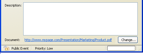
14. "Document" Hyperlink
| Property |
State
|
| Show:
|
If user added a document link to the event.
|
| On Click:
|
Browses the document.
|
The image below shows the Event dialog extended by a hyperlink.

"Change..." Button
| Property |
State
|
| On Click:
|
Opens the URL Dialog. With the hyperlink preselected stated in the Event dialog.
|
Status Bar
The status bar contains 3 items:

1. "Privacy State"
| Property |
State
|
| Show:
|
Depending on the state selected in the menu or toolbar one of the following states is displayed:
- (ICON) Public Event,
- (ICON) Show Time and Date Only,
- (ICON) Private Event
|
2. "Importance State"
| Property |
State
|
| Show:
|
Depending on the state selected in the menu one of the following states is displayed:
- Importance: 1 Star
- Importance: 2 Stars
- Importance: 3 Stars
|
3. "Progress Bar"
| Property |
State
|
| Show:
|
- After selecting "Save" the process of saving is displayed
- After clicking "Save & Close" the process of saving is displayed
|
| Min. Value
|
0
|
| Max. Value
|
100
|
| Min. Time Progress is visible
|
400 ms
|


